One thing that this sketch has a lot of is white space. White space can be an important element of design and sometimes without it the page can look too busy or it can be difficult to find all the vital information like the journaling, title, or even the pictures. However, I know that leaving that white space on your page can be a little scary, especially at first and especially when it's in as large of a dose as the sketch this week. If this sketch is a little heavy on the white space for your style, the layouts today show some easy and effortless ways to help reduce that space without completely covering it up.
Two-page Sketch #8
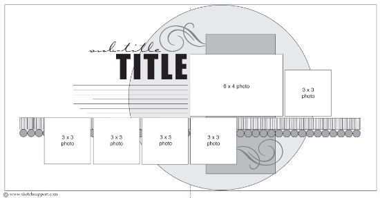
You can download and print this sketch by clicking on the two-page sketches link found under the "printable sketches" tab on the right sidebar.

"Happy Little Guy" by Shari Thurman
Supplies - Pattern paper, Chipboard Elements, Cardstock Accessories and Decorative Brads: My Mind's Eye; Punches: EK Success, Fiskars and Creative Memories; Other: Machine Stitching
I have a similar "quirk" to Allison. I too have to make sure that the subjects are looking toward the center of the layout. This is the reason I flipped the layout left to right. Overall, the dimensions of the elements are the same as shown on the sketch.
• I used my sewing matching to create the zig-zag stitching around the background circle.
• I layered the 4 1/2 x 9 inch teal paper with red paper measured the same size, just off set to the top right.
• I added a scalloped border to the bottom, trimmed it with orange and then created a decorative scalloped border around the edges with my sewing machine.
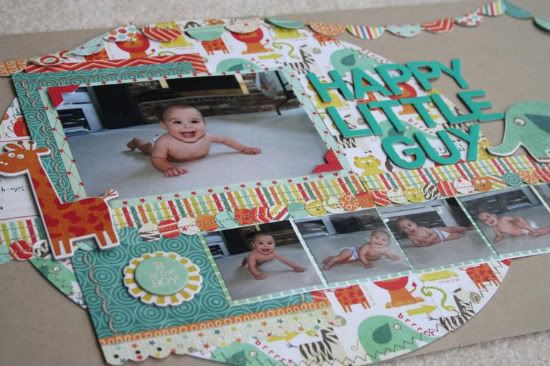
• I stitched along the striped paper and stitched the 1/2 inch circles together creating the decorative strip.
• I matted the 4x6 photo and used to photo corners to make it stand out.
• I placed the title as suggested, but since it was so large, I moved the journaling to the left of the main photo where the sketch suggests a 3x3 photo.
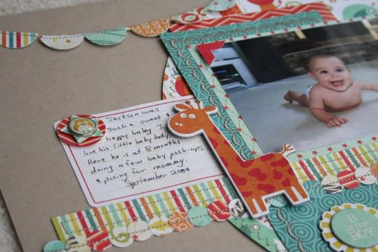
Journaling reads, "Jackson was such a sweet and happy baby. I love his little baby body. Here he is at 8 months doing a few baby push-ups and posing for mommy. September 2009"
• For my supporting photos, I used seven 2 x 2 photos instead of the suggested 3 x 3 size. This allowed me to get more photos on the layout. Since they were so much smaller, I moved them down below the striped and decorative border to fill the space and make it more pleasing to the eye. They seemed to be getting lost on the busy background pattern, so I matted them on a more neutral paper cut slightly larger.
• For the embellishing, I added the banner at the top by using my 1 inch circle punch, folding the circles in half, attaching to twine and running it through the sewing machine. I then layered the decorative brads with punched stars and circles. Finally, I added several Chipboard elements to finish it off.

• • • • • • • • • • • • • • • • • • • • • • • • • • • • • • • • • • • • • • • • • • • • •
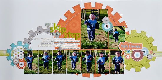
"With a Skip in His Step" by Allison Davis
Supply list - Cardstock: Bazzill; Patterned paper: My Mind's Eye; Chipboard gears: My Mind's Eye; Die Cut ("fun times" and gear border strip): My Mind's Eye; Alphabets: Making Memories (with a, in his) and American Crafts (skip, step); Jewels: Kaisercraft; Embroidery floss: DMC
• Variation #1 - I was working with all vertical photos so I switched the horizontal 4 x 6 to a vertical one. Switching the orientation of 4 x 6 is possible in almost all sketches. It's only a two inch difference and when you think of two inches compared to the 12 x 24 size of your layout, it isn't much. You really shouldn't have to make big adjustments to accommodate the extra inches to either the height or the width.
• Variation #2 - Since I had more height in my 4 x 6 photo I removed the rectangle piece. Most of it was covered and it also didn't quite fit in with the design I had in mind.
• Variation #3 - I really couldn't crop down the photos of Jackson running to a 3 x 3 so I used wallet size in place of all the 3 x 3 photos. This way I could keep the whole picture, uncropped and still have a size close enough to 3 x 3 that it would work with the design. I was also able to include more photos since they are smaller in width.
I had mentioned on Sunday that this sketch is perfect for action photos with the row of photos along the bottom. My layout today is an example of that. I used that bottom row to show the movement of Jackson running.
• Variation #4 - A dilemma I ran into with the papers is that I had very few showing on the page. After I added more photos across the bottom and used a vertical 4 x 6 I lost a lot of the paper design. I wanted more color on the page so I decided to have a little fun with the papers and add some more to match the bigger circle. With so much white space on this sketch it was easy to add in extra pieces without taking away from the rest of the design.
••••••••••••••••••••••••••••••
26 comments:
The first thing I noticed was the direction of Shari's main photo. I would have had to turn the sketch too.
These are both so cute. I think they are both fun and colorful and love all the pictures you can add to this. I wish my son was still this little and cute. Great job to both of you.
Love both of these!!!
love the colors in #1 and gears of #2 - what fun layouts......
Shari, what amazing stitching. And Allison, love the gears--perfect for boys! The colors on both are fantastic.
I love the colors and the way the white space was utilized as I find that intimidating too! Great job ladies! Love all the action shots! Any suggestions on printing photos at various sizes?
I really like the sketches today and the variations. Very playful!
Crystal, I've heard a lot of great things about Photosheet http://www.photility.com/PhotoSheet/default.html
It's a free software that allows you to combine multiple images onto a single image, like six 2 x 2 photos printed on a 4 x 6. You can use it for both home printing and photo processing places. :)
Hey Allison
Is the paper you used "die cut" or did you cut out the large gear shape and what paper line is it?
Love your layout. You are so talented!
Thank you Kathy! It's the Lil' Robots collection from My Mind's Eye. I cut the into a gear shape myself. I didn't have a template so I had to use a ruler to make all the little rectangles. :)
Thanks Allison. Great job on the gears. I may have to attempt this:)
Oh wow, I am in love - I've already done this sketch twice and now I want to do it again - lol! GORGEOUS layouts! Shari - I love how many pics you put on yours and the rotated sketch and Allison, FAB job of changing up the background! SO inspiring!
Great job on the layouts ladies. I love the banner on the top Shari's layout and the gears on Allison's are awesome!!!
These are amazing!! Love all of the details on Shari's LO and I love the cogs and stitching on Allison's! Great job!! :)
Love this sketch. I like how Shari added the banner and love your gears.
I just can't get over how AWESOME the GEARS are. You totally ROCKED this one. I love the action sequence. I love all the smaller pics.
Once again, thanks for sharing your incredible talent.
Super cute and so many photos. Love it!
I love white space on a layout...you taught me that, Ali. It allows me to use a variety of patterned papers without having the layout be too busy or cluttered. I am loving this sketch, and the layout examples this week. Thank you!
They both look great!! Shari, do you use anything special when you do your machine decorative stitches? Is your needle extra small? Mine just have not done well on paper and was hoping you might have some suggestions. Yours look great!!
Love the gears ... Great layouts.
Laura,
I use the "Janome Red Tip universal needle size 14". It provides the extra strength and durability needed for denser embroidery and thicker fabrics (or paper). This size 14 needle is equipped with a larger eye, which helps to prevent thread breakage, which often occurs when working with tricky threads, such as metallic. I took this information from the Janome site.
My local sewing machine store recommended this needle for sewing through paper. I been told to change to a new needle when I started a fabric project. Paper can dull needles. Also, that you should change your needle after 8-10 hours of usage.
As for the thread, I discovered from another scrap booker, that a thicker thread such as upholstery thread or coat thread(DMC) is easier to see on scrapbook pages. This works great with my sewing machine. I used to have some trouble with my sewing machine jamming up, but haven't had any trouble since I changed my thread. The bad part is that it only comes in a few colors. I've used nylon and polyester. I like both.
Hope this helps. Shari
awesome layouts as usual girls!!
staci
Great layouts!!!! Love the banner!!!
Wonderful layouts! I really love the colors/pattern mix in the Little Guy LO!
Thanks Shari. That is all really helpful info. I can't wait to gather those supplies and try it out! Thank you!
Both of these layouts are too stinkin' cute! Absolutely adorable!
Post a Comment