Yesterday I mentioned reducing the white space on the sketch and today the layouts we are sharing show some more ideas on how you can do that.
Another thing the layouts today have in common is that they each use a different style of die cut patterned paper instead of the circle on the sketch. If you ever see a die cut patterned paper on a sketch, you can still follow the sketch by using a die cut patterned paper but the style/shape of the paper you use can make a huge difference in the overall look.
Don't have a die cut patterned paper to use? Maybe you have one but it doesn't quite match what you are working with? You can always make your own with a template (my favorites are from The Crafter's Workshop and I'm really excited about the Lucky 8 Punch from We R Memory Keepers), use another die cut patterned paper as a template, or use a simple rectangle or square in it's place.
Two-page Sketch #8
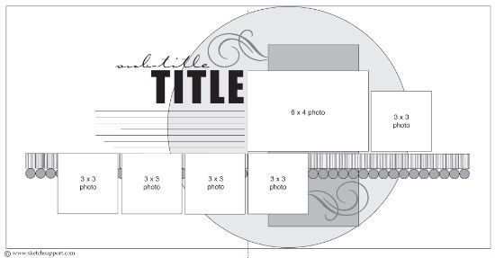
You can download and print this sketch by clicking on the two-page sketches link found under the "printable sketches" tab on the right sidebar.

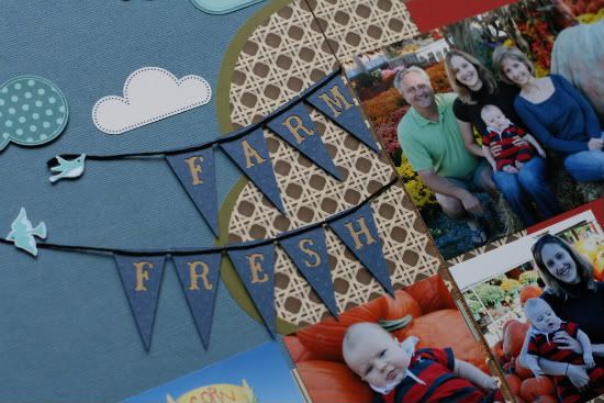
"Farm Fresh" by Noey Hunt
Products used: Patterned paper: Bella Blvd (cloud cut outs), Coredinations (background), SEI (stripes), Making Memories (die cut sheet and shimmery scalloped strips); Tools: Cricut Country Life cartridge (windmill, sunflowers, chickens, and banners)
Variation 1: I didn't stray too far from the sketch but I was inspired by the Bella Blvd cloud paper to make a landscape. I added the brown paper layer at the bottom to better define the ground.
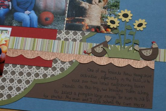
Variation 2: I moved the journaling to make more room for the title. I decided to try out the new banner trend but I was struggling with where to anchor the left sides. My wonderful husband came up with the little birdie idea!
• • • • • • • • • • • • • • • • • • • • • • • • • • • • • • • • • • • • • • • • • • • • •
••••••••••••••••••••••••••••
••••••••••••••••••••••••••••••
••••••••••••••••••••••••••••
••••••••••••••••••••••••••••••
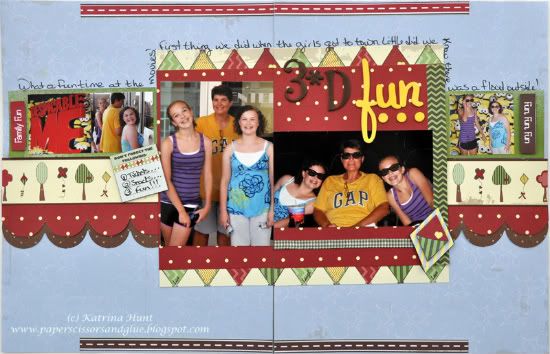
"3D Fun" by Katrina Hunt
Supplies: Pattern Paper: Nikki Sivils, Scrapbooker We Are Family Collection; Letters: American Crafts; Mist: Studio Calico Mr. Huey in Applejack; Adhesives: Scotch ATG, Fabri Tac, and Scrapbook Adhesives; Pen: Zig Micron
Variations:
• Size was the first one. I did 8.5x11, instead of a 12x12.
• Replaced the circle with the rectangle.
• Moved some of the pictures around and changed sized to make them fit.
• Title is on opposite side.
• Journaling goes around the top of the pictures, instead of all in one place.
• • • • • • • • • • • • • • • • • • • • • • • • • • • • • • • • • • • • • • • • • • • • •
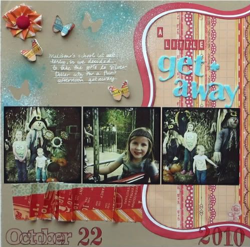
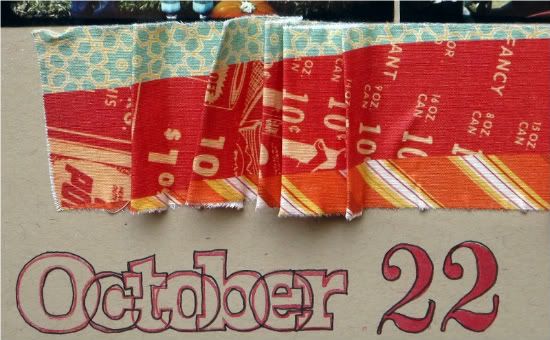
"A Little Getaway" by Christy Arthur
Products - Cardstock: Bazzill; Die cut patterned paper: Jenni Bowlin; Patterned paper: Sassafras (Vintage Yummy Pleasantly Puzzled) and Studio Calico (Home Front Conversation Piece); Alphabets: October Afternoon (Mini Market red and cream) and Making Memories (blue felt); Fabric based patterned paper: Studio Calico FabRip; Mists: Tattered Angels (Turquoise) and Studio Calico (White); Butterfly punch: Martha Stewart; Month stamp: Studio Calico; Brads: Nikki Sivils, Scrapbooker; Tools: Tim Holtz Tiny Attacher; Ink: Colorbox (Queue Chocolate and Blueberries); Pens: American Crafts (black) and Gelly Roll (white)
• I used the left side of the two page sketch and turned it into my one page layout.
• I liked the red border of the die cut paper, but the inside pattern did not match my layout. I trimmed the red border off and used that as a template to trim the border shape into the patterned paper I wanted to use. That way it looks like one piece of die cut paper, but fits my design better. I used this die cut paper in place of the circle die cut in the sketch.
• I used the three photos, like the sketch, but moved them up slightly so they are closer to the center of the layout.
• I added a ruffled patterned paper strip and moved it down below the photos instead of behind the photos, as is in the sketch.
I also decided to use a larger pattern here, which also takes the place of the small circles that are in the sketch.
• I kept my title on the top right side like the sketch. But I moved the journaling to the upper right, instead of right below the title.
• I also added some decorative details and mist to the top right corner; which is different from the sketch.

The details include a flower made from patterned paper (it is actually a "fabrip" that is sticky on the back, which makes it easy to fold into a flower) with a brad for the middle of the flower. I also created some butterflies and misted a few "negative" butterflies on the page as well.
•••••••••••••••••••••••••••••••••••••••
11 comments:
I love Jennifer's sticthing. Did you see the new WRMK 8 punch tool, just eprfect for making your own die cut paper.
I love the Farm Fresh layout! Gorgeous! I like all the tips that you all are giving too, what fun!
Beautiful layouts! Love the one page take on the sketch!
i can't wait to use this layout this weekend. I'll have to get those 8 punch tools, they look like fun!
WOW THESE ARE ALL AMAZING!! Love the birds holding the banner, first thing I noticed before reading it. So cool to do a date night page and you did great taking your own photos, like the labels too. There is so much I love about each one of these, great jobs ladies. These are all my favorites.
Amazing layouts ladies!!!!
fantastic layouts ladies! love the variety! I especially love the clouds and title banner in Noey's layout ... awesome work everyone!! :)
I can't wait for the Lucky 8s!!! SOOOO AWWWESOME!!!!
great LO's!
Tha farm layout is so stinking cute, it got me inspired to work on my scrapbook today!
What a rockin' DT you have! So much inspiration today! Thanks!
Post a Comment