I kind of messed up this week! I overlooked the layout from creative team member, Melissa Elsner that is based on this sketch. Her layout (the first one in this post) would have gone with the first day of layouts since it's a great representation of following the sketch with her own flair added in. So sorry about that Melissa!
The other three layouts in this post from Tammy, Suzanna, and Christy show even more you can do with the photos including adding more, using less, and using vertical photos instead of the horizontal on the sketch. They all did a wonderful job of making the sketch work with what they wanted to use.
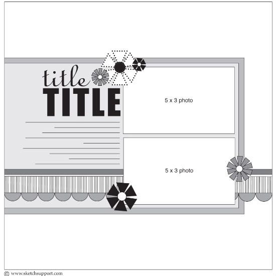
One-page Sketch #5
You can download and print this sketch by clicking on the one-page sketches link found under the "printable sketches" tab on the right sidebar.
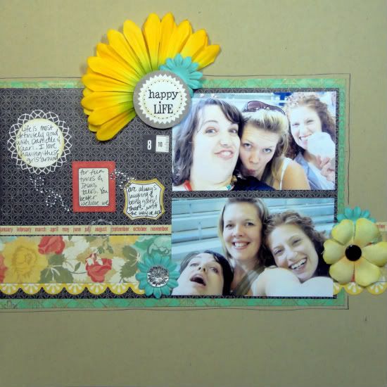
"Happy Life" by Melissa Elsner
Supplies - Paper, cardstock stickers: Crate Paper; Cardstock: Bazzill Basics Paper; Clear Sticker: SRM Stickers; Flowers: Prima Marketing, Kaisercraft; Bling: Recollections; Bling flourishes: Basic Grey; Ink: Staz-on; Brad: Recollections; Glitter glue: Stickles (Ranger Industries); Pen: Zig Memory
System
Design Notes: I stayed pretty true to this sketch. Even though the title and journaling are placed a little different, they are in the same spot as the sketch. I wanted to try something I've seen done before on layouts and that is to use multiple journaling spots for my journaling. It does add a fun look!
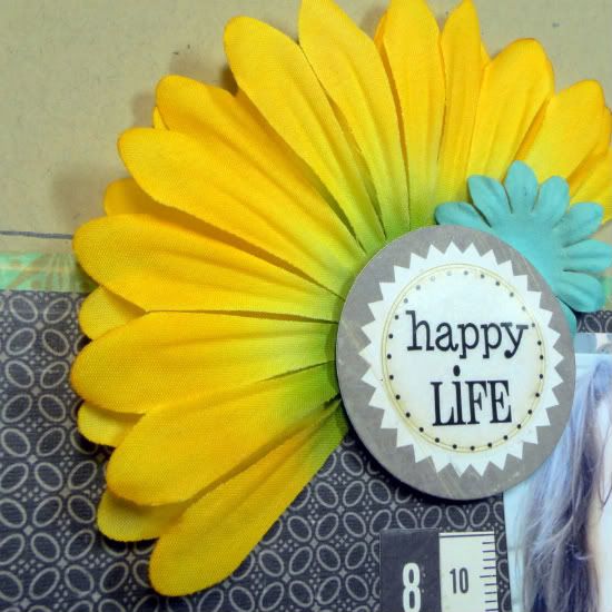
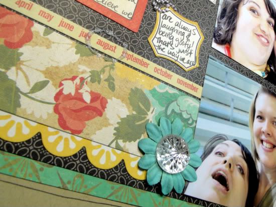
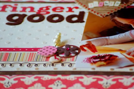
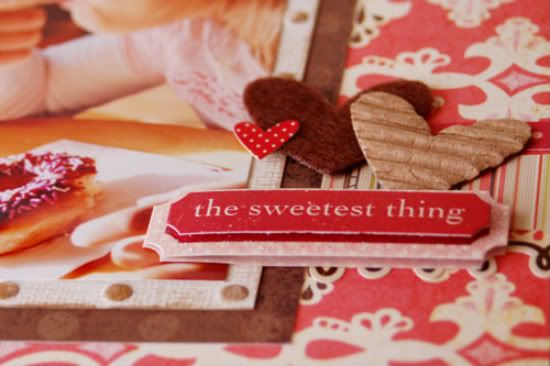
Here's a look at some of the details:
• • • • • • • • • • • • • • • • • • • • • • • • • • • • • • • • • • • • • • • • • • • • •
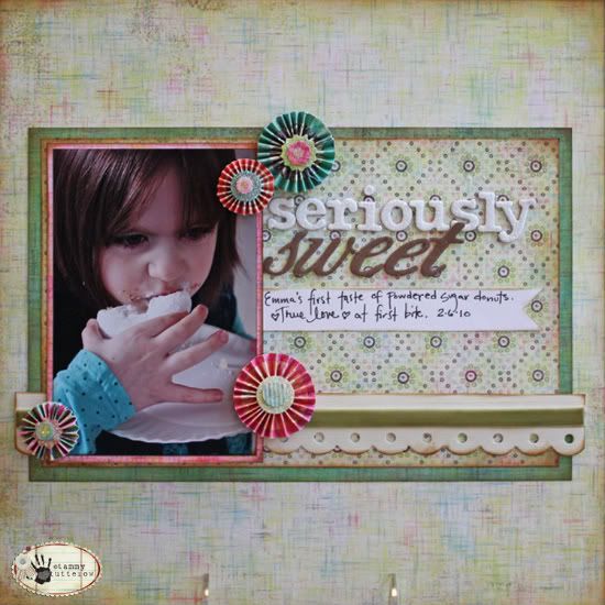
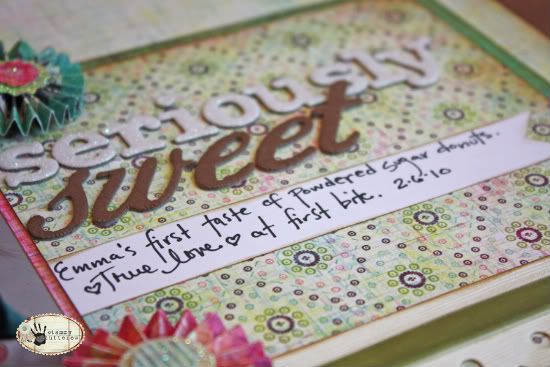
"Seriously Sweet" by Tammy Tutterow
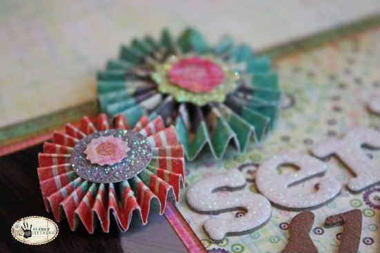
Supplies - patterned paper: BasicGrey (Sweet Threads Fashionista, Must Have, I Need, and Retro Clutch); alpha letters: American Crafts (Thickers Salutations and Bliss); cardstock border strips: Bazzill Basics (On the Edge); ribbon: unknown; embellishments: BasicGrey (Sweet Threads Wheels);
ink: Tim Holtz Vintage Photo Distress Ink
For this page, I changed the photo to the left so that the subject in the photo would be facing in towards the page, which just felt "right". I also used one single 4x6 photo vertically rather than the two horizontal photos in the sketch.
One thing I am challenging myself to do is to make some pages more quickly rather than laboring over them for hours and feeling like every single one has to be a masterpiece. By staying basic and true to the sketch, I was able to do this page in about 30 minutes. I am really happy with the result because I was able to create a page about a favorite photo and include the details of it without feeling like I needed to be super elaborate. I love that using a sketch helps me to have that freedom.
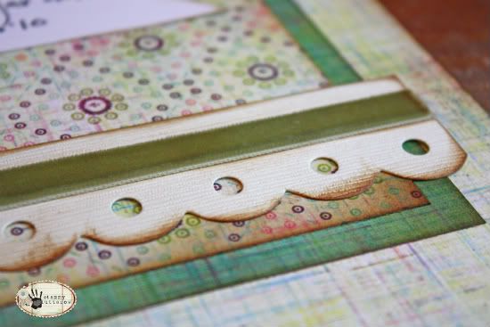
Here's a closer look at the details:
• • • • • • • • • • • • • • • • • • • • • • • • • • • • • • • • • • • • • • • • • • • • •
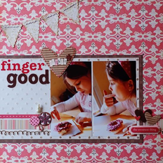
"Finger Lickin' Good" by Suzanna Lee
Supplies - Cardstock: Coredinations; Patterned paper: Echo Park, Basic Grey, SEI, Cosmo Cricket;
Stickers: Echo Park, KI Memories, Making Memories, Jillibean Soup; Chipboard Sticker: American Crafts; Corrugated Element: Jillibean Soup; Pin: Maya Road; Twine: Jillibean Soup; Alpha Stickers: Jillibean Soup, Making Memories, American Crafts; Button: SEI; Felt: American Crafts; Liquid Pearls: Ranger
Variations:
The biggest difference here is that I used two vertical pictures instead of the two horizontal ones in the sketch. And, see that lovely spot Allison has for journaling? I have one too, only I didn't journal! My excuse; I want to showcase that fantastic Core that I sanded! I also added a banner to the top left corner. It's subtle amongst the patterned background paper.
• • • • • • • • • • • • • • • • • • • • • • • • • • • • • • • • • • • • • • • • • • • • •
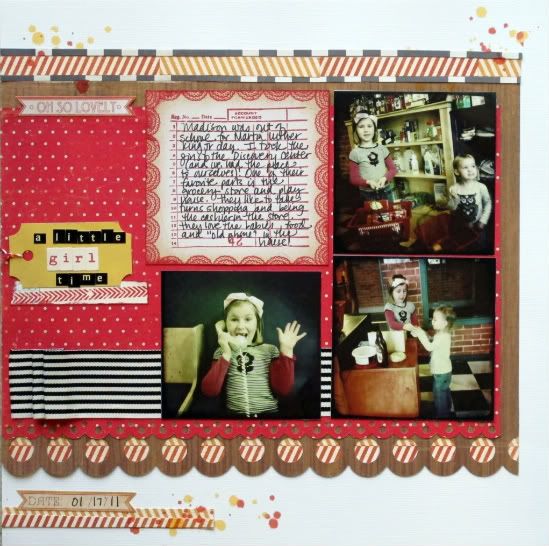
"A Little Girl Time" by Christy Arthur
Products - Bazzill: Cardstock; EK Success: Large Circle Border Punch; Jenni Bowlin: Cough Syrup ink and Receipt Stamp; Crate Paper: Portrait Accent Cuts (Emma's Shoppe Dresses, Playhouse); My Mind's Eye: Stella and Rose Trims and Label Stickers (Mabel So Sweet Herringbone); Martha Stewart: Scallop Dot Punch; October Afternoon: Mini Market School house; Cosmo Cricket: Tiny Type; Studio Calico: Mister Huey Lemonade and Orchard; Jillibean Soup: Twine
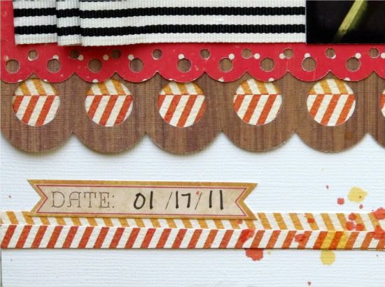
To create the top border, I pieced together different colors of the herringbone paper and lined it with small strips of the black and white crossword side of the wood grain paper. For the journaling card, I stamped an image in the center of a square patterned paper so that it appears to all belong together.
Some variations on the sketch:
• I flipped the location of the title and the journaling; so the journaling is on top and larger and the title is smaller to the side.
• I used three smaller photos instead of the two larger ones.
• I added a scallop border, so there are two borders instead of the one on the sketch.
• I added a little detail in the left corner along with the date.
•••••••••••••••••••••••••••••••••••

6 comments:
I really like the half flower on the happy life, the change to one photo on seriously sweet, the addition of the banner on finger lickin good and the use of border punches on the girl time. Great job, ladies. :)
I agree with everything Amy said in the comment above. These were really cute layouts, can't believe we are getting some yummy ones this week. Great job as always ladies.
Nice job again ladies! I love seeing all the ways a sketch can be interpreted. Tammy is that a border punch you used for the scallop in "seriously sweet" ? If so I would love to know which one. The ones I have don't look quite like yours. I really like that scallop. Thanks.
great job on the sketch. love seeing all the variations.
amazing layouts!!!
CO Scraps- It is a pre-made border from Bazzill, Just the Edge in Vanilla.
Post a Comment