••••••••••••••••••••••••••••••••••••••••••
One-Page Sketch #9
You can download and print this sketch by clicking on the one-page sketches link found under the "printable sketches" tab on the right sidebar.
Supplies - Pattern Paper: Echo Park Splash Collection; Cardstock: Echo Park; Cardstock Stickers: Echo Park Splash collection; Tags: Echo Park Splash collections; Photo Collage template: Carina Gardner (Two Peas in a Bucket); Stamp: Unity Stamp Co.; Chipboard Letters: American Crafts Thickers; Twine: The Twinery Baker’s Twine; Punches: Martha Stewart; Adhesives: Scotch ATG and Scrapbook Adhesives by 3L; Ink: Jenni Bowlin; Pen: Zig Micron in black
Variation 1 - I loved the sketch, but I just couldn’t find the right pictures for the papers I wanted to use or make the right size of pictures. I even tried flipping the sketch, but I didn’t like that either. In the end, I decided to change the picture sizes slightly and use the general idea of the background papers on the sketch. I made the pictures that I had work by changing the sizes and making a collage in Photoshop Elements with a template. I also cut the collage square and added an embellishment that I created in the blank spot above the left bottom picture and just attached it right to the photo paper.
Variation 2 - The title and journaling had to be moved to accommodate the picture change. Journaling placed on a tag.
Variation 3 - I actually made quite a few of the “extras” on my page. I added a peek-a-boo tag at the top, made the “heat wave” embellishment on the collage, added to the journaling tag with the blue strip of waves from another tag and added some of the coordinating cardstock stickers. I also made a tag for part of my title to stand out by taking a bracket stamp and stamping on white cardstock first and then on my pattern paper. I then cut out pattern paper stamped and adhered it over the top of my white stamped piece. I then evened out the bottom. I needed something for the letters to stand out on.
Variation 3 - No curve at the bottom (truth is…I have MAJOR trouble making those!), I decided to go with a border punch at the bottom and near the top.
• • • • • • • • • • • • • • • • • • • • • • • • • • • • • •
Products - Crate Paper: Portrait Bridesmaid, Neighborhood Picnic, Emma's Shoppe, Quilts, Books, Inventory and Chipboard; Studio Calico: Cooped Up, Countryside Cut outs, Orange Die cuts and Dot Stamp; EK Success: Flourish Punch; BasicGrey: Life of the Party Micro Mono Stickers; Jenni Bowlin: Chewing Gum Ink; October Afternoon: 5 & Dime Label and Word Stickers; Hambly: Washi Tape; Hero Arts: Typewriter Stamp; Bazzill: Kraft Cardstock and In Stitch'z
Since I only had one photo to use, I added a collage of different patterned papers and chipboard elements where the 4x6 photo is in the sketch.
I made my patterned paper (the green paper) square slightly larger than it is in the sketch.
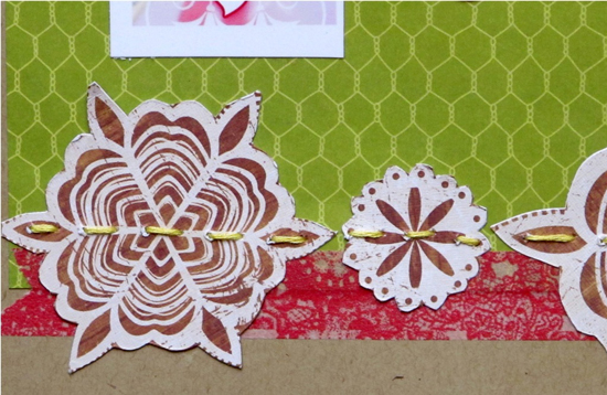
Instead of a curve, I use flower elements cut out of patterned paper at the bottom of my layout.
The curves in the elements are my take on the "curves" from the sketch. I added a little stitching across the flowers.
I added a hidden journaling tag on the side of my layout that is different than the sketch.
I moved the title to one of the brackets instead of below the photo, since my photo was longer than the one in the sketch.
••••••••••••••••••••••••••


4 comments:
Both these layouts are bright and colorful and fun. Way to go ladies.
Such fun colors! Nice job ladies!
Such creative takes on the sketch! Love the paper choices on both layouts!
The boat war page looks super fun
Post a Comment