••••••••••••••••••
Card Sketch #11

You can download and print this sketch by clicking on the card sketches link found under the "printable sketches" tab on the right sidebar.
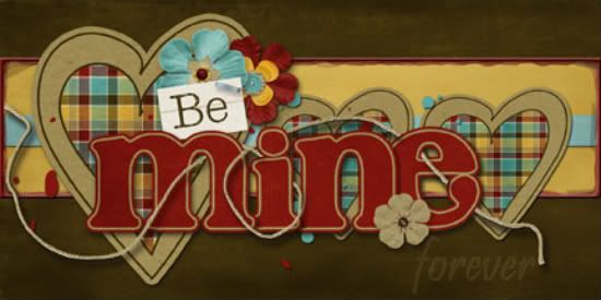
"Be Mine" card by Tammy Volland
Supplies - Digital Kit by: Connie Prince / Who Lives Here; software used: Adobe Photoshop CS3
Well, I know I am off seasons with this one, but I had a friend wanting a "be mine"
card. So I thought this would be a great one for that.
Variation 1) I used hearts instead of the squares. I made one bigger to offset the title.
Variation 2) I added a plastic glass frame around the middle paper piece. You can get the action for Photoshop at www.atomiccupcake.com.
Variation 3) I made the title art (word art with kit) to stand out and faded out the forever part. I put drop shadows behind all of it to make it look more paperistic (if that is such a word! lol).
• • • • • • • • • • • • • • • • • • • • • • • • • • • • • •
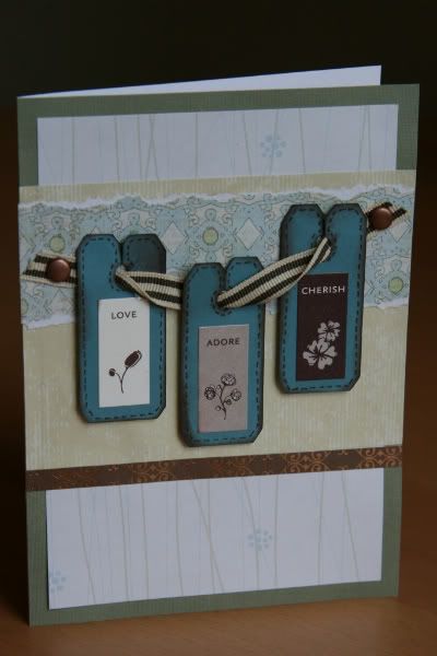
"Love. Adore. Cherish." card by Noey Hunt
Products used - Patterned paper: Paper Reflections (vines), Creative Imaginations, Chatterbox (brown); Stickers: Stampin' Up; Brads: American Crafts; Tools: Cricut Walk in my Garden cartridge (bread tags)
Variation 1: I've been wanting to try out these little bread tags for a long time now and thought three of them together would work well, like in this card sketch. So I switched the row of squares into a line of bread tags hanging on a ribbon.
Variation 2: I rotated the sketch because I wanted my bread tags to stretch across the card but they were too skinny with the horizontal layout.
Variation 3: I had to adjust the widths and placement of the accent paper strips because I needed them to work with the ribbon holding the bread tags.
Variation 4: My bread tags already had words on them that gave purpose to the card, so I dropped the explicit message. But I wanted more brown and a little bling and I accomplished this by added another thin strip below the other accent papers.
• • • • • • • • • • • • • • • • • • • • • • • • • • • • • •

"Love You More!" card by Shari Thurman
Supply List - Patterned Paper and sticker sentiment: Bella Blvd.; Rhinestones: Kaiser Crafts; Twine: The Twinery; Ink: Colorbox Chalk Ink (Chestnut Roan); Other: Machine Stitching and cardstock
This card measures 4 1/4 x 5 1/2. On this card, I kept the background basically the same as the sketch and stitched around the edges. I lowered the stripes of paper so that they were centered. Instead of adding three embellishments, I used one flower with a sentiment. I attached the flower with 3D foam adhesive and added rhinestones around the circle. I then added twine tied into a bow along the bottom.
• • • • • • • • • • • • • • • • • • • • • • • • • • • • • •
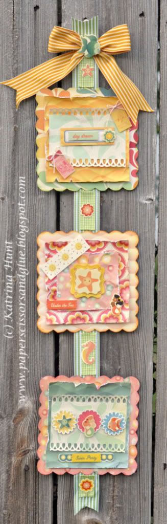
"Swim Party Banner" by Katrina Hunt
Supplies - Patterned Paper: Comso Cricket (Salt Air); Chipboard: Cosmo Cricket Blackboard; Stickers: Cosmo Cricket (Salt Air); Ink: Jenni Bowlin (Chewing Gum, Stick Candy, Chicken Feed); Adhesive: Scotch ATG, Fabri-Tac, Scrapbook Adhesives by 3L; Twine: The Twinery Baker’s Twine; Ribbon: May Arts
As soon as I saw the card sketch, I knew I wanted to make a banner. The three squares on the card just reminded me of a banner with squares and a ribbon going all the way down.
• Variation 1 - Banner instead of a card
• Variation 2 - Squares are more embellished than the squares on the card sketch.
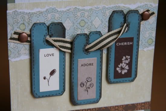
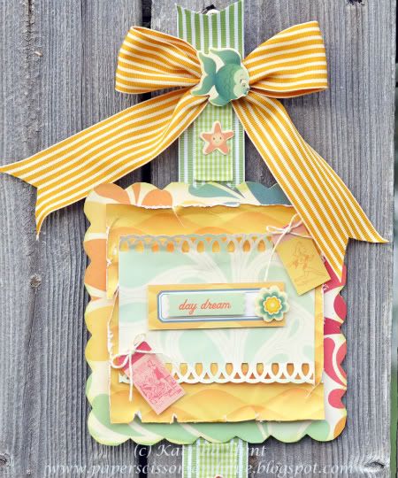
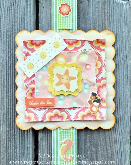
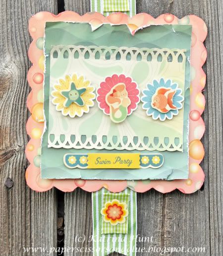
Here's a closer look at the details:
••••••••••••••••••••••••
4 comments:
wow ladies, so many takes on this sketch. They look wonderful and fun.
love them....
I spy some left over papers from one of the recent Scrapbook Generation kits in the swim party banner. I've seen some beautiful cards/projects this week with this sketch.
More great cards today! love the Be Mine.
Post a Comment