••••••••••••••••••••••
Two-page Sketch #25
You can download and print this sketch by clicking on the two-page sketches link found under the "printable sketches" tab on the right sidebar.
"Made With Love" by Penny Grimsley
Supplies - Cardstock: Bazzill; Patterned paper: Pebbles (With Love); Alphabets: Silhouette Die Cutting Machine; Embellishments: Jillibean Soup, Tim Holtz, Making Memories; Punch: Martha Stewart; Ink: Jenni Bowlin; Embroidery Thread: DMC; Twine: The Twinery; Fonts: Pacifico, Pharmacy; Date Stamp: EK Success; Stamp: Ali Edwards
Variation #1 - I changed the photo blocks by swapping them from one page to the other. I needed my photos to be in order of the story I wanted to tell.
Variation #2 - I added a cardstock mat under the photos.
Variation #3 - I punched the borders of the patterned paper and then stitched along the edges for emphasis.
Variation #4 - I added a journaling card in place of the two 2x2 photos.
Variation #5 - I moved the title to the right page to work my heart into it.
Variation #6 - I substituted a stamped journaling bracket on the left page for the journaling strips.
Variation #7 - I added a ticket and paper clip with twine on it to capture the photo date.
• • • • • • • • • • • • • • • • • • • • • • • • • • • • • •
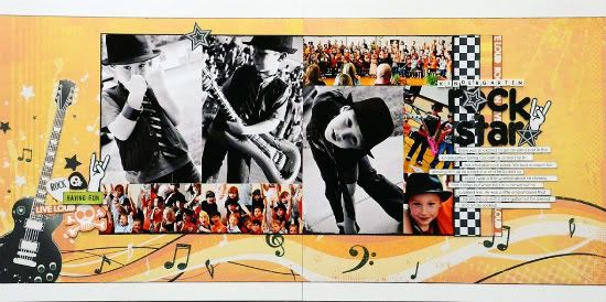
"Kindergarten Rock Star" by Allison Davis
Supplies - Cardstock: Bazzill; Patterned paper: Best Creation Inc; Alphabet stickers: Kaiser Craft; Chipboard alphabet: American Crafts; Paint: Ranger
Variation #1 - I flipped the sketch. The guitar/music notes paper was so perfect for these pictures that I couldn't resist using them and for those papers to work the guitar had to be on the left page.
Variation #2 - Instead of using three papers for the background, I used one large piece and stretched it all the way to the edges of the white cardstock. In order for the guitar/music notes paper to work I had to stretch it to the ends.
Variation #3 - I used the large guitar in place of the flowers.
I also added a few more details to the right of the guitar.
Variation #4 - I used lots of different photo sizes than what the sketch suggests. I had three 4 x 6" photos that I wanted to include on the layout. I started with those three and then built the rest of the photo block around them.
On the left page I used four 2 x 2" photos. On the right I used one 6 x 2" photo, one 2 x 3-1/2" photo and one 2 x 2-1/2" photo.
Variation #5 - I framed the whole photo block by adding paint to the outer edge of the photo block as a whole.
Variation #6 - I moved the photo block up so that more of the music note design would show.
Variation #7 - I cut the 12" strips by the title, down to the same height as the photo block. I wanted to leave most of the music notes design on the background paper showing.
Variation #8 - I moved the title and journaling strips down to work with my photos.
• • • • • • • • • • • • • • • • • • • • • • • • • • • • • •
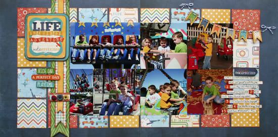
"Life is Full of Adventure" by Shari Thurman
Supplies - Patterned paper, Alpha and Element Stickers: Echo Park (A boy's Life); Adhesive: ATG by Scotch, EK Success (3D dots), Beacon 3 in 1 Advanced craft glue and Zots; Ink: Colorbox Chalk Ink (Chestnut Roan); Baker's twine: The twinery; Thread: DMC; Tools: We R Memory Keepers Paper Piercer and Piercing Mat; Buttons: unknown
Variation #1: I love this paper collection and I couldn't decide on just three patterns of paper for the background, so I decided to do a patchwork quilt-type background using the A and B sides of four different papers. The squares measure 2 1/2" each.
Variation #2: I've mentioned before that I love banners and pennants so much that I will put one on just about anything. Instead of using the three strips of paper down the left side as shown on the sketch, I layered three pennants in various lengths and widths.
I notched the ends of each and threaded them through a paper band embellished with buttons. I used 3D dots on the ends of each pennant for added interest.
Variation #3: I replaced the journaling strips on the left with three phrase stickers and omitted the butterflies.
Variation #4: I kept the title in the same location, but I placed it on a journal spot and double matted it on paper using 3D dots between each layer.
Variation #5: I replaced the flower embellishment on the right with my journal strips.
Variation #6: I changed the size of my photos on the right to 4 x 4" to work with the photos I wanted to use.
Variation #7: I added a banner to the top right corner of the layout.
•••••••••••••••••••••••••

.jpg)


3 comments:
These all look amazing, love love the themes and the colors. Great job on this sketch, I can tell everyone is having fun with it.
Allison, I remember those photos and love what you did with them. Great colors against the b/w photos.
Wow!! These are all fabulous!! I love what each one of you did with the sketch!!
I can't wait to use this sketch! Love all the wonderful layouts I've seen!
Post a Comment