••••••••••••••
One-page Sketch #19
You can download and print this sketch by clicking on the one-page sketches link found under the "printable sketches" tab on the right sidebar.
"I'm a Big Kid Now" by Jill Sarginson
Supplies Used - Patterned Paper: Bella Blvd; Cardstock: Bazzill Basics; Alpha: Basic Grey; Embellishments/stickers: Bella Blvd; Ink: Creative Memories Pen; Other: DMC floss, pop dots
Variations:
• I changed the size of the photo (to approx 4.5 x 4).
• I used 7 strips of pattern paper vs. 8 as the sketch has.
• I moved my title to above the vertical paper strips.
• • • • • • • • • • • • • • • • • • • • • • • • • • • • • •
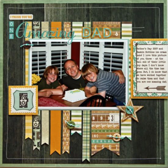
"One Amazing Dad" by Penny Grimsley
Supplies - Cardstock: Bazzill; Patterned paper: Echo Park, My Minds Eye; Alphabets: Echo Park, Silhouette Die Cutting Machine; Embellishments: Echo Park, Tim Holtz; Twine: The Twinery; Font: Another Typewriter
I didn't change up this sketch very much because it worked perfectly for a favorite photo of mine that I have had propped on my desk for a few years now.
Variation #1 - I used a 5x7 photo.
Variation #2 - I added a patterned paper mat to the page.
Variation #3 - I added a cardstock mat to the photo and journal box.
Variation #4 - I used a journal box for the journaling.
Variation #5 - I added stitching around the edge of the patterned paper background.
Variation #6 - I moved the embellishment under the title down to the bottom of the photo.
• • • • • • • • • • • • • • • • • • • • • • • • • • • • • •
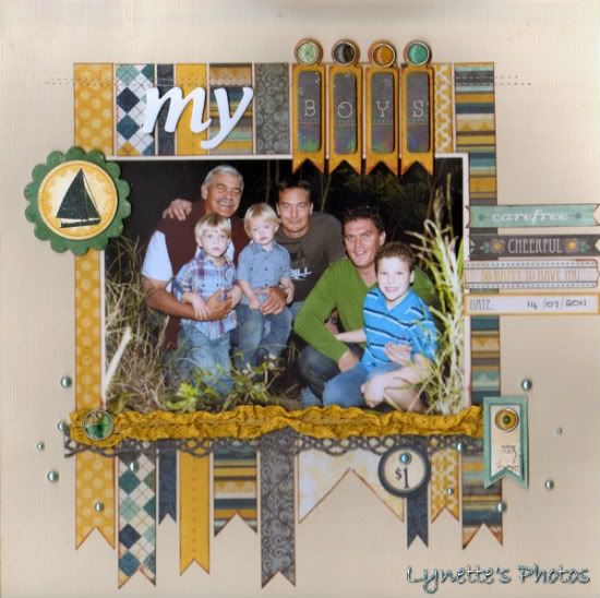
"My Boys" by Lynette Jacobs
Supply List - Cardstock: Bazzill; Printed Paper: My Minds Eye (Stella and Rose Hattie); Stickers including "Boys" title: My Minds Eye (Stella and Rose Hattie); Brads and Trim: My Minds Eye (Stella and Rose Hattie); Pearls: Melissa Francis; Punch: Martha Stewart
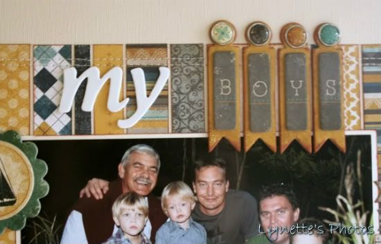
Variation #1: I used a 5x7 photo and therefore added a few additional strips. I also liked the idea of using flags as part of my title with the word "Boy".
Variation #2: I matted my photo on cardstock.
Variation #3: I used pearls and brads instead of buttons and scallops.
Variation #4: Instead of journaling on the left side of the photo I added some banner stickers.
Variation #5: I punched a border and then added trim to put below the photo.
••••••••••••••••••

.jpg)


3 comments:
Beautiful! I don't do one picture layouts very often but always struggle with adding and placing embellishments that will enhance the photo. These layouts really give me some good ideas:)
Jill, I love the cute, whimsical look of your page! Penny, that wood-grain background, really makes the paper strips from the Charming collection pop!! And Lynette, I love the little flags with your title and the scattered pearls at the bottom of your page!
These are all wonderful and awesome. Each one is special and I love each take you had on this sketch.
Seriously loving this week and how amazing the DT is doing. It's only Wednesday so I'm excited to see what will be shared the next two days.
Post a Comment