•••••••••••••••••••••••••••••••
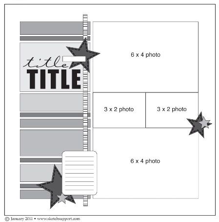
Today's layouts show some great options for other photo placements and sizes. I think photos are one of the easiest areas on a sketch to alter to fit what you have or what you want to use. I also think the more comfortable you become with using sketches, the easier it is to not focus so much on making your photos fit the sketch, but instead making the sketch fit your photos. One-page Sketch #2
You can download and print this sketch by clicking on the one-page sketches link found under the "printable sketches" tab on the right sidebar.
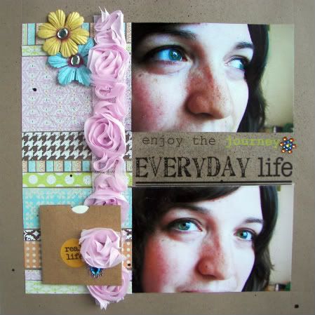
"Everyday Life" by Melissa Elsner
Supplies - Cardstock: Recollections; Patterned paper, rub-ons: Lily Bee Design; Ribbon: American Crafts; Flowers: Prima Marketing; Bling: Studio116 and Prima Marketing; Kraft envelope & journal tag: Melissa Frances; Walnut Ink: Tsukineko
I stuck true to the measurements on this layout. That's one of the things I love about these sketches is that the measurements are included. Sometimes I don't have the best eye when trying to decide how long or wide to cut something.
Instead of doing the two smaller 3x2 photos, I used some rub-ons from Lily Bee and a sticker from SRM. I like the gab it shows between my two photos. This layout is also a great way to use up your scraps!
• • • • • • • • • • • • • • • • • • • • • • • • • • • • • • • • • • • • • • • • • • • • •
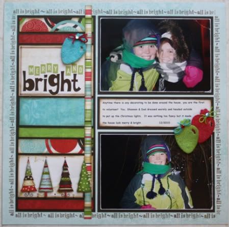
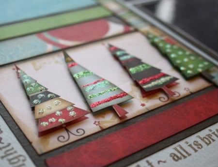
"Merry and Bright" by Carolyn Wolff
Supply List - Cardstock: Bazzill; Patterned paper: Bo Bunny; Ink: Tim Holtz Distress Ink, Ranger;
Stamps: Close To My Heart; Stickers: Jillibean Soup and Cosmo Cricket; Floss: We R Memory Keepers; Markers: Copic and American Crafts; Tools: Sizzix; Felt, bling: unknown
This was such a great sketch for using up scraps of paper. I went straight to my scrap bin and I really wanted to use some paper I had from Bo Bunny, but I was very limited on what was left. I was able to create this single page and I still have paper left.
Variation #1 – I decided to use a brown piece of cardstock behind the strips of pattern paper. It defined the border area and popped it off the page.
Variation #2 –I moved my journal area between the 2 photos instead of in the lower left corner as shown. I didn’t have 2 photos that I could use and because of the trees in the pattern paper, I didn’t want to cover them up.
Variation #3 – I matted my photos and journal area with brown cardstock to match the cardstock behind the patterned strips. Once I adhered all these elements to my page, I used a word/phrase stamp and created a border around everything.
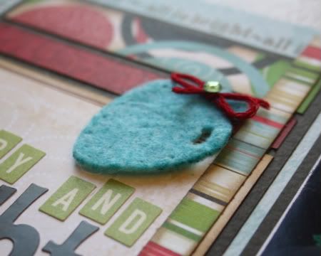
Variation #4 – For my embellishments, I used white felt and cut the light bulbs using a Sizzix die-cut. I used my Copic markers to colour the felt and make them match my papers.
I tied some coordinating floss around the tops and added a little bit of bling to add some sparkle.
Variation #5 – I cut out some extra trees from the pattern paper, popped them up and stuck them over top of the trees on the piece of paper in my border. I added some Stickles to decorate the trees.
• • • • • • • • • • • • • • • • • • • • • • • • • • • • • • • • • • • • • • • • • • • • •
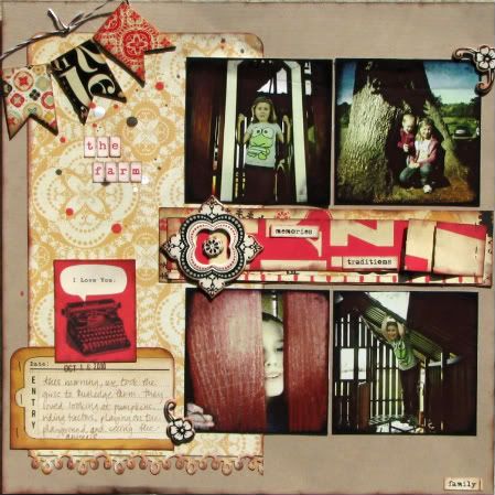
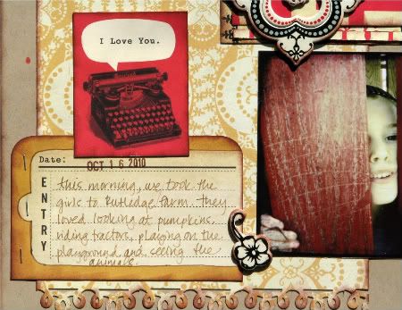
"The Farm" by Christy Arthur
Supplies - Cardstock: Bazzill Basics; Patterned paper and chipboard: Cosmo Cricket Circa 1934; Stickers: October Afternoon and The Girls Paperie; Pen: American Crafts; Mists: Studio Calico Mr. Huey; Twine: Jillibean Soup; Punch: Martha Stewart; Ink: Colorbox; Adhesive: Glue Arts Glue Glider Pro; Corner rounder: Creative Memories; Tools: Tim Holtz Tiny Attacher
I love the way these little square pictures print (about 3-1/2 inches square, taken on my iphone with the hipstamatic app and then printed as a normal 4x6) and have been using this format a lot lately. So, I used four square photos instead of the two 4x6 photos in the sketch.
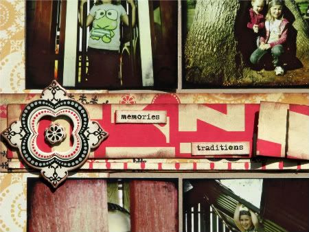
I also added some paper embellishments in the center where the two 3x2 photos are in the sketch.
I layered and pleated one piece of patterned paper on top of another and then added another tiny strip of patterned paper below the pleated paper. Then I added some details on top to further communicate the story of the day (traditions and memories).
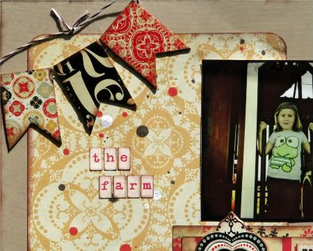
On the right side, I flipped the embellishments to the other side of the title on the top and bottom to incorporate a banner and a larger journaling square.
I did not include the striped vertical strip of paper that is in the sketch. There was not a lot of space to add it once the square photos were placed. I also added a little word to the bottom left of the page that was an addition to the sketch.
• • • • • • • • • • • • • • • • • • • • • • • • • • • • • • • • • • • • • • • • • • • • •
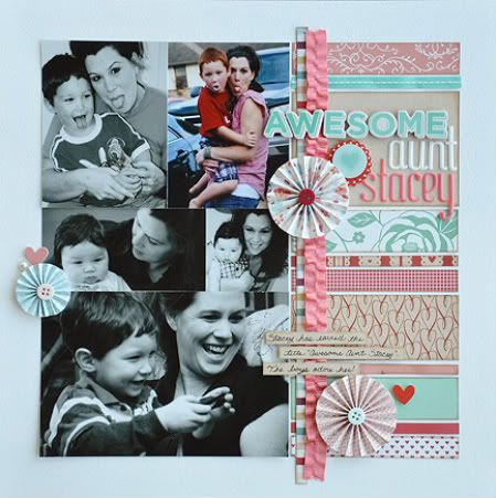
"Awesome Aunt Stacey" by Allison Davis
Supply list - Cardstock: Bazzill; Patterned paper: American Crafts; Alphabets: American Crafts; Paper flowers: American Crafts; Chipboard: American Crafts; Ribbon: American Crafts
Variation #1 - It might be a little OCD but I try, when I can, to keep the subjects in the pictures from looking off the page. An easy fix for this problem is to flip the sketch from left to right. In the bottom 4 x 6 photo my sister and my son where both looking to the right. If I would have kept the sketch as it is, with the strips on the left, they would have been facing off the page (and I'm admitting, it would have driven me insane!)
Variation #2 - When I saw the package of ribbon from American Crafts I knew that in some way I had to incorporate the pink, ruffled ribbon on my layout. With two boys it's not often that I get to use pink so when I get the opportunity I use it everywhere I can! I added the ruffled ribbon slightly overlapped onto the striped strip.
Variation #3 - I didn't quite have the right pictures for this sketch and I had more than four, as the sketch suggests. I kept one 4 x 6 the same but on the other split it into two 3 x 4 photos. Together they make up the same 4 x 6 as on the sketch so no adjustments were needed.
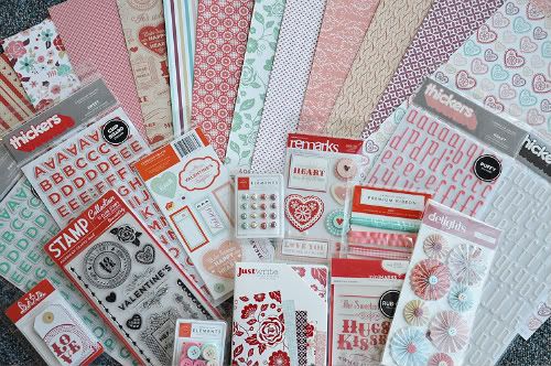
Sponsor Giveaway - American Crafts
We're talkin' papers, chipboard, stickers, rubons, buttons, brads, tags, four sets of Thickers, stamps, ribbon, and note cards with envelopes. That, my friends, is a whole lot of awesome!
To be eligible all you've got to do is leave a comment, we'll randomly pick a winner, and on Thursday will announce who the lucky one is.
•••••••••••••••••••••••••••••••••••••••

211 comments:
«Oldest ‹Older 201 – 211 of 211I'm loving you're blog... thank you! --Christy
I love love love that prize pack! This new site absolutely rocks, Allison!
I just started scrapbooking with my mom. I recently completed my 1st album. sketchsupport has great ideas. I love seeing the new ways to use the same add on but in. Totally different ways.
I love this layout. I saw it in the store and it is too cute! You must be an awesome aunt.
Loving this site, loving the sketch and loving all the AC goodness in the giveaway!
what an awesome sketch and take by the DT! Great giveaway too! Thanks for the inspiration!
I'm loving these sketches and layouts!!! So fun to see everyones take on the same sketch!
So pretty. I <3 them. Thanks for the giveaway
Oh my....just found your site! It's awesome& great inspiration!
Im soooo loving this site! Thank you!
This is my first visit to this blog and I must say I'm impressed! The sketch is great and all the variations of it are wonderful! What a great inspiration!!
Post a Comment