Are you ready for a little challenge? Sketch Support and Jillibean Soup have come together to present a product challenge for our creative team and for you too.
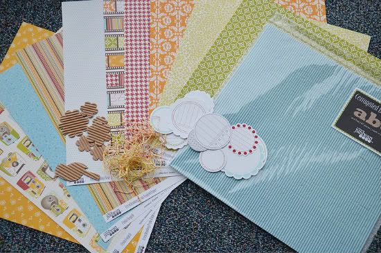
Jillibean Soup has provided a kit of the same materials for each of our creative team members. The products we are using in our challenge (pictured below) are:
• Five sheets of patterned paper from the Pasta Fagioli collection.
• One sheet of Brown Pea Pod kraft patterned paper
• Blue Corrugated Alphabets
• Corrugated shapes
• Journaling Sprouts in red, green, blue, and brown
• Bean Stalks twine in orange and yellow
Together with the February sketches we are going to show you how using the same products and even the same sketches can produce so many different results. Each week on Friday, (except for the add-on week), we will post our product challenge projects based on the sketch for that week.
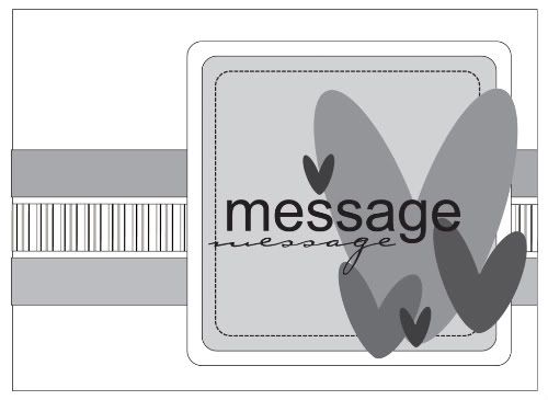
Today all of the projects for the product challenge are based on the card sketch we've been using this week. There is a lot to share so sit back, get comfortable, and enjoy!
Supply list - Kraft Cardstock: Jillibean Soup; Patterned Paper: Jillibean Soup - Pasta Fagioli; Alpha's: Jillibean Soup - Pasta Fagioli; Twine: Jillibean Soup; Embellishments: Jillibean Soup; Ink: Versamark
Variation #1: I used three horizontal pieces of pattern paper but I opted to layer the middle one over the bottom layer. To finish it off, I also tied the twine around the entire card.
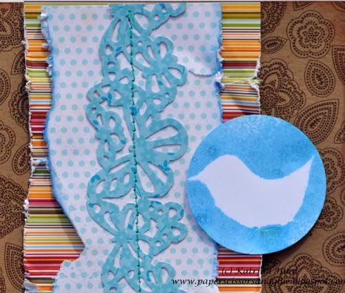
Variation #2: Instead of using a square embellishment, I opted to go circular. I used a Journaling Sprout from Jillibean Soup and then layered a corrugated flower and another Journaling Sprout on top.
• • • • • • • • • • • • • • • • • • • • • • • • • • • • • • • • • • • • • • • • • • • • •
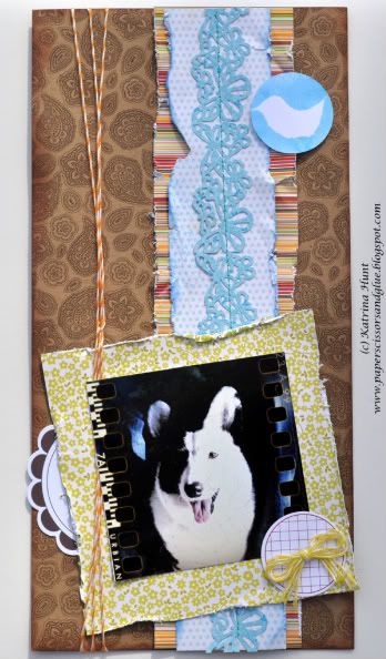
6 x 12 layout by Katrina Hunt
I was excited about the project challenge between Jillibean and Sketch Support. I love Jillibean, but haven’t worked much with her products. They are always sold out when I try to get them! And this collection, Pasta Fagioli, I have loved since the moment it came out. I had it in my head I was going to use those camera, but when I started creating, my projects took a whole different direction!
Speaking of a whole different direction, have you ever made a 6 x 12 layout? You could call it the “black sheep” of the scraping sized layouts, but so fun! This size can be a challenge if you are like me and like “stuff” on your pages! You have minimal amount of room to add things! But when I saw the card sketch, I knew that I wanted to do just that. And please, if you decide to try it, link it up here or contact me through my blog I would love to see it!
Hugs, Katrina www.paperscissorsandglue.blogspot.com
And don’t forget to pull those pictures off your camera phones! That is where this picture I used came from. Some of the apps have such fun features and take some fun pictures that you might not otherwise have taken in the moment!
Variations:
• The obvious, flipped the sketch. It would have worked either way with the layout, but I wanted to flip it!
• Obvious #2, no sentiment, no title. I don’t feel like I have to title every page, especially if I am just creating to create. I love the look of this without the title. And truthfully, I scrap pictures more than once. Chances are this is one of those that is going to get scrapped again, and you may see it on here!
• Added the twine around the page on the side. This is not on the sketch. I am a ribbon, twine, etc. girl, so I always tend to add it to sketches.
• I added the Jillibean Sprout in a random spot, the blue bird at the top.
I took a sprout, turned it over, and using a corrugated bird shape that was in my package as a mask, misted to create a negative shape.
• I don’t “measure” exactly by the sketch, no one is going to put you in time out if you don’t either! I also offset my center strip compared to the sketch, it’s what I felt like at the time!
• • • • • • • • • • • • • • • • • • • • • • • • • • • • • • • • • • • • • • • • • • • • •
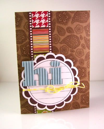
"U" card by Carolyn Wolff
Supply List - Cardstock: Bazzill; Ink: Ranger Distress Ink, Vintage Photo; All other supplies: Jillibean Soup
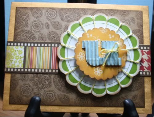
Variation #1 – To the card base, I added a layer of pattern paper. I chose the paisley print. The pattern measures 3 ¾ x 5 inches.
Variation #2 – I replaced the 3 strips of paper in the middle of the card with one strip of the pattern that resembles a film strip. The different patterns gave my card a nice splash of colour.
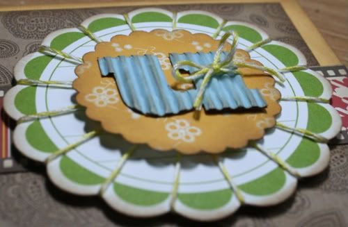
Variation #3 – For the main ‘message’ part of the card, I used one of the large journaling sprouts and wrapped some of the yellow bakers twine around each scallop to create some texture.
I punched out a scalloped circle from the orange floral pattern and layered it on top of the large sprout. I tied some of the yellow twine to the letter ‘u’ and attached it to the center of the orange scallop.
The reason that I chose to use the letter ‘u’ is for flexibility. When I use the card, the letter will give me many options, ’u’ rock! ‘u’ make me smile! ‘u’ are too cute! See what I mean.
This card sketch is so versatile. I love the clean and simple design. Thank you to Allison and Jillibean for a great product challenge.
"Happy Day" card by Allison Davis
Supply list - Cardstock: Bazzill; Pen: American Crafts; Embroidery floss: DMC; All other supplies: Jillibean Soup
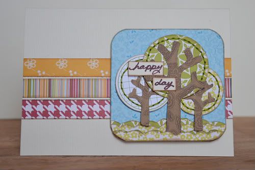
Variation #1 - Instead of using the hearts on the sketch I made trees with circles punched from the Jillibean patterned paper and a Journaling Sprout as my tree tops.
Because it's is almost impossible for me to not stitch on things, I added hand stitching around the circles. I think hand stitching is such an easy way to enhance a simple shape.
I was relying on the blue square to look like blue sky behind the trees and to help paint that picture I added small scallops at the bottom for grass.
• • • • • • • • • • • • • • • • • • • • • • • • • • • • • • • • • • • • • • • • • • • • •
Supplies - All pattern paper: Jillibean Soup; Cardstock: Stampin UP!; Die: Stampin Up!
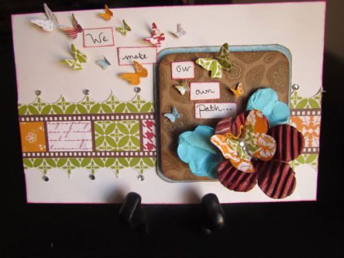
Variation #1: For the product challenge using the card sketch, I changed several dimensions because I didn't make it as a card, more of a piece of art to frame. Although I am notorious for making actual cards you can't mail. I have trouble making things flat. I needed a little more room across the card to use the butterflies the way I wanted so the first variation I made was to the overall card size. It ended up being 5 x 8 . For the squares, I used the largest square dimensions for the smaller square and made the large square 1/4" larger. I used pop dots on the smallest square.
Variation #2: I also changed the measurements for the stripe and border around it. Because it was close to the same size, I cut a strip out of the filmstrip patterned paper to use as the stripe and then cut out along the green pattern to use as the border.
Variation #3: I changed the embellishment placement and added extra butterflies floating away from it as well as my message. For the flower, I first sprayed the corrugated shape with Red Velvet Glimmer Mist and then cut out 1 petal. I then pulled the next 2 petals together with adhesive to form the shaped base. Next I turned over a scalloped journaling spot and misted it with Jazz Blue and crumpled it
up. Then I cut it in 1/2 and folded each piece together to form "leaves". The butterflies are all diecut/embossed.
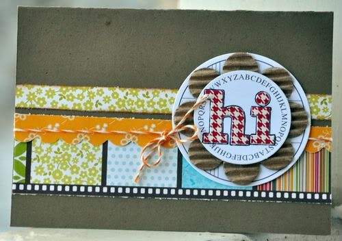
"Hi" card by Melissa Elsner
Supplies - Patterned Paper, Journal Spot, Alphabet, Twine: Jillibean Soup
Variation #1: I chose to flip the sketch this time and take a different approach.
Variation #2: The journal sprouts from Jillibean Soup are perfect for so much more than just journaling. I used the larger sprout in place of the square on the card and popped it up.
Variation #3: There is a lot of pattern going on with the kraft base and strip so I chose to leave it as simple as possible for the top with the sentiment. Thankfully, Jillibean's corrugated alphabets are awesome enough to stand on their own.
• • • • • • • • • • • • • • • • • • • • • • • • • • • • • • • • • • • • • • • • • • • • •
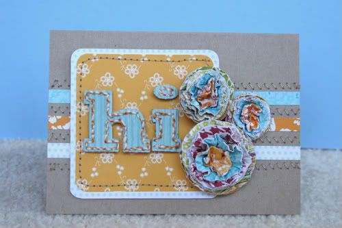
"Hi" card by Shari Thurman
Supplies - Pattern paper, Corrugated Alphabet and Bakers Twine: Jillibean Soup; Circle Punches: Stampin' Up and EK Success; Tools: We R Memory Keepers Corner Chomper and brad setter/paper piercer
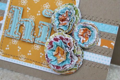
When I first saw the product for this challenge, it made me feel bright and happy like flowers do, so I knew I wanted to make paper flowers for my card. I attached three 1/4 inch strips to the card and zig-zag stitched between the strips. I attached my squares to the left side of the card to allow space for my flowers. I hand-stitched with Bakers Twine around the corrugated letters and attached to the card.
Flower tutorial: To make these flowers, punch 8 circles out of different patterned papers. Mist them with water and crinkle. Then open them up enough to stack them. Use a paper piercer to poke a hole in the center and attach a brad. Fold all the circles to the middle and let dry a bit. Then fluff. I used 3 different sized circle punches for my flowers. Instead of circle punches, you can use your Cricut or any other die cutting system to cut your circles. You can also use scalloped circles or flowers for very pretty results.
• • • • • • • • • • • • • • • • • • • • • • • • • • • • • • • • • • • • • • • • • • • • •
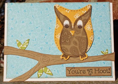
“You’re A Hoot!” by Christina Hoffman
Supply list – Cardstock: Bazzill; Patterned paper: Jillibean; Font: unknown; Ink: Colorbox Fluid Chalk Ink (Chestnut Roan); Journaling Pen: Unknown
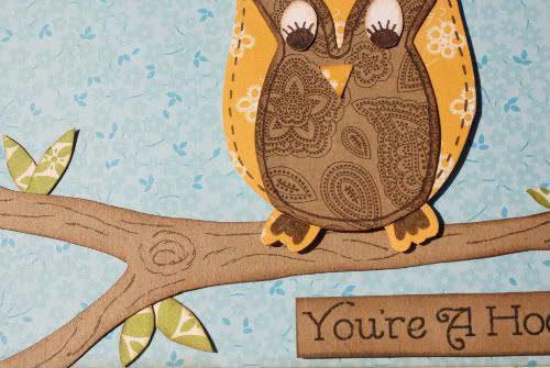
Variation #1 – Instead of using three strips I made a tree limb with two branches in place of the strips and moved them closer to the bottom of the card. The tree limb/branches were free handed.
Variation #2 – I also replaced the squares and hearts with an owl and leaves. I traced the owl then free handed the center part of the owl, the eyes and the leaves.
"Cheese!" by Allison Davis
Supply list - Cardstock: Bazzill; Embroidery floss: DMC; All other products: Jillibean Soup
I thought the design of this card sketch would also be a fun design for a layout.
I'm so glad I stumbled across these pictures when I was cleaning out the console in my car last week. I had completely forgotten about our silly photo booth pictures and what perfect timing to find them during our product challenge since the Jillibean Soup papers were a great fit with the theme.
Converting a card sketch to a layout is pretty easy. The only downfall is that you obviously have to throw out the measurements. This is one of those times that you really have to use the whole sketch as a suggestion. You can do your own thing to mimic the design and just let the sketch be more inspiration than a guide.
Variation #1 - Since I was working with a much larger space and because the pictures where so small, I added more strips than the three on the sketch. I also used different sizes of strips instead of three of the same size.
Variation #2 - Another thing I changed due to the larger space I was working with was the largest square. I ended up using a longer piece to help occupy all the empty space and to help the photos stand out. Against the strips the photos were getting a little lost in all the colors.
Variation #3 - I used Journaling Sprouts and cameras cut from patterned paper as my embellishments and arranged them to kind of frame the pictures.
• • • • • • • • • • • • • • • • • • • • • • • • • • • • • • • • • • • • • • • • • • • • •
Now it's your turn!
• Create a project with Jillibean Soup products (any collection or product) based on Card Sketch #3.
After you have created your project: in the comments post a link to your project (it can be in an online gallery or on your blog).
This week we are giving away a copy of our newest card sketch book, Sketches for Cardmaking, Volume 2 to the winner of the challenge. You have until Friday, February 11 and we will post the winner on Sunday, February 13.
We look forward to seeing your creations!
••••••••••••••••••••••••••••••••••••


27 comments:
Oh I love Jillibean, they have such beautiful colors and the corrugated stuff is my favorite!
Everything looks good when you use JB products. I don't have any though but love all their stuff. This was so much fun to see everyone's take on the sketch and the supplies. Great job to all of you, amazing and talented ladies. Thanks for making a fun challenge for us too, will be fun to see what everyone does. Have a good weekend.
How fun! I cannot believe that everything came out SO different and unique! That is simply stunning! No Jillibean products for me yet but maybe next week!
These cards are gorgeous! I love the Jillibean goodies you used!
LOVE this post! Great work everyone! Allison, LOVE the way you did the title on the cheese layout ... love the 6x12 layout too ... great work!
These are amazing!! Great job ladies!
Love Jillibean. Fabulous interpretations of the sketch and they look so great with Jillibean.
Oh.My.Gosh!!!!! FABULOUS, I mean INCREDIBLE, OUTSTANDING, OFF THE CHARTS layouts and cards!
Love Jillibean Soup and loved seeing all your creations.
I love their corrugated letters!
Here's my card using the sketch and Jillibean Soup papers - love, love, love their products!
http://brendasscrappyblog.blogspot.com/2011/02/over-at-sketch-support-they-posted.html
Fantastic Challenge! Thank you for the inspiration! Here's mine:
We'll Be Ok
Is there a misprint here. You are giving away your newest sketch Book Vol 2 ? do you vol 7 ?
or do you mean Cards Vol 2 ?
I have sketches Vol 2 that why I asking?
It our newest card sketch book, volume 2. :)
Here's mine.card sketch # 3 with all Jillibean except for stamp:
http://www.twoscrapbookfriends.com/photopost/showphoto.php?photo=4446&limit=recent
Allison Davis said...
It our newest card sketch book, volume 2. :)
February 6, 2011 10:04 PM
thanks, I'm senior takes me a while to read it correctly(that's my excuse anyway)
it's a great prize.I have Vol 1 and love it.
http://www.twoscrapbookfriends.com/photopost/showfull.php?photo=4446
entry by maryann novakowski
Here's the card I made:
http://www.flickr.com/photos/guileandgrace/5432331329/
Thanks for all the great inspiration!
So excited that you are having a contest like this. Thanks for the chance to win. Here's my project using Jillibean papers.
http://thissnthat.blogspot.com/2011/02/sketch-support-and-jillibean-soup.html
I’m fairly new to the world of online scrapping blogs & fourms but this new website with all it’s great sketches and designs has inspired me so much I thought I’d give it a try. Here’s the card I made, thanks!
http://www.twopeasinabucket.com/gallery/member/498124-kalh1221/1705136-monster-birthday/?c=t
http://www.twoscrapbookfriends.com/photopost/showphoto.php?photo=4457&cat=500
Here is my take on the sketch:
http://outofmybook.blogspot.com/2011/02/sketch-support-card-challenge.html
TFL!
This was so much fun! I love sketches for layouts and I'm learning to use them for cards now too. :)
Here's my card:
http://inreallifefaith.blogspot.com/2011/02/oh-whats-one-more.html
I am not much of a card maker, but I love Jillibean and sketches! I loved the way Carolyn Wolff wrapped her sprout, I couldn't wait to copy it!
http://www.twopeasinabucket.com/gallery/member/428618-af-wife/1706769-jillibean-soup-card/?c=t
Post a Comment