Flipping the sketch is always a no fail solution to getting multiple uses out of one sketch. And you've got several ways to flip it: upside down, sideways, rotate it. Just think of how many times you could use one sketch with each layout looking completely different!
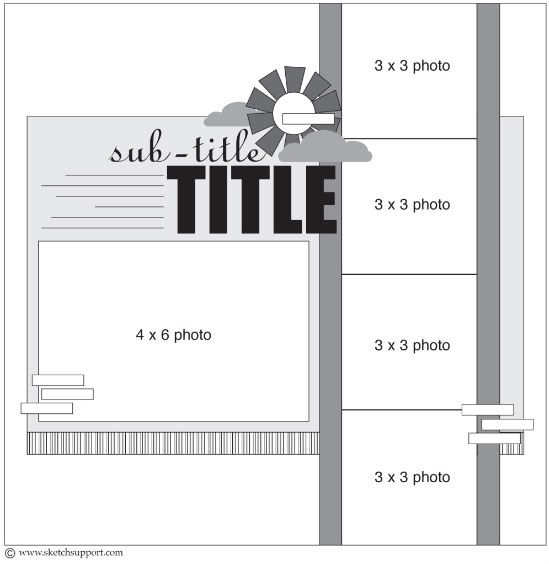
One-page Sketch #4
You can download and print this sketch by clicking on the one-page sketches link found under the "printable sketches" tab on the right sidebar.
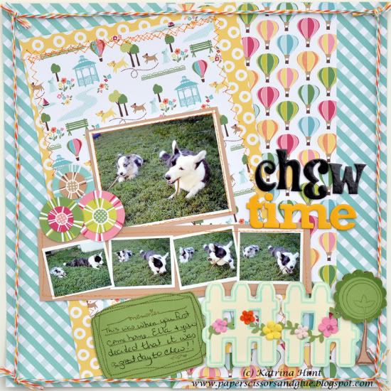
"Chew Time" by Katrina Hunt
Supplies - Cardstock: American Crafts; Pattern Paper: American Crafts (City Park collection); Letters: American Crafts; Stamps: Unity Stamp Company; Twine: The Twinery Bakers Twine; Die Cutting: Making Memories Slice; Adhesive: Scotch ATG, Fabri Tac, and Scotch Adhesives; Ink: Memento Ink
I love this sketch. I had thought about using the same picture over and over on the strip, but found these pictures when I was going through folders and decided to use them.
• Variation 1 - I flipped the sketch on its side, I just liked the feel whenever I tried it.
• Variation 2 - I flipped my larger picture, it was the way it would work with the sketch
• Variation 3 - I angled my backgrounds to the left side slightly. Doing this can give your page a different feel.
• Variation 4 - I added the fence and the tree, just to give the page a fun, whimsy kind of feel.
• • • • • • • • • • • • • • • • • • • • • • • • • • • • • • • • • • • • • • • • • • • • •
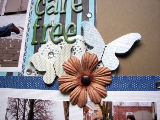
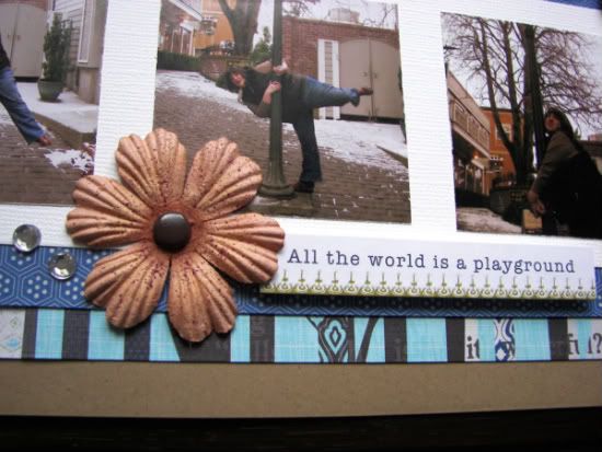
"Carefree" by Melissa Elsner
Supplies - Paper, stickers, journal spot, doilies: Little Yellow Bicycle; Cardstock: Recollections; Alphabet, brads: American Crafts; Flowers: Prima Marketing; Bling: Teresa Collins
Here is a closer look at some of the details:
• • • • • • • • • • • • • • • • • • • • • • • • • • • • • • • • • • • • • • • • • • • • •
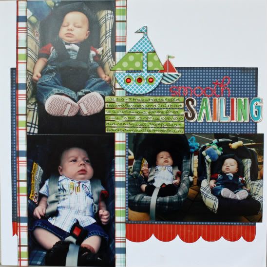
Supplies - Cardstock: Bazzill; Patterned paper: Echo Park; Alphabet: Echo Park and Doodlebug Design; Jewels: Unknown: Tools: Cricut (Sailboat)
Variation #1 - I flipped the sketch.
Variation #2 - I used 4 x 6 photos in place of the 3 x 3 photos.
Variation #3 - I used a scallop strip instead of the striped strip below the background paper.
Variation #4 - I didn't like the title under the sailboats so I had to switch the placement of the title and my journaling.
• • • • • • • • • • • • • • • • • • • • • • • • • • • • • • • • • • • • • • • • • • • • •
•••••••••••••••••••••••••••••••••••
We've got a giveaway going on our Facebook fan page today! You can check it out by clicking here.



4 comments:
Love all the takes, each one is so unique and true to the designer! Great job ladies!
I like the flips to the sketch. great job everyone.
I actually flipped this sketch for a layout yesterday, and created a second page to mirror it. Posted it on my blog this morning. Thanks so much for the inspiration.
Don't get as much of a wow factor when the sketch is flipped. Love the first page though from today!
Post a Comment