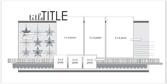
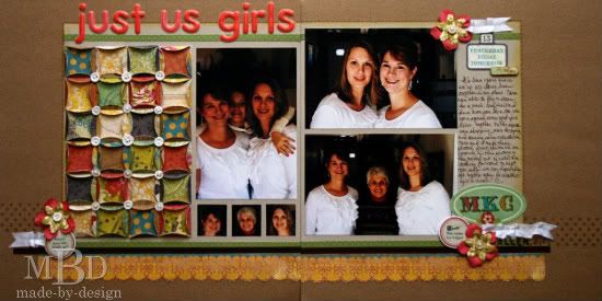
We are wrapping up two-page week with a layout from our March Guest Designer, Megan Bickers. Megan's layout is a great interpretation of the sketch and the amount of detail is amazing!
Two-page Sketch #10
You can download and print this sketch by clicking on the two-page sketches link found under the "printable sketches" tab on the right sidebar.
“Just Us Girls” by Megan Bickers
Supplies Used - Cardstock: Close To My Heart (white), DMD Inc. (kraft), Bazzill (dark brown and green embossed Dotted Swiss), and unknown (gray); Patterned Papers: Crate Paper Restoration (Chaplin, Garbo, Bette, Elements, and 6x6 pad); Stamps: Technique Tuesday Alphabet (Underground Caps), Studio G (Monogram letters), Paper Trey Ink (Polka Dots), and Fontwerks (Ruler Border Stamp); Inks: Ranger Distress Inkpads (Walnut Stain, Peeled Paint), Tsukineko (Versamark Inkpad); Markers: EK Success Zig Markers (Brown, Pink, Blue, Yellow); Punches: EK Success (1 ¾ circle, 1 ¼ square); Embellishments: American Crafts (Chit Chat Grapefruit Puffy Letter Alphabet Stickers) Making Memories (Paper Flowers), and Crate Paper Restoration (Stickers and Die Cuts); Buttons: Craft stash; Ribbon: Martha Stewart (white); Other: White crochet thread and Martha Stewart Scoring Board
Photos:
• I used 5 photos total,
• I used one 4x6 vertical photo and two 4x6 horizontal photos
• For the smaller photos, I punched each of our faces from an extra photo (1 ¼” squares)
• Instead of overlapping these smaller photos, I lined them up under the vertical photo.
Title:
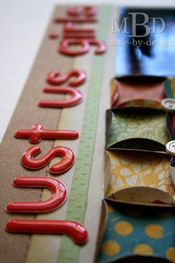
• I loved how these puffy pink thickers matched the papers so well and are a reminder of my sticker-collection days with my sister growing up. We loved the puffy stickers the most!
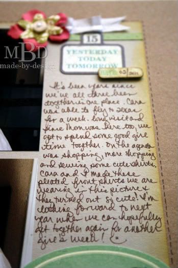
• Journaling was written on the extra space provided on the grey cardstock.
• I also stamped the words “Allen girls” in the bottom right corner.
Papers:
• Instead of using a stripe paper as shown in the sketch, I stamped a ruler pattern on the dark brown cardstock to create my own striped paper with a tone-on-tone look.
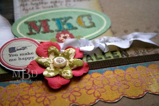
• I added a scallop border along the bottom of the layout that was fussy-cut from a pattern paper.
• I added ribbon in addition to the paper borders along the bottom. I used white ribbon that I ruffled with a sewing machine to mimic the ruffles in the shirts my sister and I made together.
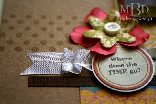
• I also stamped a polka dot section along the background where the photos and paper borders meet.
Embellishments:
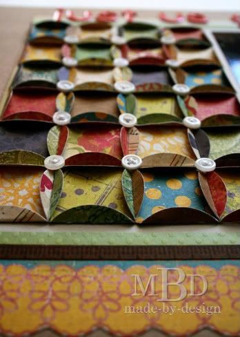
• Instead of the stars in the grid shape that were shown on the sketch, I was inspired with the stitching element and decided to create a quilt with paper. I used paper circles folded to resemble a Cathedral Window quilt pattern, just like a quilt my mom has made. I stitched buttons at each intersection for added embellishment.
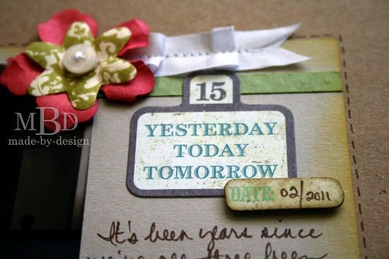
• I added 3 clusters of embellishments to the layout that weren’t originally drawn in the sketch to draw your eye around the page.
• Layered flowers with sewn buttons, circle stickers mounted on white cardstock circles, and ribbon ruffles completed these embellishment clusters.
• I also added a couple of die cut shapes on the 2nd page along with an oval sticker that I stamped our initials on, embossed and colored in with markers. The colors I used for each letter coordinated with the colors of our rooms when we were growing up.
• To finish off the layout, I drew faux stitching lines around the gray cardstock with a brown marker. I also inked the edges of the gray cardstock with a green ink pad and a sponge.
••••••••••••••••••••••••••••

24 comments:
That is gorgeous, but I particularly love the quilt.
The detail is outstanding!! I love how your details have meaning behind it.
Very nice layout. Love the quilt.
Absolutely STUNNING
This is gorgeous, love love the details.
I love, love, love the quilting! Simply beautiful take on the sketch!
Wow! Love all the details and work that went into this. :)
Very cool Megan! Your paper folding seems to add to the moody look of your pics! TFS
Love all of the details on this little quilted squares! Lovely layout!! :)
Ooh..I really like this,I am so scraplifting that folded square technique for a card! TFS..great job : )
LOVE the THOUGHT put into this spread..just gorgeous details and the sentiment behind the layout itself is very warming..L.O.V.E it!
This is amazing! Really enjoyed reading about the details that you put into the LO.
Great details!
This is one amazing layout! I LOVE all the detail ... fabulous work!
Beautiful Layout ... great detail and embellies!
What a stunning layout! Absolutely LOVE the quilted look! Incredible work!
I love how thoughtful you were in your embellishment and color choices, like matching the markers with your childhood paint colors. The layout really reflects the love in your relationship.
Loving the LO's created with this sketch. I'm a new follower to this blog. Is there a place to link or upload pages created with the weekly sketch? I can't seem to find any info. I would love to play along. Thanks!
I loved how you did the two horizontal four by six pictures so here is my take on this sketch!
http://crystalscraftycreations.blogspot.com/2011/03/always-be-unique.html
this is a beautiful LO!
Oh my goodness! What a georgeous layout! It's so detailed! Excellent job!
The "quilt" you've created is amazing!
Great idea for a quilt look! I never would have thought to use circles like that. Beautiful Layout.
Loved this sketch! I posted my take on it on my blog at: http://scraplifterdesigns.blogspot.com/2011/03/sc-spring-fling-challenge-4-sketch.html
Post a Comment