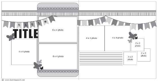
Showing posts with label guest designer. Show all posts

Saturday, July 30, 2011

One-Page Week, Part 6 - Guest Designers

•••••••••••••••••••

One-page Sketch #11


You can download and print this sketch by clicking on the one-page sketches link found under the "printable sketches" tab on the right sidebar.


"Go Big Kev" by Amy Wheeler
Supplies Used - Cardstock, Stitching Template: Bazzill; Patterned Papers, Die Cuts, Foam Stickers: SEI; Alphabet Stickers: American Crafts; Brads: Making Memories; Floss: DMC

We spend our summers at the baseball fields with our two sons and I believe I have more baseball photos than anything to scrap. When I saw the huge star on this one-page sketch, I knew I could use it with baseball photos!

Variation 1: Instead of just using three pieces of patterned paper in the center of the layout, I opted for two different patterns.

Variation 2: I also decided to mat each patterned paper piece with the other pattern I used on the layout.

Variation 3: All the matting inspired me to cut down my 12x12 base cardstock by 1/2" so I could also mat it on the baseball patterned paper. I rounded the corners to match the pieces in the center of the layout.

The rest of the layout sticks pretty close to the layout. The title placement and embellishments worked well with the photos I was using. I liked the dimension that stitching around the inside of the star shape gave to the layout.

Variation 4: I used three different sticker fonts for my title.


Variation 5: Instead of adding a smaller star on top of the large star in the left corner, I added coordinating embellishments from the paper line (pennant, baseball).


Variation 6: To make my "swirls" coming off the star, I used a Bazill stitching template to punch holes, but instead of stitching, I added pewter brads. (I have so many brads...need to use them up!)

Variation 7: I journaled on cardstock strips to match my background and adhered them with pop dots to add a little dimension. I also outlined them.

 • • • • • • • • • • • • • • • • • • • • • • • • • • • • • •


"Michigan" by Diane Iversen
Supplies - Blue Cardstock, Black Cardstock, White Cardstock, Black Ink: Stampin’ Up; Distressing Rub-Ons: Basic Grey, unknown; Square Letter Stickers: Marcella by K

When I saw this sketch, I knew I had to use it as a title page for my Michigan trip. Instead of using three strips of paper in the background, I used an 8 X 10 photo of Lake Superior. Then I took some of my favorite snapshots in wallet sizes and used them for the three smaller pictures on the sketch. I didn’t want to cover up anymore of my lake picture, so I decided to place the swirl in a different position. The journaling is in place of the title; I just printed the strips off on my computer, ripped the paper and outlined the edges with a broken line in felt tip pen. I felt like the layout needed just a little more pizazz since I was just using cardstock and no patterned paper, so I inked the edges with black ink and used rub-ons to create a distressed look. The "Michigan" letters and swirls were cut out on my Cricut.

This is more of simple layout than I usually do, I have a tendency to go overboard and cover every single area on my layout. But it is simple and pretty and it will make a perfect first page to my album.
•••••••••••••••••••••••

Saturday, July 23, 2011

Add-on Week, Part 6 - Guest Designers

••••••••••••••••••••
Add-on Sketch #7

You can download and print this sketch by clicking on the add-on sketches link found under the "printable sketches" tab on the right sidebar.


"Celebrate" by Diane Iversen
Supplies - White Textured Cardstock, Polka-Dot Paper (Creative Imaginations), Paper Cut Outs (Dream Street), Tag (‘dumpster dive’ off a pair of jeans J), Silver Ric-Rac, Black Cat Fireworks Tag, Embroidery Floss, Creamy Caramel Ink (Stampin’ Up), Gems, Envelope Ties

The Fourth of July is one of my favorite holidays. This add on sketch was perfect for my layout. The only thing I changed was the swirly pattern on the bottom of the fireworks and the fact that I only used the smaller size. I like using things that are not necessarily scrapbook products like tags off of clothing and tags from items used during the event. Like I have said before, I am a huge fan of polka-dots, so that is where I started and worked my way out from there.

I wasn’t sure how to transfer the add on sketch to my layout because I usually free hand with a light pencil line and then paper pierce and stitch with embroidery floss from there. This time, however, since I had so many layers to go through, I decided to free hand the swirls on another sheet of paper and then used that as a template for my page, poking holes through the template onto my page.


I did the same thing with the fireworks sketch. I used the sketch as a template, lined it up with the swirls and then paper pierced holes for my embroidery. The gems were just loose gems that I had lying around the house from another craft project and I simply put mini glue dots on the back and stuck them to my page. Voila!

As you can see, we have a lot of fun on the Fourth of July. My husband and daughter are more than willing to take over the pyrotechnics while I snap pictures, mingle with the family and enjoy their handy work.

 • • • • • • • • • • • • • • • • • • • • • • • • • • • • • •


"For Our Future Church" by Amy Wheeler
Supplies Used - Patterned Papers: My Mind's Eye, Crate Paper; Alphabet Stickers: American Crafts (chipboard), Echo Park; Flowers: Kaiser Craft; Border Stickers, Buttons: Crate Paper; Twine: Pink Paislee; Mist: Studio Calico; Trim: PolkaDotWhimsy.com

For several years now, it seems that we always miss 4th of July celebrations because we are in the car returning from a baseball tournament. Knowing I didn't have the traditional 4th photos, when I saw the sketch for "fireworks" my mind starting going in a different direction. I could see flowers that I could use with a couple photos that had sat on my scrap table for way too long.

I used the sketch to make an accent in the lower corner of a layout. I built my layout around the area for the "flowers." I selected a ledger patterned paper for my background so I wouldn't have to worry about where/how to do my journaling. I visualized my "flower" accents in the lower corner with the journaling/title above them. That left the left hand side of the page for my photos.

Instead of using stitching and circles (jewels/brads) to create the design, I "built" my shape using other elements.

Step 1: For the base of my flowers, I hand cut shapes from a patterned paper (by Crate Paper).

Step 2: The patterned paper piece was topped with a flower (by Kaiser Craft).


Step 3: I completed the stacked flower shapes with a flower shaped button (by Crate Paper) that was tied with twine.


Step 4: I handstitched the "stems" of the flower and completed each with a bow to mimic leaves.

To complete my "scene", I added a white picket fence sticker along the bottom edge of the page.
•••••••••••••••••••••••••

Saturday, July 16, 2011

Two-Page Week, Part 6 - Guest Designers

••••••••••••••••••••••

Two-Page Sketch #17


 You can download and print this sketch by clicking on the two-page sketches link found under the "printable sketches" tab on the right sidebar.


"Purple Aces vs. Racers" by Amy Wheeler
Supplies Used - Cardstock: Bazzill; Patterned Papers, Borders: SEI; Alphabets: American Crafts (stickers), Jillibean Soup (corrugated); Floss: DMC

For this layout, I stuck REALLY close to the sketch. I already had the SEI "I'm An Athlete" papers and knew instantly that the stars in the line would work great with this sketch. I also conveniently had the perfect photos to work with what was already suggested for the sketch.

Variation 1: Instead of using a cardstock base and patterned paper star for the right hand page, I used a patterned paper background and cardstock for my star so I could journal directly onto the cardstock.


Variation 2: On the left hand page, I used a couple border strips from the paper line in place of the two suggested strips of patterned paper.


Variation 3: So the blue alpha stickers I selected would stand out more on my layout, I shifted the title placement just a bit.


All of the stars were hand-cut from a sheet of patterned paper. It took a while to cut them all, but I think it was worth it in the end. I am very happy with this page.

 • • • • • • • • • • • • • • • • • • • • • • • • • • • • • •


"To Dye For" by Amy Wheeler
Supplies Used - Kraft Paper: The Paper Source; Patterned Papers: Jillibean Soup, Bella Boulevard, Sassafrass Lass; Alphabet Stickers, Mist: Studio Calico; Chipboard Alphas: Creative Imaginations; Sticker: My Mind's Eye; Twine: Pink Paislee; Ribbon: May Arts; Punch: EK Success; Buttons: misc.

Variation 1: I flipped the whole sketch for this Easter layout. My large shape and all the photo placements are the opposite of what was shown.

Variation 2: I selected an egg shape to go with my theme.

Variation 3: I made slight adjustments in my photo sizes. The three stacked photos are 4x5 and the single photo was left uncropped as a 4x6.

Variation 3: I kept the title on the left hand side of the page and added it over top of the large egg.


I used a mixture of alphas and chipboard (misted to resemble dying eggs) for my title.

Variation 4: Instead of having stars and stitching across the spread, I used buttons and either stitched them on or tied knots through them.

Variation 5: I added a label and button in the upper left hand corner of the layout to include my date.


Variation 6: To further accent my large egg, I added "grass" along the bottom edge of the page using ribbon and a punched patterned paper border.

Variation 7: Since I added my title inside the large shape, I moved my journaling to the lover right corner of the layout.


I journaled on strips of kraft paper that I then adhered on top of the base of the layout.

Variation 8: I added a collection of buttons in the upper outside corner of the single photo on the right hand page.


 • • • • • • • • • • • • • • • • • • • • • • • • • • • • • •


"Puppy Parade" by Diane Iversen
Supplies - Black Cardstock; Off White Cardstock with Stitching: We R Memory Makers; Paper: Bo Bunny Back to Basics; Paw Print Ribbon: Offray; Green Decorative Strip: Stampin' Up; Black Embroidery Floss: DMC; Flowers: Prima; Stickers: 7 Gypsies & Paper Crafts; Big Brads: Making Memories; Small Brad & Gems: Kaiser Crafts

I normally create more one page layouts than two page layouts, depending on the number of pictures I have on the subject. I decided to use half of this two-page layout and it seemed to work beautifully. This is what I love about your sketches, Allison, there are some many possibilities.

I changed the size of the pictures just a little to fit the page since I used a sewn outline around the edge. There is a double line of stitching that seemed perfect for filling with dog phrase stickers.


I hand stitched the wavy line across the page and decided to add flowers instead of stars. For the most part, I kept the sketch the same, I only moved the embellishment near the title.

 • • • • • • • • • • • • • • • • • • • • • • • • • • • • • •

Surprise Giveaway Time!
•••••••••••••••••••••• 
Surprise giveaways are always fun to throw out there every once in awhile. We couldn't end Two-Page Week without giving away another copy of Sketches for Scrapbooking, Volume 8. Especially since the sketch we used this week is a peek into our newest book. We have selected a commenter from yesterday's post as the winner.

 dawn said...
These are fun layouts today ladies. I like it as a one pager too.


On the first layout, great layering and clustering. The banner is so cute.


The second layout, what a fun theme and the colors and title are great. I like that your husband will do the writing part. Love the banner colors.


Allison, your cake is amazing and colorful. Sweet photos of baby Jackson too. I love the banner and different sizes you made it. The stitching is good too.


My daughter turns 13 next week and I've been thinking about banner ideas and wanted to include the number 13 in it and this gave me a great idea for it, hope I can make mine this cute, thanks for the idea Allison.


I'm sad to see this week end, it was such a fun one.

You can email me at allison@scrapbookgeneration.com with your shipping information and we'll get that book sent out to you. 
•••••••••••••••••••••••••••••

Saturday, July 9, 2011

Card Week, Part 6 - Guest Designers

••••••••••••••••
Card Sketch #9


You can download and print this sketch by clicking on the card sketches link found under the "printable sketches" tab on the right sidebar.


Flower card by Diane Iversen
Product list - brown and white cardstock; misc. ribbon; choc chip ink - stampin'up; butterfly stamp - stampin'up; pearls - stampin'up; misc. button; prima flower; hardware - stampin'up

I started this project by looking for the perfect ribbon in my scrap pile. I save all my scraps and anything that might make a handy scrapbook embellishment. I layered my ribbon in the same way the design calls for strips of paper. I needed something to wrap the ribbon around so I could place it on the front of the card and I came across a cardboard backing to some Making Memories stickers. Voila! It was perfect, and it even had polka-dots! My favorite! I cut it down to size and tore off the top and bottom edges. Then I used decorative scissors on a strip of white cardstock, inked the edges with chocolate chip ink and placed them at the ends. The Making Memories sticker package also had this beautiful border so I carefully cut it out and used it at the bottom of the ribbon. (I just love to recycle.)

I wasn't sure what to use for words on my card so I decided to use an embellishment in place of a sentiment. I used the hodge-podge hardware frame and placed a contrasting flower and button in the middle. And, of course, loving butterflies the way I do, I had to put a butterfly on the flower. I used self sticking pearls for the middle.

I really like the texture and dimension of this card. I usually make my own envelopes, but this time I opted to just line the inside of an existing envelope with matching polka-dot paper.

 • • • • • • • • • • • • • • • • • • • • • • • • • • • • • •


"Hello" card by Diane Iversen
Supplies - Black, White and Red Cardstock; Scrap Paper; Lady bug stamps by Stampin' Up and Hero Arts; Letter Stickers - Cloud Nine Design; Black Felt Tip Pen; Water Color Pencils - Stampin' Up; Pin: Maya Road

I love this card sketch because it gives me a chance to use all my scraps! All of the strips are scrap paper and I also used a piece of ribbon. I used ladybug stamps and then stamped an extra set, colored them in with water color pencils and cut them out. I used thick glue dots and placed the cut outs over the stamped images to give them a little dimension. The fanned edge around the "bug me anytime" was created by scoring a strip of black cardstock and accordion folding it and adhering the ends together. Then I used a pin left over from another project and another piece of scrap ribbon. I finished off by drawing a broken line over the white cardstock pieces.

 • • • • • • • • • • • • • • • • • • • • • • • • • • • • • •


"Thanks" card by Amy Wheeler
Supplies Used - Patterned Papers: Cosmo Cricket; Border Stickers: Pink Paislee; Ribbon: May Arts; Alphabet Stickers: Adorn It

I'm not usually a card maker, but do enjoy making them when I am just down to scraps with a kit or paper line I'm using. I had a whole package of the new Pink Paislee borders from their Hometown Summer line and when I saw this sketch, I just knew I had found a use for some of those borders.

Variation #1: I used patterned paper to cover the base of my premade card (from Michaels).

Variation #2: Instead of using strips of patterned paper, I used border sticker strips alternating with strips of ribbon.

Variation #3: Since a couple of my strips were wider than those on the sketch, I adjusted to only use four strips across my card.

Variation #4: With my top strip being a banner, I opted to add my title on the ribbon just below it.

This card came together really quick!

 • • • • • • • • • • • • • • • • • • • • • • • • • • • • • •


Two cards by Amy Wheeler
Supplies Used - Patterned Paper: Crate Paper; Border Stickers: Pebbles; Alphabet Stickers: Paper Trunk

I had a set of border stickers by Pebbles in a kit I received. I thought they were really cute, but realized after completing several pages that I'd barely touched them. This card sketch gave me a reason to put them to good use! By using a coordinating sheet of patterned paper and one set of alphas, I was able to whip up two adorable cards in no time.


"Congrats" card

Variation #1: I used patterned paper to cover the base of my premade card (from Michaels).

Variation #2: I flipped the card so it would open from the bottom.

Variation #3: Instead of using strips of patterned paper, I used border sticker strips.

Variation #4: Since the height of my card was smaller than shown on the sketch, I only used three sticker strips on my card. However, I LOVED the bird strip and really wanted to use it, so I added it on top of the wide polka dot strip in the center of the card.

Variation #5: Instead of placing my title on one of the strips, I added it in the lower right corner.


Blank card

Variation #1: Again, I used patterned paper to cover the base of my premade card (from Michaels).

Variation #2: Although I started adding the sticker strips so the card would open from the side, I wanted to include the leaf" sticker (on far left), but it then the leaves would be sideways, I then decided to flip the card so it would open from the bottom.

Variation #3: With the card flipped, "something" was missing, so I added the flying butterfly sticker strip along the bottom edge.

Variation #4: I decided not to include a title on this card. I will be able to use it for any occasion now.
••••••••••••••••••••••••••••••••

Saturday, June 25, 2011

One-Page Week, Part 6 - Guest Designer

•••••••••••••••••••••••••••••

One-page Sketch #10


You can download and print this sketch by clicking on the one-page sketches link found under the "printable sketches" tab on the right sidebar.


"Love Me Do" by Sue Bone
Supplies Used - Patterned Papers, stickers and embellishments: Jillibean Soup; Ribbon: My Mind's Eye; Ink: Tim Holtz Distress Ink (Broken Weathered wood)

I knew immediately what photo to use for this sketch. Whilst in Liverpool last month we met up with fellow scrapper, Kirsty Wiseman who took this photo for me. When the layout was almost finished I asked my family for the names of Beatles songs - Yellow Submarine and others were not helpful, but
my daughter (pictured) suggested Love Me Do.

Variation #1: I flipped the sketch and rotated it too to suit my portrait photo.

Variation #2: I matted the photo.

Variation #3: As one of the stickers I had used had room for journalling I decided not to add the journaling strips

Variation #4: I used the felt ric rac instead of the thin strips of striped paper.

Variation #5: I added the photo corners from the sticker sheet to opposite corners.

I would usually use a cardstock base for my layout but this subtle patterned paper works well. I love this Jillibean Soup range, it's so easy to use and a great range of stickers on one sheet including the alphabet.
•••••••••••••••••••

Saturday, June 11, 2011

Two-Page Week, Part 6 - Guest Designer

•••••••••••••••••••••••••
Two-page Sketch #16


You can download and print this sketch by clicking on the two-page sketches link found under the "printable sketches" tab on the right sidebar.


"Blo Karting" by Sue Bone
Supplies Used - Cardstock: Bazzill, Stampin Up and Club Scrap; Patterned Papers: Jillibean Soup, Basic Grey, Sassafras; Alphas: Jillibean Soup; Embellishments: Dymo tape, Tim Holtz Distress Ink (Broken Weathered wood and antique linen); Die cuts and embossing: Sizzix, Quickutz, Silhouette and
Cuttlebug

I will admit that when I received the sketch I was shocked - only three photos!! In my mind I was going to scrap lots of photos from our recent trip to the home of the Beatles, Liverpool. Photos of the Superlambanana will have to wait for another time. However I was surprised to find two sets of perfect photos from the previous week. So here is the first.

Variation #1: I flipped the sketch so that it was the opposite way as my photos were facing the wrong way

Variation #2: The clouds were perfect for my photos but there aren't many butterflies on a windy beach so I substituted the seagulls for the butterflies. I cut the clouds using my Silhouette and embossed them using Cuttlebug and Sizzix folders. The seagulls were Quickutz and Sizzix dies with a smattering of weathered wood distress ink on the edges.

Variation #3: Instead of the flowers I cut a stencil from a photo I found on the web of La Rocco Tower which you can just see in the background of the small photo on the left handside. I used my two colours of distress inks to do a subtle shadow.


Variation #4: Instead of using strips of card for the journalling I used strips of Dymo tape. Fortunately I have a good stock of a variety of colours.

Variation #5: As I had a long title I encroached on the block of patterned paper and stitched over the letters.

Variation #6: I also stitched down the horizontal strip which was a border strip from the yellow and blue floral by Sassafras.

I love the background Basic Grey Basics in white as it just has enough detail to make a more interesting base than just plain cardstock and the collection packs come with two sheets of each design so it's perfect for two page layouts.

• • • • • • • • • • • • • • • • • • • • • • • • • • • • • • • • • • • •
"Jersey Boat Show" by Sue Bone

Supplies Used - Cardstock: Coredinations (red), unknown (turquoise); Patterned Papers: Cosmo Cricket, Basic Grey, Paper Pizazz, American Crafts and Jenni Bowlin; Alphas: Making Memories; Embellishments: Tim Holtz Distress Ink (antique linen); Spellbinders die: unknown (ric rac)

Variation #1: I moved the smaller photo to the left so that the photos were chronological.

Variation #2: I substituted the stars for the clouds, butterflies and flowers. Some were cut from the Jenni Bowlin paper and others were cut from the red Coredinations star embossed cardstock with a Spellbinders die. I then sanded the embossed cardstock to reveal the secondary colour. I also cut an extra star and raised it off the patterned paper on the bottom right so as to create a visual triangle with the stars.


Variation #3: No stitching on the patterned papers

Again I used Basic Grey Basics in manila for the background as it just has enough detail to make a more interesting base than just plain card.
••••••••••••••••••••

Saturday, May 21, 2011

Add-on Week, Part 6 - Guest Designer

••••••••••••••••••••••••••••••

Add-on Sketch #5


You can download and print this sketch by clicking on the add-on sketches link found under the "printable sketches" tab on the right sidebar.


Paper Floral Hanging Frame by Angela Ploegman
Supply List - Patterned Paper: Pebbles; Cardstock: Bazzill; Punches: EK Success; Gems: Doodlebug; Brads: American Crafts

I LOVED this sketch!! On first view I immediately flipped it upside down and thought of a hanging wreath. As my thought process progressed, I ended up creating a hanging circle frame, embellished with punched flowers with pointed circle centers and some bling! Dimension was added to the flowers by misting them with water and gently shaping them before they were dry.
••••••••••••••••••••••••

Saturday, May 14, 2011

Two-Page Week, Part 6 - Guest Designer

•••••••••••••••••••••••••
Two-page Sketch #13


 You can download and print this sketch by clicking on the two-page sketches link found under the "printable sketches" tab on the right sidebar. 


"Snowstorm of a Lifetime" by Angela Ploegman
Supply List - Cardstock: Bazzill; Patterned Paper: BoBunny; Punches: EK Success; Die Cut Paper: Little Yellow Bicycle; Mist: Tattered Angels; Acrylic Snowflakes: Imaginisce; Gems: Teresa Collins; Alphabet Letters: Reminisce (brown BLIZZARD), Basic Grey (LIFETIME); Rubons: American Crafts


Two page sketches are my absolute FAVORITE! It's how I first became a fan of Allison's sketch books. I love having a multi photo 2 page layout all balanced and ready to go, it truly takes the stress out of page design for me!

Because of Allison's well balanced designs, I rarely play around with photo placement on the two pagers. I started by 'winterizing' the layout. I had these pictures from last winter's 'storm of a lifetime' and because of all the white snow in the pictures, I selected a dark brown background to help the pictures pop. I used some punched snowflakes and some snowflakes cut from a die cut paper to create masks, before misting.

The banner in the sketch became a sweeping string of snowflakes and instead of a scalloped border accent, I use a pointed starburst border (it looked like snowflakes to me!). Because of size of the snowflakes I had selected as embellishments, I spread the trio of embellishment clusters to the edge of the page to allow them to fit. I also swapped the title and journaling block as I needed space for a larger title and wanted to better balance the large string of snowflakes. Since the pictures explained the extent of the storm quite well, the journaling could be kept to a minimum.

  • • • • • • • • • • • • • • • • • • • • • • • • • • • • • •


"Picking The Perfect One" by Christina Hoffman
Supplies - Cardstock: The Paper Loft; Patterned paper: The Paper Loft; Alphabet: The Paper Studio; Kaiser Craft; Embroidery Floss: DMC; Memory Thread: DMC; Tools: Fiskar's Border Punch, Cricut Machine; Buttons: The Paper Studio

Variation #1: I flipped the sketch.

Variation #2: I layered the 1/2 inch stripe strip over the top of a 1 inch piece of brown cardstock.

Variation #3: I changed the size of the photo's. The photo on the left side of the page is a 5 x 7; the large picture on the right side of the page was an 8 x 10 cut and I cut it down to a 6 x 8. I kept the other picture on the right side of the page the suggested size of 4 x 4.

Variation #4: I created a vine instead of a banner. I free handed the vine.


Variation #5: I moved my title to the top of the left page instead of next to the picture.

Variaiton #6: I placed a scallop border above the 4 x 4 photo on the right side of the page. I also placed a scallop border bellow the 5 x 7 photo on the left side of the page.

Variation #7: I also opted to leave out the journaling for now until I can figure out the date these pictures were taken. I plan to put it under the 4 x 4 photo.
••••••••••••••••••••••••••••••••••••

Saturday, May 7, 2011

Card Week, Part 6 - Guest Designer

••••••••••••••••••••••••••••••••••••
It's our May guest designer, Angela Ploegman's turn to share what she created with the sunshine card sketch. I love it and I'm sure you will too! It's always fun to see how differently everyone interprets the sketch.

Card Sketch #6


You can download and print this sketch by clicking on the card sketches link found under the "printable sketches" tab on the right sidebar.


"My Congrats to You" card by Angela Ploegman
Supply List - Cardstock: Bazzill; Patterned Paper: Pebbles; Template: Crafter's Workshop; Mists: Tattered Angels; Glitter paper: Reminisce; Punches: EK Success (scalloped circle and pointed circle)' Paper Studio (large circle), Fiskars (medium circle); Alphabet letters: Basic Grey; minibrads: Karen Foster

This card sketch brought a big smile to my face. I had picked up a Crafter's Workshop Sunburst template some time ago and had been looking for an excuse to use it! This sketch fit the bill, to a 'T'!

I ended up centering the design and misted the sunburst onto white card stock. Since I put the design in the center, the card took on a more graphic than whimsical look, so I enhanced the graphic feel by mounting the design first on orange patterned paper and then on a black 6x6 inch card base. I added custom photo corners, using strips of coordinating red paper and black mini brads. The center tag is a scalloped circle punch layered with circle punches and popped with pop dots...I replaced the trio of clouds with 3 pointed circles and used them as a base to complete the card sentiment.
 ••••••••••••••••••••••••••••••••••

Saturday, April 30, 2011

One-Page Week, Part 6 - Guest Designer

•••••••••••••••••••••••••••••••••••••••
Today our April guest designer, Jennifer DeWolfe, is sharing her version of the one-page sketch. Her layout is full of fun and creatively clever details! I love that she really took the theme to an extreme level and incorporated it into so much of the design.

Jennifer has created some really great projects and we've enjoyed having her designing with the sketches this month. Thank you Jennifer for sharing your creativity with us!

One-page Sketch #5


You can download and print this sketch by clicking on the one-page sketches link found under the "printable sketches" tab on the right sidebar.


"Weekend In The Woods" by Jennifer DeWolfe

Supplies UsedCardstock: Bazzils (White); Patterned Papers: American Crafts (Campy Trails Collection); Alphas: American Crafts Thickers (Blue), Basic Grey (Brown); Embellishments: American Crafts Campy Trails Stickers, Embroidery Floss, Acrylic Paint (White), Tim Holtz Distress Ink (Broken China and Shabby Shutters) and Ribbon.

Everyone thinks my husband and I are nuts when we say we love to winter camp but honestly we do. It’s always so peaceful and quiet and most of the times we are the only ones around. This year my husband decided to treat me and take me somewhere with heated washrooms and let’s just say that I will not be going back to outhouses in -20C (that’s -4F for my American friends) weather again! I sure do hope you enjoy this layout I have for you today.

Variation #1: I flip the sketch so that it was the opposite way.

Variation #2: I wanted my background paper to have more of a wintery feel so I took some white acrylic paint and a tooth brush and splattered paint all over the background paper.


Variation #3: Instead of using the striped strip like in the sketch I made a really cool strip of logs. I love how these look!


 It was really easy to do. I cut 1” squares and then took each one and wrapped it around a pencil and gluing it in place and holding it for a few seconds until the glue sets. Be careful not to get glue on the pencil or you won’t be able to slide it off once it sets.


Variation #4: Instead of using scalloped strip like in the sketch I switched things up a bit and used two types of blue ribbon, a ruffle and a blue satin with snow flakes.

Variation #5: Instead of using the cardstock strip like in the sketch I decided to stitch little snow flakes using the We R Memory Keepers Sew Easy tool.


And there you have it! I would like to thank you all for kind words and support over the past month. I have enjoyed being a guest designer so much that words can’t express and I hope that next year Allison will have me back! Take care and happy sketch scrapping everyone!
••••••••••••••••••••••••••••••••••••