The two projects today all used the add-on sketch more for inspiration instead of looking at the sketch as a guide.
Add-on Sketch #4
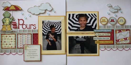
"When it Rains it Pours" by Carolyn Wolff
Supply List - Patterned Paper: Nikki Sivils, Scrapbooker; Cardstock: Bazzill, Core-dinations; Alphabet: Alphalicious Cricut Cartridge; Floss: DMC; Embossing: ScorPal; Ink: Ranger Distress Ink, Vintage Photo, Papertrey; Raindrops: Dew Drops, Glossy Accents; Punch: Scalloped Circle Ek Success
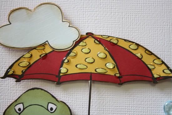
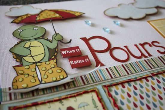
As soon as I saw this sketch I thought of this adorable turtle holding an umbrella. The sketch inspired me to create this entire layout surrounding the umbrella.
Here are my variations on the sketch:
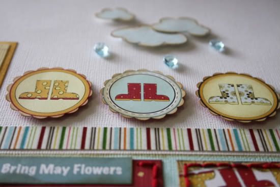
Variation #1 – I hand cut out the turtle and umbrella. I added Glossy Accents to the polka dots on the umbrella and his rubber boots to make them look like they were wet.
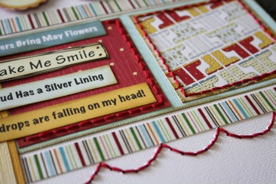
Variation #2 – I accented the squares with red stitching along with creating a border using a scalloped die-cut to poke the holes.
Variation #3 - I used a lot of foam adhesive to pop up my paper embellishments. This gives them lots of dimension and they appear to pop right off the page.
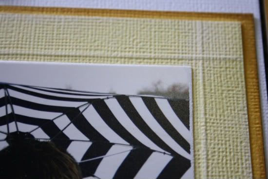
Variation #4 – I used my ScorPal to emboss a border on all of the photo mats. I accented the embossed line with white ink. This creates another layer for my photos without adding more paper.
• • • • • • • • • • • • • • • • • • • • • • • • • • • • • • • • • • • • • • • • • • • • •
"When I Was the Letter U" by Jennifer Larson
Supplies - Patterned paper: Sassafras, Fancy Pants; Paint: Claudine Hellmuth; Letter Stickers: October Afternoon, Cosmo Cricket; Ribbon: Crate Paper; Thread: DMC; Label Sticker: Scenic Route; Button: Crate Paper; Corner Rounder: EK Success; Die Cut Card: Sassafras; Stitching Template: Bazzill; Pens: Zig, American Crafts.
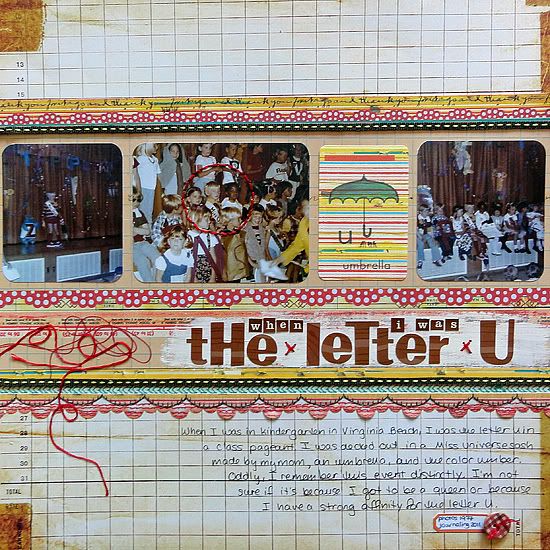
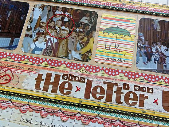
1. The umbrella made me think about the time I had to be the letter U in a Kindergarten show. The whole story came back to me, so I dug out these pictures and the umbrella die cut.
2. Using Photoshop Elements 7, I did an Auto Correct, then a Color Correction on the photos, which were from the 1970s. These two edits fixed many of the problems quickly.
3. I only used two pieces of patterned paper; one had many different strips in it, so I trimmed them to look like layers of different patterned paper. I even lay two pieces together to house the photos on a mat; if you look close, you can see the seam.
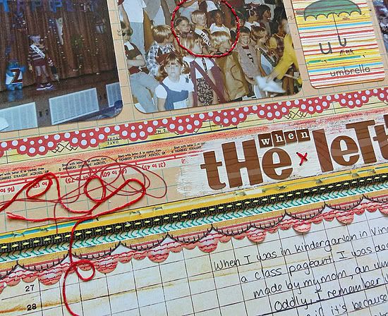
4. To make the thread on the patterned paper more dimensional, I glued down some DMC in random squiggles.
5. To make me stand out more in the center photo, I stitched a circle around me.
6. I also painted over the patterned paper to make the letter stickers stand out more.

9 comments:
I love the dots on the umbrella for the first one and the turtle and PP are perfect and so cute. Great job. The second one is cool that you have yourself as a kid in it. I like the umbrella and the painting and the stitch around you. Great job ladies.
These are both such fantastic LO's! I love the variations!
Love these pages! Corolyn, your page is so great. The raindrops on the umbrella are perfect! Love it!
These layouts are so great! Love the turtle with the umbrella, and the Letter U layout is adorable-especially the header.
Great layouts! The turtle holding the umbrela is too darn cute!
love the stitching and layering in the LO's! both are so pretty.
Love the idea of scoring around your photos and adding ink or paint to make it pop! I never would have thought of that...totally learned something new today! Another great day on Sketch Support!
Connie O.
I LOVE the scoring idea! I will have to remember to use that on my own pages!
The raindrops look great, as does the hand-stitched scallop border. You ladies really are too much with the perfect hand-stitching!
Dawn - as soon as I saw this paper I loved it too!
Tiffany - Thank you! The papers made it super easy to create this layout.
Cindy - Thank you! I love the turtle too.
COScraps - glad you learned something new today. I always find inspiration here.
Luv2talk - Thank you! I can't do a layout without stitching.
Post a Comment