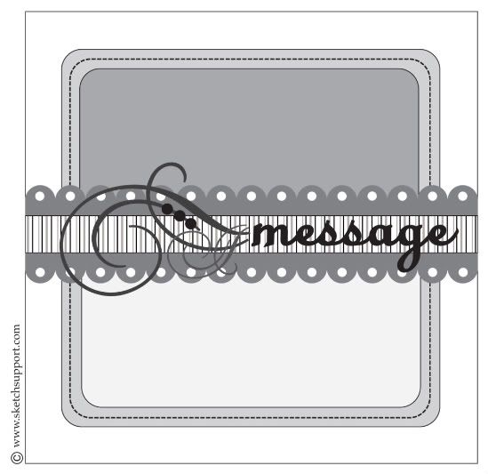
As I've mentioned already, this sketch has so many different options and room for changing it up. Today we've got two great cards from Melissa and Christy that show a slightly simpler version of the sketch and how you can substitute many different things for the element on the sketch.
Card Sketch #5
You can download and print this sketch by clicking on the card sketches link found under the "printable sketches" tab on the right sidebar. *The website we use for uploading our PDFs of the sketches, Scribd, has changed their format and the print tab has been removed. Right now, the only option to print them is to become a FREE member of Scribd. When you click on the "download" tab at the bottom of the sketch it will direct you to the Scribd website were you can create a username. We are currently looking into other options to make the printable sketches easier to print. We are sorry for the inconvenience.
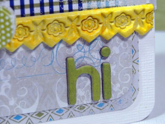
"Hi" card by Melissa Elsner
Supplies - Patterned Paper, Butterfly Sticker: Little Yellow Bicycle; Cardstock: Core'dinations; Alphabet: Basic Grey; Artisan Border: Pink Paislee; Mist: Smooch Spritz (Clearsnap); Corner Punch: EK Success
Variations: I shrunk the size of the card by one inch. Instead of the pretty flourish I used a butterfly sticker and then moved the sentiment to the bottom right.
The Artisan Elements border from Pink Paisley worked perfectly as the scalloped border from the sketch.
• • • • • • • • • • • • • • • • • • • • • • • • • • • • • • • • • • • • • • • • • • • • •
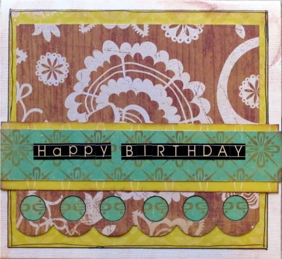
"Happy Birthday" card by Christy Arthur
Products - Cardstock: Bazzill; Circle Punch: EK Success: Patterned paper: Echo Park (For the Record) and Crate Paper (Portrait Bridesmaids); Pen: American Crafts; Alphabet stickers: Jenni Bowlin Mini Chalkboard stickers
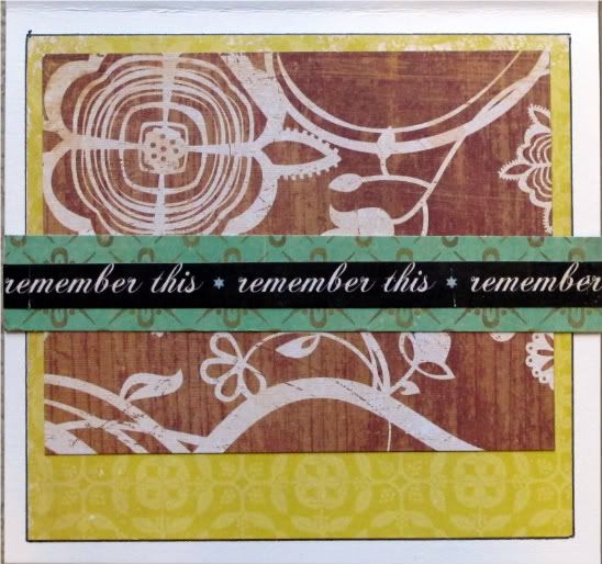
Inside of the card
• I simplified the sketch slightly by using all of the same background on each layer, instead of mixing and matching.
• I added a punched border with accent paper featured behind it at the bottom of the card.
• I kept the corners square instead of rounding them like the sketch.
• I centered the message and kept it simple by not adding the embellishment.
•••••••••••••••••••••••••


2 comments:
adorable cards girls!!!! Loving that yellow border on Melissa's and loving the way Christy backed that punch!!!! hugs, Katrina
Great cards! Love the butterfly and border Melissa and how you put patterned paper behind your punched scallop Christy!
Post a Comment