Due to some issues with the site we were using, (Scribd), to download and print our sketches we are in the works of finding a different one. We have found another site to offer the PDFs of the sketches so you can download and print them. The download and print options are on the bottom of the sketch. The download tab has an arrow pointing down and the print tab has a little icon of a printer. At this time the only sketch that is available as the new PDF is Two-page Sketch #11. We will get the others changed to the new version as soon as possible so you can print out the other sketches. We are sorry for the inconvenience.
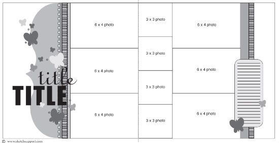
Two-page sketch #11 is very easy to adapt to any theme by simply replacing the butterflies with another element like stars, hearts, flowers, circles, etc. You can use the placement of the butterflies on the sketch as a guide for where to place them and what size to use. Or if the butterflies do fit your theme you can still play around with the look of them by using less or adding more to your layout.
Two-page Sketch #11
You can download and print this sketch by clicking on the two-page sketches link found under the "printable sketches" tab on the right sidebar.
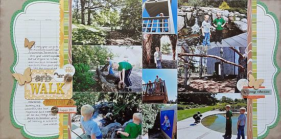
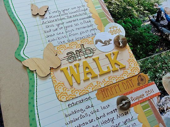
"Arb Walk" by Jennifer Larson
Supplies - Cardstock: Bazzill; Patterned Paper: Studio Calico, KI Memories, Cosmo Cricket; Fabric Rips: Studio Calico; Stickers: Studio Calico, My Mind's Eye; Letter stickers: Cosmo Cricket, Sassafras; Die cut card: Cosmo Cricket; Wood veneer butterflies: Studio Calico; Pens: Zig, American Crafts; Buttons: Craft Supply; Ink: Stampin' Up!; Circle and border punch: EK Success; Linen thread: Stampin' Up!; Other: machine thread.
1. I had a lot of photos from our trip to the Minnesota Landscape Arboretum, so I kept the design of photos very close to fit them all.
2. I trimmed up a piece of the die cut calendar paper to fit on either side of the photo block.
3. Butterflies didn't really fit the theme of our visit, but wood did, so I used just a few across the page to suggest summer and trees!
4. The squirrel was punched out of some patterned paper, a perfect fit for this page! Same with the wood grain fabric rips that I subbed in instead of patterned paper.
• • • • • • • • • • • • • • • • • • • • • • • • • • • • • • • • • • • • • • • • • • • • •
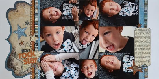
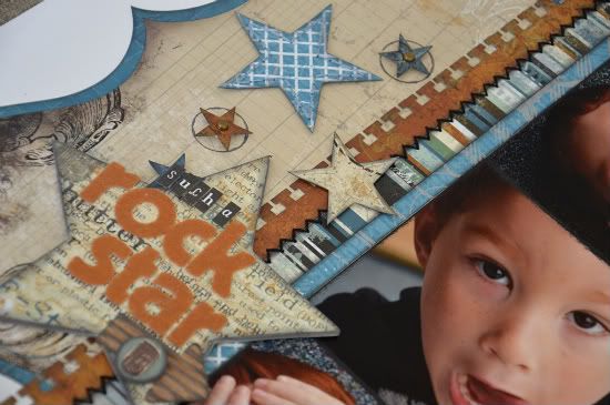
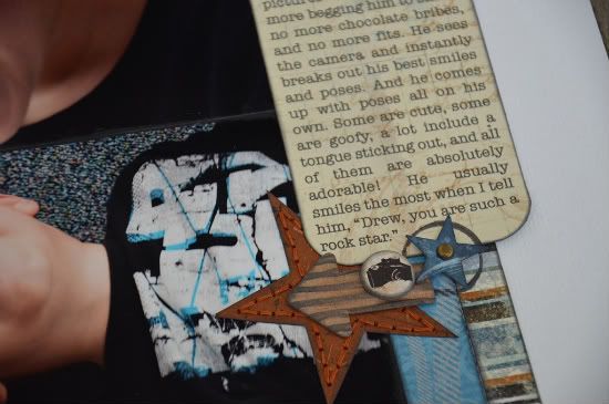
"Such a Rock Star" by Allison Davis
Supplies - Cardstock: Bazzill; Patterned paper: BoBunny and Little Yellow Bicycle; Alphabets: American Crafts and Making Memories; Border punch: EK Success; Brads: Doodlebug; Corrugated arrows: Jillibean Soup; Chipboard circles: BoBunny; Mist: Tattered Angels; Paint: Ranger; Embroidery floss: DMC
Variation #1 - I used the picture sizes on the sketch with the exception of the column of 3 x 3" photos. I had one photo that I really didn't want to crop down to 3 x 3". I would have ended up either chopping of the top of Drew's head or his chin so I cropped it to a 3" width but kept the 6" height of the photo.
Variation #2 - I used stars instead of the butterflies on the sketch and added a big star behind the title.
To accent the smaller stars with a circle around them, I used a technique I had really been wanting to try after seeing creative team member, Christy Arthur do it on her pages a few times. I used the lid of my Glimmer Mist to stamp the mist onto the page. I also added small brads to the center of the smaller stars.
Variation #3 - On the right page of my layout I added a little cluster of embellishments similar to the one below the title on the left page.
There is only one butterfly on the sketch in that area but there is plenty of room to add more.
• • • • • • • • • • • • • • • • • • • • • • • • • • • • • • • • • • • • • • • • • • • • •
Unibind PhotoBook Creator Winner
Congrats to...
Jenny Lilac said...
I LOVE your album of the funny things you little boy says! So adorable!
You are the winner of the Unibind PhotoBook Creator! And trust me, you are going to love it!
You can email me at allison@scrapbookgeneration.com with your shipping information.


16 comments:
Super cute layout.
These layouts are stunning!!
These are both great layouts, can't believe how many pictures fit in. Drew is a ROCKSTAR!!
Love the layouts and think the sketch is great! Lots of possibilities with this one!
These are fabulous!!! I love all the photos on here!!! All the years of living in MN, and I have never been to the Arboretum. How sad is that?!
great layouts ladies! :)
really like both of these layouts, the detail in them both are great. Not sure if you were aware or not but the website that the sketches are on now wants a montly payment to be able to print out previous sketches. I was a bit behind on printing them out so was getting caught up this morning and they have archived most of them and a fee is now required. That is a bummer that they changed their site.
Wonderful job on yours and Jennifer's LOs using this great sketch. A word about printing the sketches. I just copy and paste your sketch directly from the posting into a word document. If one wants it to be larger just use the landscape orientation and make the margins all .5 then grab the corner and pull it to the size you want keeping the correct proportion. Works great and that's what I pretty well always do. So no need to sign up with that site for getting your copy of the sketches. Thank you, Allison, I do love your sketches and the way you make them so available to us.
Laura, I am aware and working on it as fast as I can.
Love both of these! Jennifer, the colors you chose are fantastic!!
it's a good suggestion on copy and pasting but I had already tried it and it didn't work for me thus the comment. It took the outline of the sketch but no words (directions, measurements, etc...)
No Worries Allison!
We've got a new one up that you can try. The information for it is in the post. :)
Wow, now that's alot of pictures! Lovely layouts!
I have been a lurker for some time now and just wanted to let you know that I love your sketches. My favorite layouts are 2 pagers filled with photos so naturally your sketches have quickly become my favorite. Your layouts are also detailed but clean looking!
These are some great layouts ladies! What talent you have! Love them both!
What an AMAZING sketch!! Cant wait to use it!!
Post a Comment