
It looks like we have found a better way to offer the sketches. So far, from what we can tell, the new PDF hosting site is much easier and there are no requirements from you to join the site if you want to print or download the sketch. We want to make the sketches as easy to access as possible so we are in communication with the new PDF hosting site to make sure that this is going to be the right fit for us. We don't want to run into a similar problem down the road so we are making sure that everything will work for what we need in order to offer the sketches in an easy, hassle free way to everyone. We are waiting to switch the other sketches to the new PDF hosting site until we are 100% sure that this is going to work for Sketch Support. As soon as we find out, we will convert all the sketches on the site and you should be able to download and print without any problems. Thank you so much for your patience with us!
Using smaller photos than the sketch suggests is effortless with this sketch since all of the photos are in a block together. Since the design of the papers is right on the edge of the photos, (big, small, or as they are on the sketch), there really aren't any major adjustments to make. The two layouts today show how this sketch works with smaller photos and that you still end up with the same look as the sketch.
Two-page Sketch #11
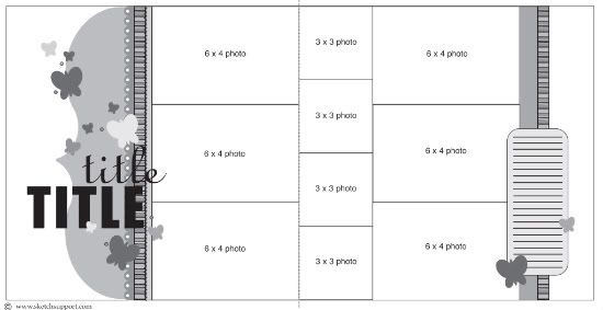
You can download and print this sketch by clicking on the two-page sketches link found under the "printable sketches" tab on the right sidebar.
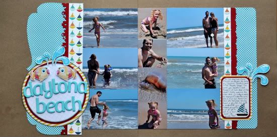
"Daytona Beach" by Jill Sarginson
Supplies - Patterned Paper: Echo Park (Little Boy collection), Scenic Route; Cardstock: Bazzill Basics; Tools: EK Success Beach Edger border punch, Fiskars Bracket border punch, Creative Memories Corner Maker punch, Creative Memories Circle Cutting System; Ink: Vibrance; Alphabet: Pink Paislee; Digital Elements: Pond Play by Kristen Aagard; Adhesives: Pop dots, 2-sided tape; Pen: Zig writer
Variation #1: I opted to re-size my photos. My larger photos are 3.5x5 and the others are roughly 2.5x2.5 (they are a collage that I made in Photoshop Elements so the three smaller photos span the height of 10.5 inches so the half inch was distributed among all 4 photos).
Variation #2: To make the title stand out, I put it on a layered circle and then added some embellishments to it. I pop-dotted the embellishments to help make them stand out more.
Variation #3: To tie the left side in with the right side, I added a piece of matching pattern paper and rounded the edges.
• • • • • • • • • • • • • • • • • • • • • • • • • • • • • • • • • • • • • • • • • • • • •
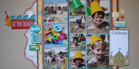
"At the Beach" by Carolyn Wolff
Supply List - Cardstock: Bazzill, Core-dinations; Patterned Paper: Little Yellow Bicycle ; Stickers: Scenic Route, Little Yellow Bicycle ; Dimensional Stickers: Little Yellow Bicycle; Stitching Tools & Floss: We R Memory Keepers ; Wave & Bracket Die-cut: Accucut; Ticket: My Mind’s Eye; Journal Spot: Little Yellow Bicycle
I followed this sketch pretty closely with just a few adjustments to suit my photos and embellishments.
Variation #1 – I had to change the layout of the photos to accommodate my photos. I left the row of 3x3 photos the same (my photos are more like 2 ¾ because I like to mat them). I changed the 4x6 photos on page 2 to vertical photos. For the photos on page 1, I just shortened them a bit to focus in more on the subject.
I also sanded the edges of my photos to make them stand out on the teal blue background.
Variation #2 – I moved my title towards the top of the page instead of towards the bottom like it was shown in the sketch. I replaced the butterflies with stickers that I mounted on cardstock and popped up using foam adhesive.
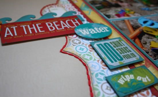
I added a wave die-cut, ticket stub (that will eventually have the date that the photos were taken) and a 3-D bucket to embellish the title.
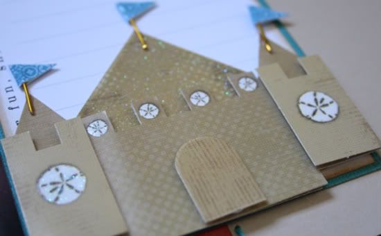
Variation #3 – I added a 3-D sand castle to the bottom of my journal spot.
I apologize for not having my journaling filled in, but I need to look up when the photos were taken and refer to the notes that I made about this day on the beach. I also added some stickers above my journal spot to balance the layout.
Variation #4 – No layout is complete without a little bit of stitching. I created a border on both pages. On page 1, I used red floss and followed the line along the edge of the bracket die-cut. On page 2, I stitched along the edge of the red strip using blue floss.
•••••••••••••••••••••••••••••••
13 comments:
These layouts are super, love them. I was thinking yesterday that the sketch would be good for a water page because you always get lots of pictures of swimming in pools and beach pictures. Great job ladies.
Love this weeks sketch and these layouts are amazing!
Great layouts! Really love the beach one!
Beautiful LO's! I love all the slight variations!
Love this layout! I am working on Christmas layouts with lots fo photos and this will be perfect.
question: I know we can't post the sketch on our blogs, but can we share the layout and link back to sketch support (this sketch) or say the design was inspired by Allison Davis' Sketchbook volume 6? I have one ready to post from vol 6 and wondered if I can link to your store? thanks, kelly
Love both of these examples sooo much!
Kelly, you can share it. :)
Love the sketch and great LO's.
Very Nice.. I love this sketch this week. So many options and seeing all yours is so helpful!
Connie
Fabulous sketch and layouts!!
Beautiful interpretaions! It looks like fun days at the beach :)
Lovin these layouts and the sketch that inspired them!
I joined that previous site to be able to download some of the sketches - should we go back and cancel? (if so, what was the site and how do we cancel?) - is there some danger?
Post a Comment