Today it's Guest Designer, Jennifer DeWolfe's turn to share how she used two-page sketch #11 to create her two-page and one-page layout. You'll love the extra details she added! We've also got another layout from one of creative team members. Christina shares her simplified and pretty two-page layout based on the two-page sketch.
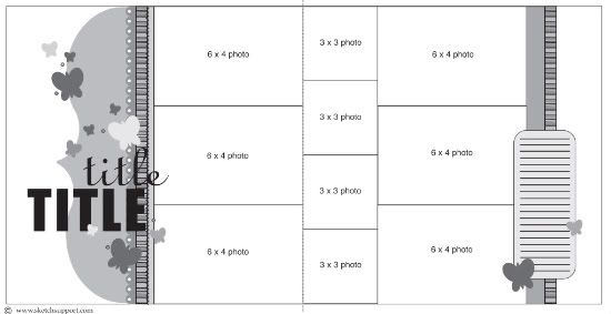
Two-page sketch #11
You can download and print this sketch by clicking on the two-page sketches link found under the "printable sketches" tab on the right sidebar.
"Starting Now" by Jennifer DeWolfe
Supplies Used - Cardstock: Bazzill (grey); Patterned Papers: SEI (On The Coast 12x12 pad); Alphas: American Crafts Thickers (Grey); Marker: Zig; Punches: EK Success (Scallop), Martha Stewart (Butterfly) and Creative Memories (Corner Rounder); Embellishments: Glass Beads, Embroidery Floss, String of Pearls, and Sand
My brother recently got married in Cuba and I thought this sketch was perfect for some of the photos I had. It was a great sketch that allowed me to accommodate a large photo as a focal point but still left lots of room for seven additional photos!
Variation #1: I removed the three photos on the left page and replaced them with one large (12x4) photo.
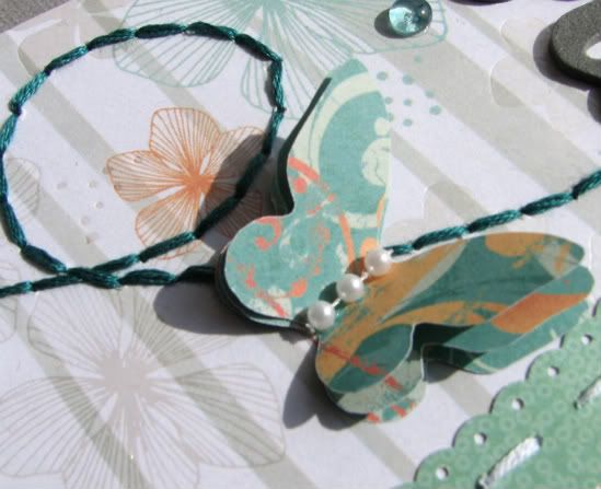
Variation #2: I layered three butterflies together to give them some dimension on the layout and then on the left page I stitched a swirled flight path to tie them together.
Variation #3: I replaced the striped strips on both sides of the layout with a strip of cardstock with sand (from the beach they were married on) adhered to it
Variation #4: I move the stitching on the left page from between the second and third strip of paper to down the middle of the first paper because it was going to be too difficult to stitch through the sand paper.
Variation #5: I kept the journaling card as I liked the placement and the way it drew the eye across the page but I really didn’t have much I wanted to say, so I found a quote I liked and used it there instead.
• • • • • • • • • • • • • • • • • • • • • • • • • • • • • • • • • • • • • • • • • • • • •
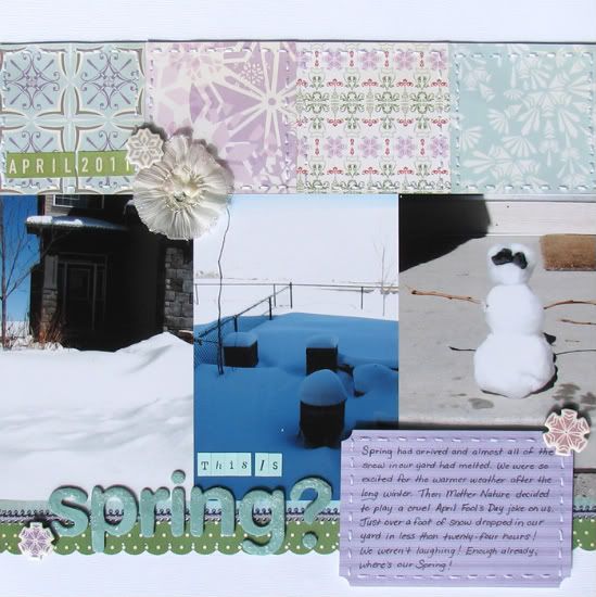
"This is Spring?" by Jennifer DeWolfe
Supplies Used - Cardstock: Bazzils (white); Patterned Papers: Cosmo Cricket (Mitten Weather); Alphas: American Crafts Thickers (Aqua), October Afternoon (Green); Punches: EK Success (Scallop), Martha Stewart (Butterfly) and Stampin’ Up (Reverse Corner Rounder); Embellishments: Cosmo Cricket Mitten Weather Chipboard Shapes, Embroidery Floss, Prima Flower, and Ribbon (Purple)
Spring had arrived at our place and we were starting into April when Mother Nature decided she had other plans for our yard clean-up weekend! We got a huge dump of snow, something I hadn’t seen it well over 5 years! So of course I was out there taking lots of pictures.
Variation #1: I switched the layout from a two page layout to a one page layout using the right page of the sketch.
Variation #2: I rotated the sketch ninety degrees clockwise and then moved the entire sketch down one inch to give me a more centered look.
Variation #3: I replaced the strip of 3x3 photos with 3x3 squares of different patterned paper. I added stitching around each square for dimension and definition.
Variation #4: I changed the dimensions of the journaling square to 4x3 and moved it to the right. I added stitching around it for consistency with the top strip of patterned squares.
Variation #5: I added a small strip of ribbon to the two strips of borders on the bottom to bring some purple down there.
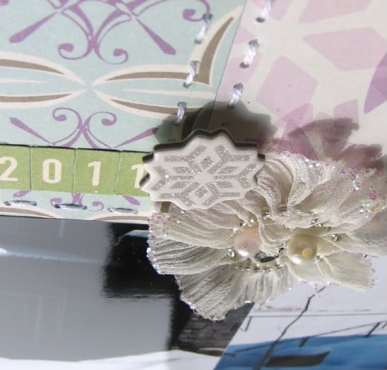
Variation #6: I found the top a little bare so I added the date and some embellishments … now I found it a little more interesting!
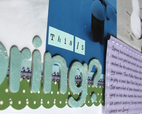
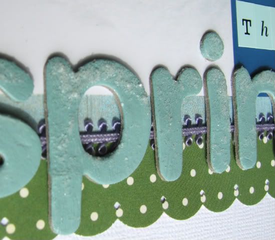
Variation #7: I added a title to the bottom next to the journaling strip. To give the title a just snowed on look I added a little bit of Distress Rock Candy randomly on each letter.
• • • • • • • • • • • • • • • • • • • • • • • • • • • • • • • • • • • • • • • • • • • • •
"Scrap-a-Palooza" by Christina Hoffman
Supplies - Cardstock: Bazzill; Patterned paper: My Mind's Eye; Alphabets: Doodlebug Design and American Crafts; Jewels: Prima and KI Memories: Embroidery Thread: DMC; Tools: Fiskar's Border Punch; Journaling Tag (Ticket): My Mind's Eye
Variation 1: I used a die cut sheet on both sides of my layout.
Variation 2: I used a small journaling tag instead of a large journaling block.
Variation 3: I stitched around all of the die but plus down the strips.
•••••••••••••••••••••••••••




6 comments:
These are all so beautiful! Great work ladies!!
Oh, I love the idea of the 4x9 pic in place of the 3. It works so well. :)
Great layouts! Jennifer, yours is just beautiful!
@Jennifer-Your layouts are so elegant and stylish. I love the use of incorporating sand from the wedding, I never would of thought of that! Your layered butterflies are so beautiful, I've seen those marketed as fancy new embellishments.
@Christina-What a super duper cute layout. I can't believe you combined all those patterned papers together and they don't overpower. I'm so jealous you went to Scrap-a-Palooza.
Love you first LO's Jennifer. It's beautiful! The other LO's are great too! Scrapaolooza looks like so much fun!
These are gorgeous!
Post a Comment