•••••••••••••••
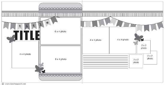
Two-page Sketch #13
You can download and print this sketch by clicking on the two-page sketches link found under the "printable sketches" tab on the right sidebar.
Supplies - Cardstock: American Crafts; Patterned Paper: Echo Park Playground; Stickers: Echo Park Playground; Stamps: Unity Stamp Co.; Ink: Memento Inks; Adhesives: Scotch ATG and Scrapbook Adhesives by 3L
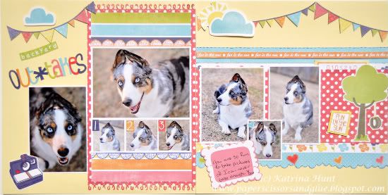
I have found that two page layouts are great to put a lot of pictures on where the pictures are somewhat the same, as these are. I love to just snap a bunch of pictures all at once, and now I am figuring out how to incorporate them all into my layout.
I didn’t change the sketch much, since I still am mainly a one page girl. I love pattern papers, so I added here and there and change some of the picture sizes.
• Variation 1 - Changed the pictures and sizes. Made a collage on the left page instead of two 4x6 pictures.
• Variation 2 - Used more pattern paper than sketch called for. Added extra on the left page under the photos and added to the right page where there wasn’t and and extended it out to the width of the entire page.
• Variation 3 - Left the strips out along the top of both pages. With the addition of the pattern paper in other areas, the strips would have looked too busy.
• Variation 4 - Added extra embellishments to liven up the page. I used a border punch on the left page along with some stamped borders along the top and bottom of the picture collage. Then I added borders, the tree, etc on the right page. Made the journaling smaller.
• • • • • • • • • • • • • • • • • • • • • • • • • • • • • •
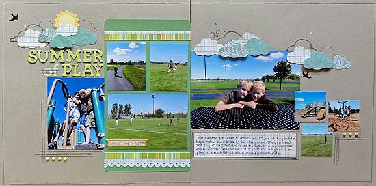
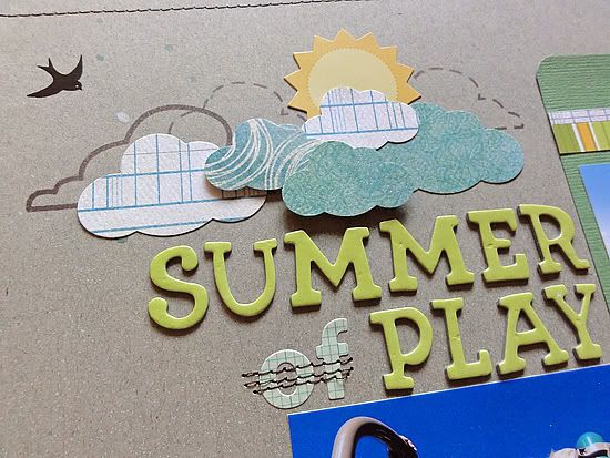
"Summer of Play" by Jennifer Larson
Supplies - Cardstock: Bazzill, Stampin' Up!; Patterned paper: Studio Calico, My Mind's Eye; Punches (clouds, border): Fiskars; Corner rounder: EK Success; Letter stickers: American Crafts (green), Sassafras (graph); Stamps: Studio Calico; Ink: Stampin' Up!; Sun die cut: Pink Paislee; Rub-ons: October Afternoon; Mist: Studio Calico; Other: brads, machine thread.
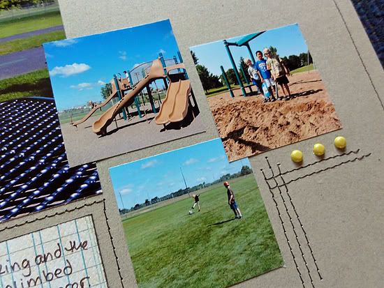
1. I had several photos already printed from playgrounds last summer, so I used what I had with the sketch rather than reprinting in the sketch sizes; I only printed the three 2x2 photos on the right to fill out the design.
2. The banners didn't really fit the theme for this page, but what hung in the sky in these pictures were clouds, so I added those across the page to lead the eye like the banners in the sketch did.
3. I lightly misted the cardstock with blue and white mist for a sky look.
4. The cloud clusters were created with stamps and punches. I put some clouds up with dimensional stickers.
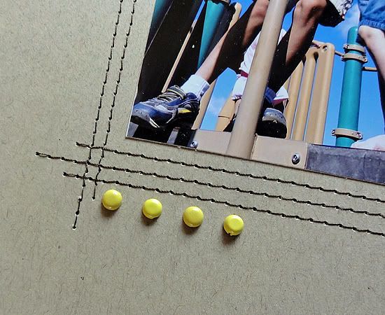
5. I added the stitched photo corners to "enclose" the right and left photos on the page.
• • • • • • • • • • • • • • • • • • • • • • • • • • • • • •
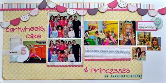
"Cartwheels, Cake, & Princesses" by Jill Sarginson
Supplies - Patterned Paper: Echo Park (Springtime collection); Cardstock: Bazzill Basics; Tools: Creative Memories circle cutting system, Creative Memories circle punch; Fiskars Scallop Sentiment border punch; Creative Memories corner rounder Ink: Vibrance; Font: Computer-generated (Calibri); Alphabets: Pink Paislee Holly Doodle, October Afternoon, American Crafts; Embellishments: Pink Paislee Daily Junque; Adhesive: Pop dots, 2 sided tap
Variations:
I tend to use smaller photos on my pages so the two 4x6 photos are reduced down to 3.5 x 5. Because I re-sized these two photos, I opted to re-size the 4 x 4 photo on the left to about 3.5 x 3.5. For the photos on the right, the two 4 x 4 photos were reduced to about 3.5 inches high and the width was altered for each one so that it worked with the photos I wanted to use. The three remaining photos were kept at 2 x 2.
I opted to mount the sketch onto a piece of cardstock for an added layer. The photos were matted to help pop them off the page.
It's very easy to create the banner - simply punch or cut circles out, cut the top of them off, ink if desired and mount with pop dots.
••••••••••••••••••••••••••


7 comments:
Katrina, those pics are adorable..and I love the 2 pager ;-)
Jennifer, the stitching is a great touch, great LO.
Jill, love the pg and title!
I love the dog in the first layout, he is so pretty. How does he make his ears stand up like that, too funny?? Beautiful layout though.
The second layout is so fun and love the clouds and how you lift them from the page, looks great. Great stitching too.
The last one is just so pretty and fun for a little girl. The colors are pretty and love the banner across both pages.
Great job ladies.
Gorgeous LO's ladies! I love the clouds and stitching!
These are such great lo's! I love seeing different ideas for the same sketch! Thanks for the inspiration ladies!
Great LO's. The colors are great today!!
Love the "cut the top off circles to make banners" tip. I'll use that!
The doggie shots are adorable! LOL
Great colors on the BIRTHDAY LO.
Great idea to string the CLOUDS across the top of the page in place of the banner.
Well done!
these are awesome!
Post a Comment