•••••••••••••••
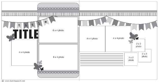
Two-page Sketch #13
You can download and print this sketch by clicking on the two-page sketches link found under the "printable sketches" tab on the right sidebar.
Supply List - Patterned Paper, Tiny alphabets and Cardstock stickers: Lily Bee Design; Glitter Alphabet: American crafts Thickers; Tools: circle punches and Corner Chomper; Glitter Glue: Ranger Stickles; Other: bakers twine and buttons
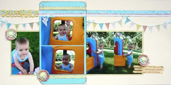
For this layout I switched things up just a bit. The most noticeable thing that I changed was the photos. I used 3- 4x6" photos and matted them on yellow patterned paper. I also eliminated the 3 smaller 2x2" photos and placed my journaling and embellishment in that location.
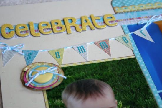
To the borders at the top, I added and additional strip that measures only 1/8" wide. The layout was needing another pop of color on the layout, but I didn't want it to look "too pink" since it was about my little boy. I prefer to call it "happy red". That way my husband doesn't get upset at me for using pink. I also added bows to the tops of the banner.
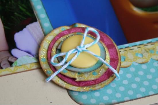
For the embellishments, I stacked 4 sizes of circles and slightly pinched them to create dimension. Notice again that I used a bit of "happy red". I then added Stickles to the yellow layers to create continuity with the glittery title.
"This was the summer of 2008. Cooper was pulling up and holding onto things and walking around. After pool time he wanted to play in his house."
• • • • • • • • • • • • • • • • • • • • • • • • • • • • • •
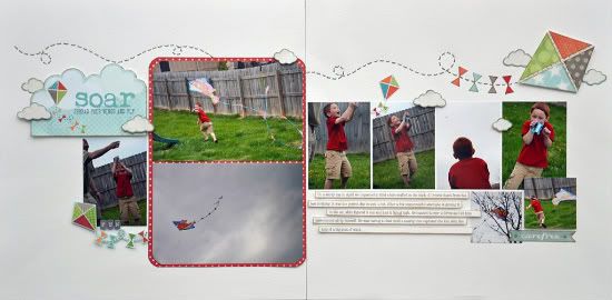
"Soar" by Allison Davis
Supplies - Cardstock: Bazzill; Patterned paper: My Mind's Eye; title die cut: My Mind's Eye; sticker: My Mind's Eye
Variation #1 - I decided not to use the strips going across the top of the page since I wanted to create kind of a scene across the page with the kite and clouds. Sometimes when creating a scene I like to keep the page on the more simple side without a lot of papers that aren't incorporated into the theme.
I also shortened the piece behind the two 4 x 6 photos.
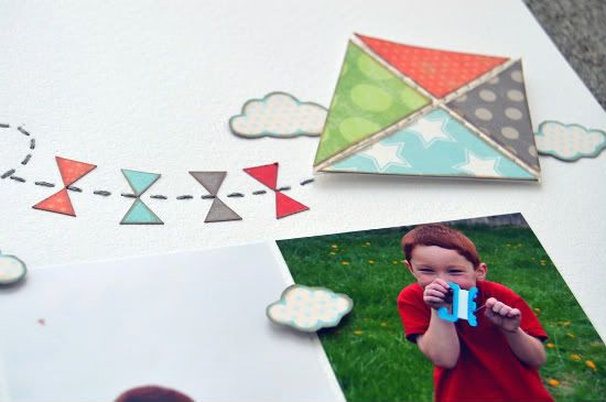
Variation #2 - In place of the banner I added a kite with a long tail going across the page.
The kite and tail follows a very similar line as the banner on the sketch does.
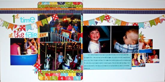
Variation #3 - Since a lot of the photos that I wanted to use on this page couldn't be cropped to 4 x 4 I used wallet size prints. I also added an extra one on the right page and removed one of the 2 x 2 photos.
• • • • • • • • • • • • • • • • • • • • • • • • • • • • • •
"1st Time at the Fair" by Christina Hoffman
Supplies - Cardstock: Bazzill; Patterned paper: Echo Park; Alphabet: American Crafts; Doodlebug Designs and The Paper Studio
The only changes I made to this layout was the placement of my title and the placement of my embellishments are a little different then the original sketch.
••••••••••••••••••••••••••••••

9 comments:
I'm really loving these layouts and the banners. All 3 layouts are awesome today.
Allison I am going to totally scraplift your kite layout. We went flying our first kite a few weeks back so when I get to those pictures I will be using your idea, GREAT job!
These are all fabulous! I am loving this sketch and everyone's variations on it!
These are so lovely! Allison, the kite string is so simple and so amazing!!
What fabulous layouts!
Love all the colors on these banners! Allison, that page is so refreshing and simple..love it!
Love them! Allison love the kite!
I am loving today's pages! The 1st 2 days I wasn't feeling it, but these 3 layouts really bring out the greatness of the sketch! Great work ladies!
Wow! What a great VARIETY today!
I love the term: Happy RED. LOL.
Love the KITE STRING across the page. What an OUT OF THE BOX way to interpret that sketch. Love it!
The last LO is so bright and happy. GREAT USE OF COLOR and it's a great THEME for the banners.
HOME RUN, ladies!
Post a Comment