•••••••••••••••••••••••
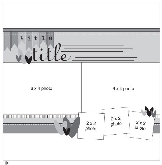
One-page Sketch #12
You can download and print this sketch by clicking on the one-page sketches link found under the "printable sketches" tab on the right sidebar.
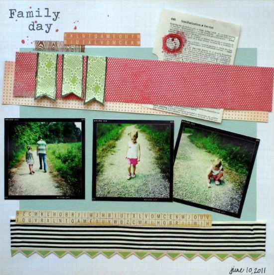
"Family Day" by Christy Arthur
Products - My Minds Eye: Good Day Sunshine head in the clouds, Stella and Rose Delightful Sweet Stripes and Hattie Boy Trims; Webster's Pages: Trend Setter Your life Beautiful; Sassafras: Ellie's Tale Time Flies; Dictionary page: Freehand Scraps May Kit; Crate Paper: Toy Box Borders; Elle's Studio: Handmade Layers Tags; Studio Calico: Mister Huey Schoolhouse and Dark Calico; Hambly Studio: Washi Tape; Hero Arts: Typewriter Stamps
I moved the title farther into the top left corner than the original sketch.
I added three larger banners instead of the seven smaller banners in the sketch.
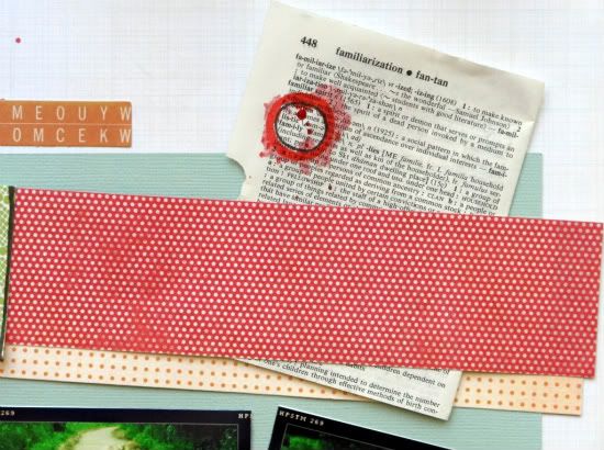
I angled my pattern paper behind the banners and layered another piece on top, that is different than the original sketch.
I added a dictionary page that says "family" and circled it with red mist.
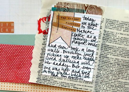
Then I added the journaling inside of the dictionary page and tucked it all into the paper.
I used three smaller photos instead of the two larger ones in the sketch and angled my last picture slightly.
I did not use the 2x2 photos that are in the sketch.
I used ribbon and border stickers to create the bottom layers, instead of the paper that is used in the sketch.
• • • • • • • • • • • • • • • • • • • • • • • • • • • • • •
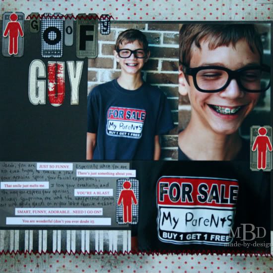
"Goofy Guy" by Megan Bickers
Supplies - Patterned Paper: Glitz Designs (Love Games - Stripe, Polka, Floral), Me and My Big Ideas (Mini Houndstooth), Cosmo Cricket (Jitterbug - Lula); Cardstock: Close To My Heart (Cream), Bazzill (Black); Alphabet Die Cuts: Cuttlebug (Red Tag), Quickcuts (Mini Alphas); Stamps: Technique Tuesday (Big Timber), Inkadinkadoo (Tickets), Maya Road (Measure Twice), Prima (Screen), Stampin'Up (Paint Prints), Stampabilities (Male Silhouette); Inkpads: Marvy Uchida (Black), Ranger Distress Ink (Barn Door, Pumice Stone, Brushed Corduroy); Stickers: Creative Imaginations (Wildberry Quotes); Pens: Zig Writer (Black); Adhesive: Foam Squares and Glue Dots; Other: Fiskars Punch (Photo Labels), We R Memory Keepers Sew Easy (ZigZag) and Red Thread.
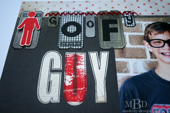
Variation #1: I loved how the title had the little flags on the sketch, so I mimicked the same look and stamped the word "guy" on cream cardstock, then stamped background patterns on top.
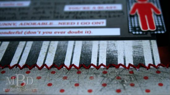
These letters were hand-cut. The word "goofy" was die cut with two different fonts and placed onto some punched and stamped ticket shapes. I used the Sew Easy tool and handstitched a zig-zag pattern across the title and along the bottom of my page.
Variation #2: I used three 4x6 photos by replacing the bottom three 2x2 photos with one 4x6. I like how the two photos on the right almost look like a larger photo of my son (the photo of the face close up and the shirt close up gave the look of one larger photo).
Variation #3: I added my journaling under the photos on the bottom of my layout. I used some quote stickers and formed my journaling around those words. I wrote the rest of my journaling with a black pen to fill in the other words. This is a great way to use up those stickers that have random sayings.
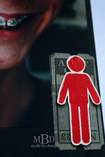
Variation #4: For my accents, in place of the hearts on the sketch, I used stamped tickets (stamped on pattern papers and cut out) along with some stamped male figures.
The stamped boys were stamped with red ink then cut out and added to the layout with foam squares.
• • • • • • • • • • • • • • • • • • • • • • • • • • • • • •
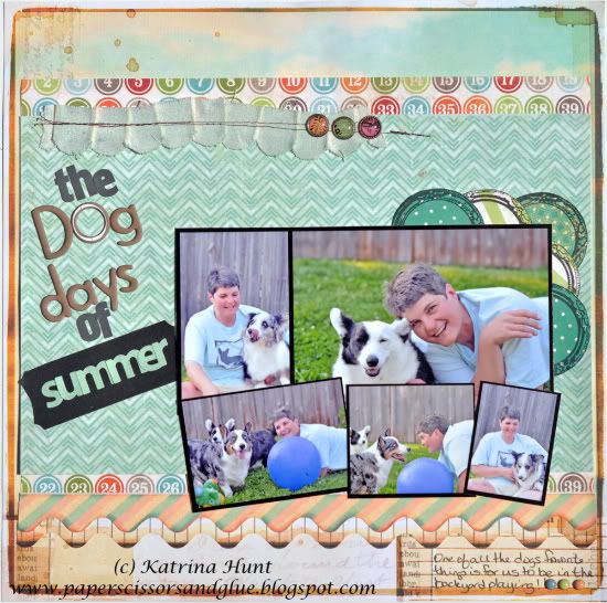
"The Dog Days of Summer" by Katrina Hunt
Supply list - Photo Collage from Kerri Bradford Designs (Picture That kit, collage #1), All Items except mist and grey letter stickers from the Studio Calico August Main Kit Boardwalk.
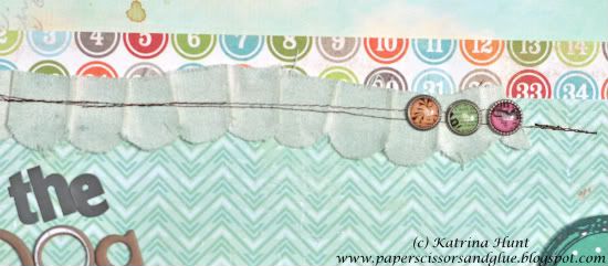
Patterned Paper: Sassafras (Enlighten and Flourish), My Mind’s Eye (Bingo), Crate Paper (Studio C and Teal Song both for Studio Calico); Stamp: Studio Calico; Mistable Linen: Pink Paislee; Chipboard Letters: Studio Calico; Letter Stickers: Studio Calico (Elementary) and Sassafras for Studio Calio (mini alpha green); Brads: Basic Grey (Out of Print); Sticker Label: American Crafts Chalkboard stickers; Mists: Studio Calico Lunchtray and White Calico; Adhesive: Scotch ATG
At first glance, this is kind of like the sketch but maybe not?! I had first planned to turn the sketch on it’s side, because I was using a photo collage. But when I got to working with my pictures and the collage template, it didn’t work with my pictures in that way. So, I went with the sketch position as it is and working around to make it work and make changes.
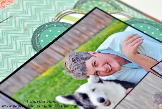
I actually printed out my photo collage and then decided that I wanted to separate the pictures, but not all of them. The pictures are actually in the same place as the collage had them, but the bottom strip I cut apart so I could skew them in different directions. This worked great and I think I may do more of it in the future.
• Variation 1 - Pictures are not the same sizes
• Variation 2 - Title starts in the same place, but continues down the side of the page, rather than across
• Variation 3 - Journaling was moved to the bottom
• Variation 4 - Detail elements were placed underneath the top right corner of the photos.
• • • • • • • • • • • • • • • • • • • • • • • • • • • • • •
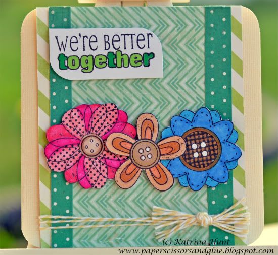
"We're Better Together" card by Katrina Hunt
Supplies Used - Most Items are from Studio Calico August Main Kit Boardwalk. Patterned Paper: My Mind’s Eye (Bingo), Crate Paper (Studio C and Teal Song both for Studio Calico); Cardstock: American Crafts; Stamp: Unity Kit of the Month (July 2010); Twine: The Twinery Baker’s Twine (Buttercup); Ink: Memento Tuxedo Black; Markers: Letraset Pro Markers; Adhesive: Scotch ATG, Fabri Tac and Scrapbook Adhesives by 3L
I thought this sketch would make a fun card, so with the leftovers from my one page layout, I did a card!
• Variation 1 - Main difference is that the sketch is flipped in my card. The flowers represent the 2x2 squares. And then, of course the sentiment had to be flipped to be able to read it!
•••••••••••••••••••••


6 comments:
love them all and great card too.
These are all great renditions... I love them all and will be taking away some awesome ideas from each! Thank you so much!
Great interpretations of the sketch...love them...and the card too.
More great LO's. I love how the banner was used as part of the title on the goofy LO.
Megan, LOVE the title with the tickets. I've got a stack of Tim H's tickets I've been saving - can't wait to break them out and try this!!
Wow great job ladies. They are all great!
Post a Comment