••••••••••••
One-page Sketch #13
You can download and print this sketch by clicking on the one-page sketches link found under the "printable sketches" tab on the right sidebar.
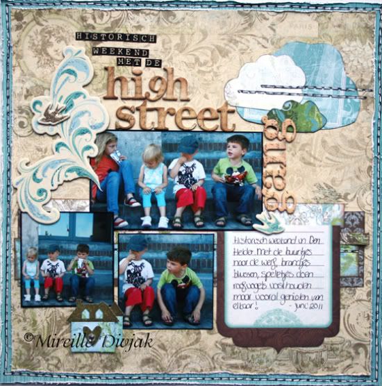
"Historisch Weekend Met de Highstreet Gang" by Mireille Divjak
Supply list - Cardstock: Bo Bunny (Double Dot Ocean Stripe); Patterned Paper: Bo Bunny (Welcome Home line); Noteworthy: Bo Bunny (Welcome Home); Chipboard Swirls and Birds: Bo Bunny (Welcome Home); Chipboard Alpha's: Bo Bunny (Et Cetera); Mini Letter stickers: Bo Bunny (Et Cetera); Stickles: Ranger (Waterfall, turquoise and gold); Ink: Colorbox (Black and cocoa); Pens: American Craft and Sakura
Story: We've got several kids in the street approximately the same age. They get along real well and we love to do stuff together, go to events together. The photos on this layout were taken during the Historical Weekend. The little ones sat on the steps drinking and eating cookies when another passed and said, "Oh my.. look at that.. it's the Highstreet Gang". (Our street is called Highstreet) Thought it was too cute. I had to use it as a title in the layout.
• • • • • • • • • • • • • • • • • • • • • • • • • • • • • •
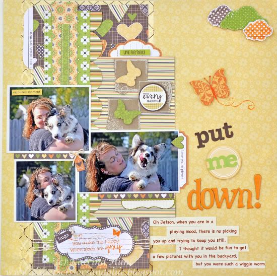
"Put me Down" by Katrina Hunt
Supplies - Patterned Paper: Jillibean Soup (Dutch Mustard Collection); Transparency: Hambly Studios; Kraft Elements: Hambly Studios; Ink: Jenni Bowlin Ink; Stamps: Unity Stamp Co-Jillibean Soup (Blossom Soup Collection); Adhesives: Scotch ATG, Fabri Tac and Scrapbook Adhesives; Twine: The Twinery Baker’s Twine (Buttercup); Letter Stickers: Jillibean Soup (Dutch Mustard Collection); Chipboard Letters: American Crafts Thickers
I loved this sketch when I first saw it. I started to do it exactly like the sketch, but then decided to mix it up a bit. I flipped it, did my pictures a little differently and added here and there.
• Variation 1 - I flipped the back part of the sketch where the strips are.
• Variation 2 - I moved the clouds to work with what I had done.
• Variation 3 - My pictures are almost the same, but I had to turn one the bigger one to make it work with the sketch. And my sizes are slightly bigger than what the sketch called for.
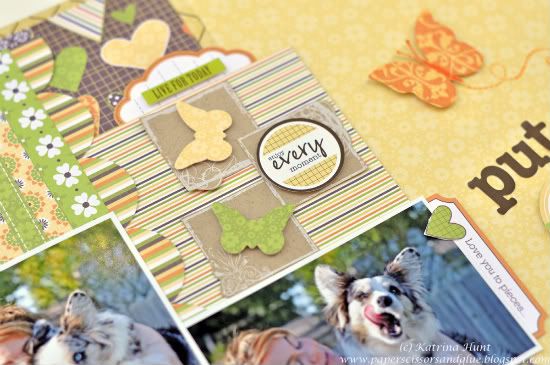
• Variation 4 - Moved my journaling and added extra embellishments to the clean areas of the sketch.
• • • • • • • • • • • • • • • • • • • • • • • • • • • • • •
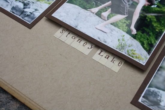
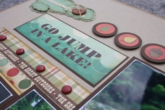
"Go Jump in a Lake" by Carolyn Wolff
Supply List - Patterned Paper and Stickers: Cosmo Cricket; Cardstock: Bazzill; Alpha Stickers: Making Memories; Brads: Basic Grey; Ink: Ranger Distress Ink (Vintage Photo); Floss: Bazzill; Cloud Die: My Favourite Things; Sanding Tool: Basic Grey; Marker: American Crafts; Buttons: unknown
Love this sketch! I just had to turn it into a double page for my photos.
Variation #1 – The most obvious variation is that I turned the sketch into a two-page layout. I loved this sketch but I had too many photos that I wanted to use. I just stretched out the basic design and added a second page.
Variation #2 – I used the sketch and started making my layout from the middle out. You can see the horizontal photo is in the middle of my layout. I added a vertical photo to the right and added extra smaller photos along the bottom. I filled in with stickers and other embellishments.
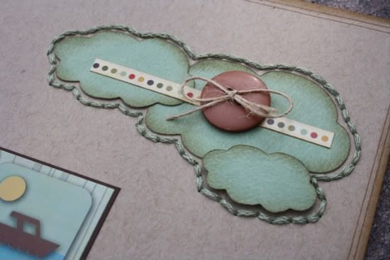
Variation #3 – I created two sets of the cloud embellishments and added stitching around them instead of through them. I embellished with a sticker and button.
Variation #4 – I eliminated the flags that were shown on the sketch and kept my title fairly simple. I played around with some letter stickers too, but I just couldn’t get it to work like I wanted.
• • • • • • • • • • • • • • • • • • • • • • • • • • • • • •
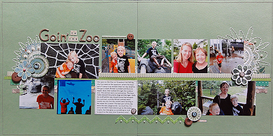
"Goin' to the Zoo" by Jennifer Larson
Supplies - Cardstock: Bazzill; Patterned paper: Cosmo Cricket, Studio Calico, Basic Grey, My Mind's Eye; Chipboard letters: Studio Calico; Stickers: Basic Grey (letters), 7gypsies (date), My Mind's Eye (Zig Zag); Brads: Basic Grey; Punches: EK Success; Pearls, buttons: Stampin' Up!; Floss: DMC; Pens: Zig, American Crafts; Other: Machine Thread.
1. I loved the sketch but wanted to fit more photos from our zoo trip, so I made a two page layout. The left side fits the sketch almost exactly; to do the right side, I flipped the sketch, putting the bigger photos on the bottom and the smaller photos on top.
2. I didn't have many embellishments left from an old kit, so I cut out flowers from patterned paper and used them as embellishments.
3. For added interest, I hand drew more flower petals and stitched them. I also stitched an Algerian eye in the O's of the title, which you can see in one of the detail shots.
••••••••••••••••••••••





2 comments:
I didn't have my computer all week to it being broken, so had to read all weeks of sketches.
All of you did amazing with this sketch. Love love the titles, colors, designs and sweet pictures on them. This is going to be a favorite sketch it's so cute and fun to use. Way to go ladies on this week. Thanks Allison for another great idea!!
Love the way the sketch was stretched to incorporate 2 pager scrappers like myself. I really want to work with this layout! All the interpretations were inspiring for one reason or another. THANK YOU to all for sharing your creativity with us. fancynan
Post a Comment