•••••••••••••
Two-page Sketch #19
You can download and print this sketch by clicking on the two-page sketches link found under the "printable sketches" tab on the right sidebar.
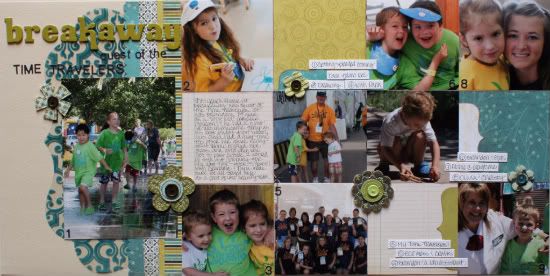
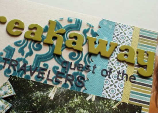
"Breakaway..." by Christine Chain
Supplies - patterned paper: My Mind's Eye, Cosmo Cricket; transparency: Fancy Pants; letter stickers: American Crafts and Basic Grey; flower stickers: Basic Grey; scalloped punch: EK Success
I love this sketch! I got quite a few good sized photos on this layout, plus a ton of patterned paper. The bonus was that I had the die-cut transparency in my stash that worked perfectly with the rest of the layout.
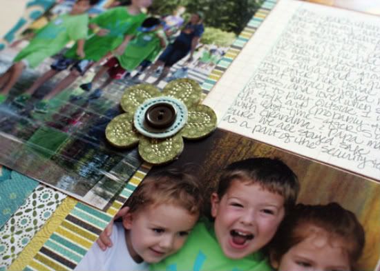
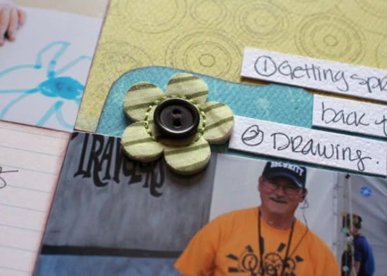
I pretty much stuck exactly to the sketch, except I added in a few flowers that I had in my stash. I like how it added an extra pop near the journaling strips.
Here's a closer look at the details:
• • • • • • • • • • • • • • • • • • • • • • • • • • • • • •
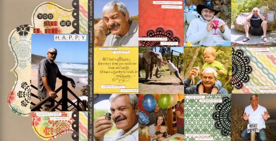
"You Make Me So Very Happy" by Lynette Jacobs
Supply list - Cardstock: Bazzill; Printed papers: Echo Park (For the Record); Doilies: Maya Road; Alphas: Echo Park; Other: DMC Cotton
• My dear husband always plays the fool when I am taking photos and I have always threatened to do a layout of his "silly pics". This sketch was perfect for them.
• I kept to the sketch and replaced the striped striped with the "remember this" strip.
• I stitched around my die cut and did faux stitching on the blocks.
• I replaced the small scallops with the doilies.
• • • • • • • • • • • • • • • • • • • • • • • • • • • • • •
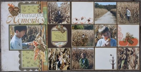
"Treasured Memories" by Carolyn Wolff
Supply List - Cardstock: Bazzill; Patterned Papers: We R Memory Keepers, Basic Grey; Die-cut Embellishments: Imaginisce; Corrugated Hearts: Jillibean; Mini Tickets: Maya Road; Bakers Twine: Jillibean Soup; Rub-ons: Pink Paislee, My Mind’s Eye, Me & My Big Ideas; Date Stamp: Close to my Heart; Ink: Ranger; Brads: We R Memory Keepers; Buttons: Basic Grey
I love a sketch that gives me a challenge, and this one did for sure. In the end, I think it may be one of my favourite layouts.
Variation #1 – I used a horizontal photo as the main photo for my layout rather than the vertical one that is shown on the sketch. I used the 4x4 concept for the rest of the layout, but I chose to mat my photos so they ended up being a bit smaller.
Variation #2 – I used rub-ons in the place of the bracket shapes shown in the blank squares on the right page
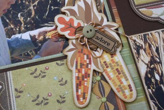
Variation #3 – I added clusters of die-cuts and embellishments in a few different spots on my page. This added a few focal points and some dimension.
• • • • • • • • • • • • • • • • • • • • • • • • • • • • • •
"Two Cute" by Janette Kincaid
Supplies - Patterned Paper: Sarah Milne for Scenic Route (North Shore Sunset); Cardstock: Bazzill; Accessory Sheet: My Mind’s Eye (Ooh La La- For Him); 4x6 Transparency: My Mind’s Eye (Bohemia – You Are My Sunshine); Corrugated Kraft Alphas: Jillibean Soup; Adhesive: Helmar Scrapdots and 450 Quick Dry; Journal Pen/Marker: Zig Black; Distress Ink: Ranger (Pine Needles); Floss: DMC; Misc: olive eyelettes
I followed the sketch almost to the letter with just a few little variations:
Variation 1: The most obvious change is the left page and the location of my title – framing the top left corner of the photo with the corrugated alpha. I used a little of Ranger’s Pine Needles Distress ink to highlight the edges.
Variation 2: I added a cluster of embellishments to the bottom left corner of the featured photo – it was one of the last things I added to the layout – it just needed something – so I repeated the eyelette and floss details from the grid on the second page and layered some of the tags from the Accessory Sheet over top.
Variation 3: The sketch called for stitching along the 4x4 grid of photos. I loved this idea but thought the stitching might take away from the photos (plus I didn’t really want to spend the time – wink!) so I added some eyelettes and threaded the floss through to create large loops of thread.
I love how it turned out! To keep the floss straight on the inside edges, I cut tiny slots/notches for the floss to sit in. I think this is my favourite part of the whole layout!!
Variation 4: I switched up the location of the plain 4x4 squares. I played around with the location of my photos and found a configuration I liked. Then I filled in the empty spaces with patterned paper and more bits from the Accessory Sheet.
A few other tid-bits:
• I used a 4x6 transparency over my featured photo. The transparency is hard to see in the images - and even looks white in the full layout image – but there is a teal coloured scroll pattern around the outside of the transparency.
• The dots for the ‘j’ and ‘i’ in the corrugated alpha sheet make perfect circles to add more detail.
• The brown vertical strip of paper on the left page is actually the bar code/name strip from the My Mind’s Eye patterned paper. The company logo and collection name are hidden under the featured photo!
•••••••••••••••••




9 comments:
WOW, what a awesome and fun sketch to have this week. I love grid looks and all the photos and PP look great on all of these layouts. Loved every single one of them. GREAT JOB LADIES!!
Love this sketch and all the variations of it. Wonderful work from all the designers.
Beautiful LO's! Love the idea of using eyelets and floss instead of stitching.
I am LOVING ALL of these layouts! Thanks Allison for another great sketch!! Can't wait to use it again!
Lynette, your LO made me smile! He seems like a fun guy to have around LOL TFS
I forgot to say..great idea with the eyelets Janette! I will have to steal that next time I don't have time to do that much stitching but still want that design element. TFS
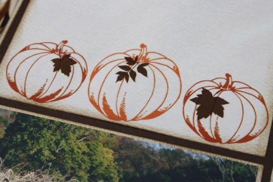
Carolyn, love those leaves on your pumpkins..makes them just "pop"!
Christine, LOVE your colors and choice of fonts. Love that die-cut too, it all goes so nicely with 1 another! Great job ladies, I am excited about this week!
Thanks for the comments about replacing the stitching with the eyelettes and loops of thread. I got the idea from here...during Stitching Week, I think it was Robbie that offered a layout with this same technique?
Love the LO's today and the sketch is great. Love the eyelets and floss technique too. Thanks for sharing!
Love this sketch. Can't wait to give it a try. Thinking it would be great for Christmas pics. Will be checking in all week for more inspiration. :)
As soon as I saw the sketch, I loved it and knew the layouts would be wonderful...and I was not disappointed! They are all fantastic and I can't wait to use the ideas on a page myself!
Post a Comment