•••••••••••••
Two-page Sketch #19
You can download and print this sketch by clicking on the two-page sketches link found under the "printable sketches" tab on the right sidebar.
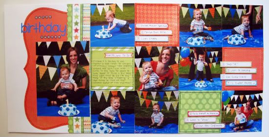
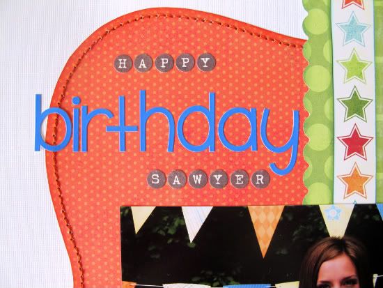
"Happy Birthday Sawyer" by Melissa Bell
Supply List - Patterned Paper: My Mind's Eye; Ink: ColorBox Chalk Ink and Inkadinkado; Letter Stickers: My Mind's Eye and Doodlebug; Label Embellishments: My Mind's Eye; Border Punch: Fiskars; Floss: DMC; Other: White Cardstock
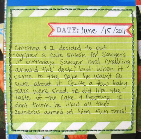
I was so excited when I saw this sketch! I love sketches that allow you to show off lots of photos. This sketch was perfect to scrapbook my nephew's cake smash. You will notice that I didn't use any birthday related scrapbook products. I think the pictures tell the story best.
Variation #1 - Instead of stitching lines across the pictures and embellishment squares I just stitched around each embellishment square. That took more than enough time!
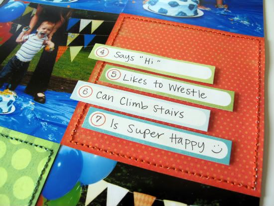
Variation #2 - I omitted the brackets on the embellishment squares. My paper strips take up quite a bit of room so the brackets would have been lost.
My strips list 10 things about my nephew Sawyer at age one.
Variation #3 - I stitched around the large bracket on the left side of the page. I think it adds some subtle definition.
• • • • • • • • • • • • • • • • • • • • • • • • • • • • • •
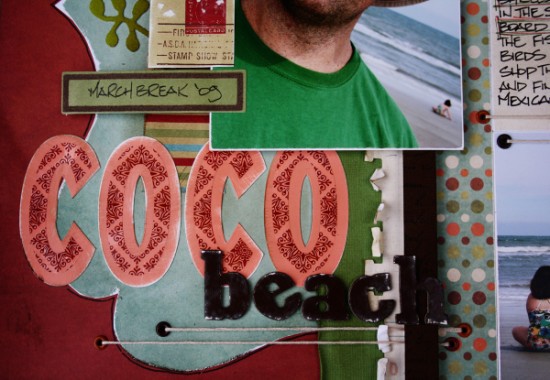
"Coco Beach" by Janette Kincaid
Supplies - Patterned Paper: We R Memory Keepers (Granma’s Kitchen, Dippity Dot, and Rich Ribbon), 7Gypsies (Family Profile); Cardstock: Bazzill; Iron On: Donna Downy for Prima; Flocked Stickers: Making Memories (Travel); Alphas: Chatterbox Shadow Stickers (Scarlet/Burgundy) and American Crafts (Thickers); Journaling Ticket: Tim Holtz (idea-ology); Adhesive: Helmar Scrapdots and 450 Quick Dry; Journal Pen/Marker: Zig Black; Distress Ink: Ranger (Walnut Stain); Floss: DMC; Other: brown eyelettes, foam core
I loved this sketch so much that I created two, almost identical layouts with it. The colour scheme, photos and patterned papers change and make them look so different. Again with this layout, I followed the sketch almost to the letter with few variations.
Variation 1: I moved the title to the bottom left for this layout. With my choice of the green iron-on embellishment, I didn’t want to clutter up the top of the page with letters.
Variation 2: I had to move the feature photo up a bit in order to allow room for the title and a bit of extra stitch detail.
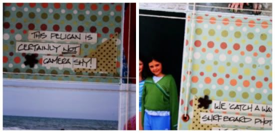
Variation 3: I repeated the same floss accents in the 4x4 grid to mimic the stitching detail in the sketch. As in my previous layout I added some eyelettes and threaded the floss through to create large loops of thread. To keep the floss straight on the inside edges, I cut tiny slots/notches for the floss to sit in.
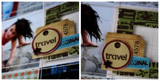
Here's a closer look at more of the details:
• • • • • • • • • • • • • • • • • • • • • • • • • • • • • •
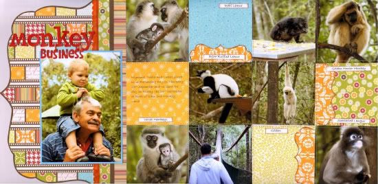
"Monkey Business" by Lynette Jacobs
Supply list - Cardstock: Bazzill; Printed papers: Jillibean Soup (Pasta Fagioli); Scalloped trim: My Mind's Eye (Fine and Dandy); Alphas: American Crafts and Paper Trunk
• I kept to the sketch with this layout only replacing the scalloped paper with scalloped trim.
• I machine stitced all the stitching as per the sketch.
•••••••••••••••••





4 comments:
What awesome layouts again today. Love the birthday one and the cake smashing idea, so cute.
the second one is pretty with all the colors and pictures.
I love the monkey's how fun to do this page. Great title too.
Really loving this sketch!
Great LO's again!
These are just perfect! I love the linear quailty and all of the pictures!
Post a Comment