•••••••••••••
Two-page Sketch #19
You can download and print this sketch by clicking on the two-page sketches link found under the "printable sketches" tab on the right sidebar.
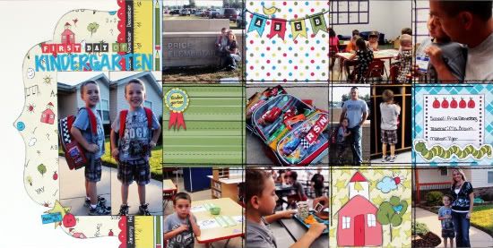
"First Day of Kindergarten" by Christina Hoffman
Supplies - Cardstock: Bazzill; Embroidery thread: DMC; Patterned paper and all other supplies: Nikki Sivils, Scrapbooker
Variation #1: I used two 2 1/2 x 7 photo's in place of the 5 x 7.
Variation #2: I used two 2 x 4 photo's in place of one of the 4 x 4 photo's.
• • • • • • • • • • • • • • • • • • • • • • • • • • • • • •
"Road Trip" by Jennifer Larson
Supplies - Cardstock: Bazzill (kraft), Stampin' Up! (natural); Die cut patterned paper: Jenni Bowlin; Patterned paper: October Afternoon; Stickers: October Afternoon; Die cuts: American Crafts; Stamps: Studio Calico; Ink: Stampin' Up!; Buttons: October Afternoon; Die cut letters: Quickutz; Punch: EK Success; Pen: Zig; Other: brads, machine thread, twine
1. I had just taken a bunch of photos using Instagram on our vacation, so I decided to print them as 4x4 photos and use them for this LO. I chose a nice family photo from the same trip for the 5x7 from my camera and used a vintage photo action on it to make it have a similar patina to the 4x4s.
2. I stayed very close to the sketch when it came to photo placement and layout.
3. I intended to do the brackets housing little journaling bits, but I stitched the photos down too soon and had to come up with an alternative plan (oops). Instead, I clustered various travel die cuts, stickers, and buttons and used label stamps for each photo.
4. To do the die cut paper, I hand cut the center out of the original sheet and used it to trace a new center out of the red bandana paper.
5. I like layering die cut title letters to give them greater contrast. Outlining the letters makes them stand out more.
• • • • • • • • • • • • • • • • • • • • • • • • • • • • • •
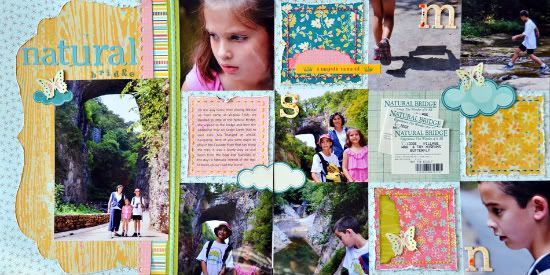
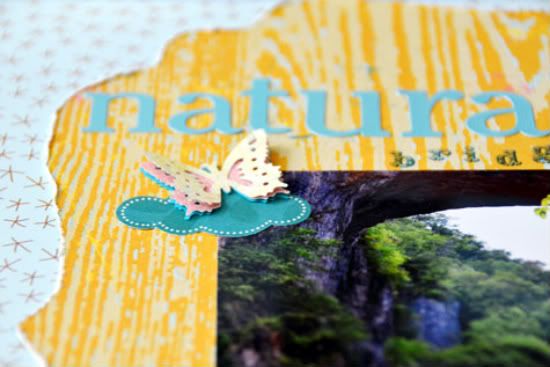
"Natural Bridge" by Suzanna Lee
Supplies - Patterned Paper: American Crafts, My Minds Eye, Authentique, Bella Blvd, Studio Calico; Alpha Stickers: Heidi Grace; Alpha Rub On and Ribbon: American Crafts; Chipboard Letters: Heidi Swapp; Punch: EK Success; Element: Authentique; Mist: Studio Calico; Ink; Tim Holtz
I pretty much stayed true to the sketch with very little "deviation". The biggest difference is that I opted not to stitch the grid. I did stitch however, opting for only the four squares. I have yet to figure out how to machine stitch on my pictures and not have the foot leave a mark on the pictures. I also omitted a picture and used that square for the entry tickets. I have boxes and boxes of "stuff" that I have saved and never put in my books. I'm trying to do a better job of using more and saving less. I also used a trio of clouds and elements for some added embellishment as well as the first initial of each of us.
• • • • • • • • • • • • • • • • • • • • • • • • • • • • • •
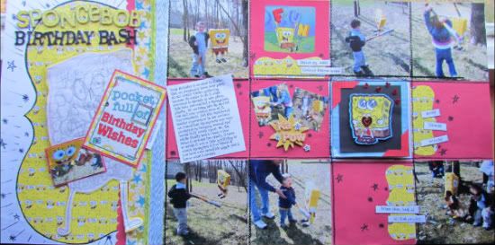
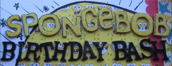
"Spongebob Birthday Bash" by Amy Roller
Supplies - Patterned Paper: Sandy Lion, Two busy Moms, unknown; Ribbon/Twill: unknown, Jillibean Soup; Cardstock: CTMH and Bazzill; Stickers: Unknown, BoBunny, K&Co; Other: Sharpie marker
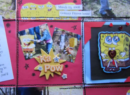
I followed the sketch fairly close on this one. I didn't have a die cut paper that matched my color palette or theme so i just traced around another one from my stash onto the back of the Spongebob paper I wanted to use and then hand cut it, making my own.
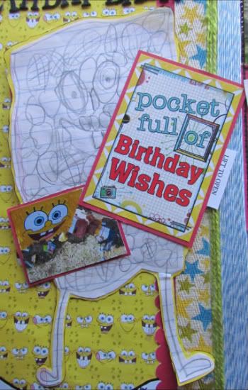
The flap and Spongebob drawing are the other variations I made to the page. I wanted to keep his drawing he did for his Birthday that year and incorporate it into the page so I used it in place of the 5 x 7 pic. This worked well because it's roughly the same size.
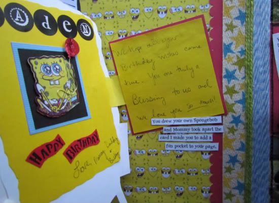
I added a sticker and another small photo here as well. I made this area a moveable element with a hinged area that you can lift for more journaling and memorabilia.
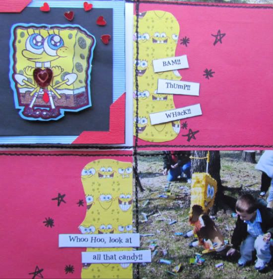
Next I put my squares in place along with the 4 x 4 photos. I did add an embellishment in place of one of the pictures on the right side.
It was from the Birthday card I made him that year. I also added another part of the card under the flap on the left side.
I kept with the 4 x 4 pics and squares for the others with exception of one. On the square next to the journaling box I added two small square pics and an embellishment on top of a 4 x 4 square.
This allowed me to add more pictures and follow the theme of the layout with the "KA POW" sticker without really messing up the overall 4 x 4 design.
Because my papers were so themed and specific, I didn't have a coordinating group to pull other patterns from. Instead I used twine and twill ribbons in place of the pattern paper strips and stripe. They also helped me pull in more colors that coordinated with the pictures rather than my main diecut papers.
The overall theme of the layout was lots of animation and movement. I wanted it to have a child-like cartoon feel to it and so there are little "doodles" and very graphic bold faux stitch lines. It's not meant to be exact, which is not my norm, but was definitely more fun and less stressful making! I didn't worry about it all being just right, I had more fun with it. I love it when my actual photos inspire me! I would have NEVER doodled and such on a layout before so this was a teeny step out of my usually very organized box!
••••••••••••••••••••••




6 comments:
You ladies are really rockin this sketch for the week. These are all amazing and fun. Love all the themes and that SpongeBob one is just too cute. Great job ladies!!
These are stunning...I can see how I can use this sketch again and again.
Christina, this sketch is perfect for a school LO..it turned out so cute..love the colors and great pics!
Love the vintage/traveled feel your page has Jennifer and all the little "treasures" throughout it!
Suzanna, love the all the little areas of detail..so cute!
Loving this sketch and al the variations today..
I really enjoyed this sketch! Another great job.
These layouts just keep getting better and better! Love them all!
Post a Comment