•••••••••••••••
Two-page Sketch #20
You can download and print this sketch by clicking on the two-page sketches link found under the "printable sketches" tab on the right sidebar.
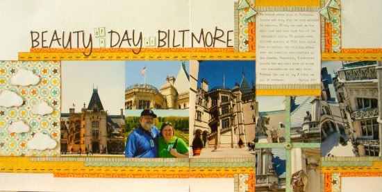
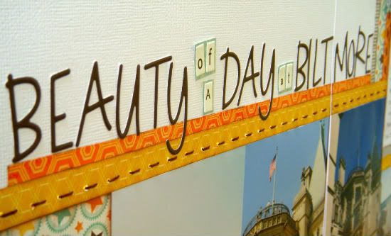
"Beauty of a Day at Biltmore" by Sue Althouse
Supplies used - Cardstock: American Crafts; Patterned Paper: My Mind's Eye (Fine and Dandy, Stella & Rose Hattie); Punches: Fiskars; Letters: Bella Blvd. Sophisticates; Brads: My Mind's Eye (Fine and Dandy); Pennants: My Mind's Eye (Fine and Dandy Layered Stickers)
I think the two-page sketches are my favorite. I rarely attempt a two-pager without referring to the Sketch Support blog or one of the volumes of Sketches for Scrapbooking. Since we take so many vacation photos, these tend to be the subject of my two-page layouts. I stayed pretty close to the sketch for this one.
Variation #1: used clouds instead of hearts and changed the placement of embellishments around the layout.
Variation #2: omitted one of the suggested paper strips in the vertical lines.
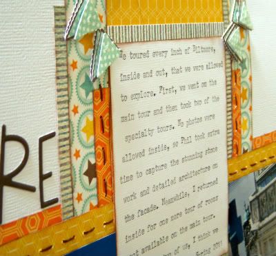
Variation #3: shortened my journaling block and added more patterned paper strips.
Variation #4: substituted four 2x3 photos for the six 2x2 photos and separated them with paper strips.
••••••••••••••••••••


3 comments:
Great job on this Sue, love the colors you picked. The title is a cute one with big & tiny font mixed in. Thanks for sharing.
Beautiful!! I absolutely love Biltmore and Ashville and I think your page captures the fun spirit and the beauty of those places. Great job!! :)
So cute Sue!!!!! I love the title work!
Post a Comment