•••••••••••••••••
One-page Sketch #18
You can download and print this sketch by clicking on the one-page sketches link found under the "printable sketches" tab on the right sidebar.
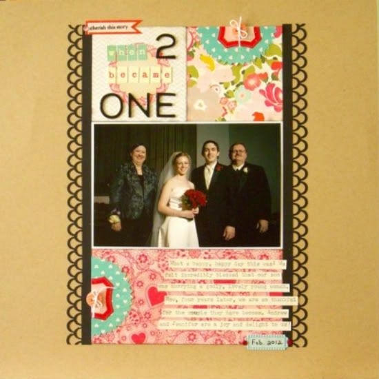
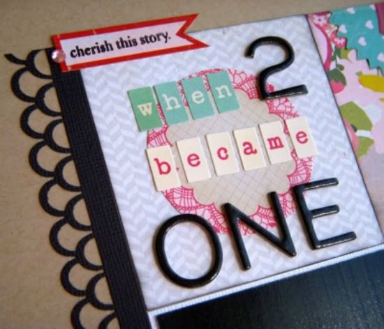
“When 2 Became One” by Sue Althouse
Supplies - Cardstock: Bazzill; Patterned Paper and Stickers: Crate Paper (Paper Heart); Alphabet: American Crafts, October Afternoon; Jewels: TPC Studio; Border Punch: Martha Stewart; Stamp: Technique Tuesday; Ink: Hero Arts; Other: black chalk ink, Nestabilities small pinking circles, buttons, white thread
I love the basic design of this sketch and couldn't help but use it again. Even turned on its side, it looks great!
Variation #1 - Rotated the sketch.
Variation #2 - Substituted patterned paper for the smaller photos and journaling block.
Variation #3 - Added punched border strips to both sides of the collage.
Variation #4 - Moved the title, journaling strips and embellishments onto the collage.
Variation #5 - Omitted the big heart background.
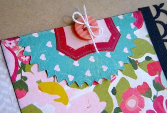
Variation #6 - Substituted jewels and buttons for the hearts.
• • • • • • • • • • • • • • • • • • • • • • • • • • • • • •
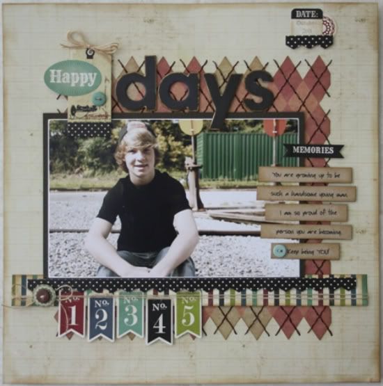
“Happy Days” by Carolyn Wolff
Supply List - Cardstock: Bazzill; Patterned Paper: Lily Bee, We R Memory Keepers, Echo Park; Stickers: Echo Park; Ink: Ranger Distress Ink; Floss: DMC; Buttons: My Mind’s Eye; Chipboard Alphas: Bo Bunny; Twine: PTI
Variation #1 – I replaced the large heart in the background with an argyle pattern paper. I cut out along the design and hand-stitched the pattern with brown floss.
Variation #2 – I sort of flipped the sketch by moving my photo to the left side and adding my journaling to the right side. I used strips of journaling instead of a block of journaling and I used only one larger photo instead of the three shown on the sketch.
Variation #3 – I eliminated the heart clusters on the sketch and replaced them with stickers that coordinated with my layout.
• • • • • • • • • • • • • • • • • • • • • • • • • • • • • •
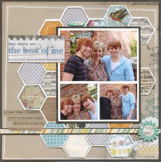
"The Best of Me" by Penny Grimsley
Supplies - Cardstock: Bazzill; Patterned paper: My Minds Eye, Basic Grey; Embellishments: My Minds Eye; Punch: EK Success; Embroidery Thread: DMC; Fonts: Another Typewriter, Bleeding Cowboys
Variation #1 - I changed the background shape from the heart to the honeycomb and added stitching on the honeycomb.
Variation #2 - I added a double cardstock mat under the photos.
Variation #3 - I changed the orientation of the photo block to match my photos.
Variation #4 - I replaced the journaling block with journaling strips to showcase the honeycomb.
Variation #5 - I eliminated the smaller clusters of shapes, as the honeycomb paper was quite busy.
Variation #6 - I matted the page on a darker brown cardstock to contrast the kraft.
Variation #7 - I added a mat under the stripe to help set it off and eliminated the stitching there.
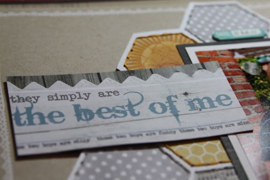
Variation #8 - I created my own title tag in PhotoShop Elements.
Variation #9 - I added a chipboard sticker to the right side of the striped strip to help balance the layout.
•••••••••••••••••••

.jpg)

3 comments:
How do you achieve the "honeycomb" look? Lovely!
Great layouts Ladies!! Love how you used the sketch and replaced the large heart shape.
Love Penny's layout with the hexagons.
Post a Comment