••••••••••••••••••••••
Two-page Sketch #25
You can download and print this sketch by clicking on the two-page sketches link found under the "printable sketches" tab on the right sidebar.
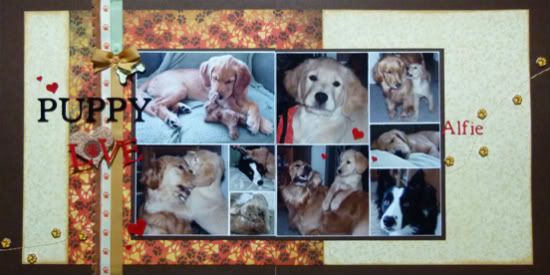
"Puppy Love" by Michele Edwards
Supplies - Cardstock: Bazzill, Bo Bunny; Patterned Paper: Basic Grey; Embellishments: Micro Beads from DeSerres, Paw prints are Jolees; Ribbon: KaiserCraft; Alphabets: Cricut (Plantin Schoolbook); Floss: DMC; Misc: Glossy Accents
Variations
1. I loved the photo sizes in the sketch, and so didn't change them, I simply rearranged a few of them. I matted the entire photo block.
2. I used ribbon for the vertical paper strips on the left side of the page. I tied a cute little bow near the top.
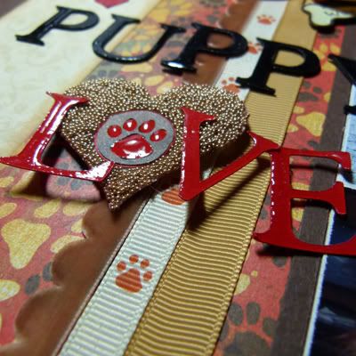
3. I wanted the title to appear wet, like the letters were just lavished with puppy kisses, so I coated them with Glossy Accents.
I used the microbead encrusted heart as the 'O' in the word LOVE, and floated the letters over the layout.
4. I removed the journaling strips.
5. Instead of flower embellishments on the right page, I stitched a curvey line across the layout and then placed little paw prints along its length.
• • • • • • • • • • • • • • • • • • • • • • • • • • • • • •
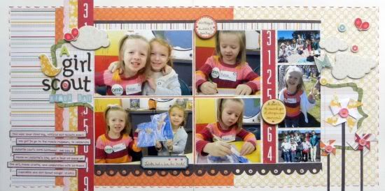
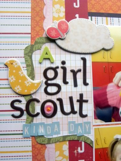
"A Girl Scout Kinda Day" by Ashley Horton
Supply List - Cardstock: Die Cuts with a View; Patterned Paper: October Afternoon, Crate Paper and Anna Griffin; Adhesive Chipboard: Cosmo Cricket; Brads: Bazzill; Thickers: American Crafts; Mini Market Stickers: October Afternoon; Stickers: October Afternoon; Font: CK Handprint; Edgers: Provo Craft; Embroidery Floss: Janlynn; Pen: Zig Memory System; Adhesives: 3L Mounting Squares, Zig Memory System and Recollections
Variation #1 - I made most of my changes to the sketch, in the sizes of the photos that I used. Instead of the two 2x2 and one 4x4 on the left page, I used a 6x4. I also changed the 3 photos on the far right hand side from two 3x3 and one 3x2, to two 2.75x2 and one 2.75x4.
Variation #2 - I added border strips above and below the photo grid.
Variation #3 - I stitched along the perimeter of the page.
Variation #4 - I added a frame (mat) behind the title and the pinwheels (which I added in place of the flowers on the sketch).
Variation #5 - Because of the size of my title, I moved the journaling strips down a little further on the page.
• • • • • • • • • • • • • • • • • • • • • • • • • • • • • •
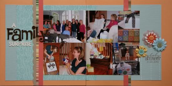
"A Family Surprise" by Noey Hunt
Products used - Patterned papers: Cosmo Cricket (stripes), Bella Blvd (rain drops); Flowers: Making Memories, Prima; Stamps: Close To My Heart; Letters: Prima (cream), American Crafts (Thickers)
Variation 1: I shrunk the sketch. The album this layout goes in is only 8x8 inches, so I took all the sizes and shrunk them to 2/3 the original size. The largest photo is 3x4 inches.
Variation 2: The photo block has the same overall dimensions of the sketch, but I couldn't make my photos fit as the sketch outlined. So I moved things around and combined some of the smallest photos into larger ones.
Variation 3: After working on an 8x8 album with 12x12 supplies, I had lots of scraps. The right page on this layout is patched together with scraps and I added the extra vertical strips to cover the seams.
Variation 4: I didn't have much journaling to do, so I skipped the journaling strips and added a little extra details with stamps under the flowers.
•••••••••••••••••••

.jpg)

3 comments:
These are all sweet layouts. Nice job on the sketch and making it your own.
What a cute puppy in the first layout, I miss my dog being that little.
Great pages today, love all the little tweaks everyone made to the sketch. This must have also been adorable picture day, love the kids and puppies!
Great work Ladies!! Love what I've seen so far with the Two Page sketch!!
Post a Comment