••••••••••••••••
Two-page Sketch #27
You can download and print this sketch by clicking on the two-page sketches link found under the "printable sketches" tab on the right sidebar.
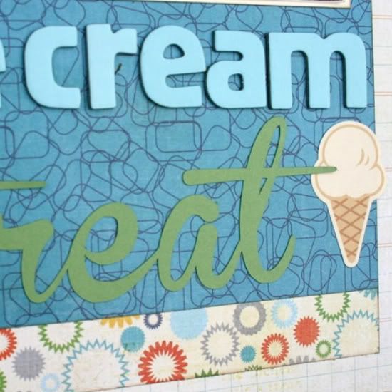
"Ice Cream Treat" by Cherie Nymeyer
Supplies - Cardstock: Stampin' Up!; Patterned Paper: Echo Park; Letter Stickers: American Crafts; Die Cut Title (Treat), Silhouette; Sticker: October Afternoon; Die Cut Tag: My Little Shoebox; Stamp: Unity Stamp Co; Ink: Stampin' Up!
Variation #1 - I made this sketch a single page layout instead of a two-page layout.
Variation #2 - On page one, I centered my patterned paper instead of bringing it right to the edge.
Variation #3 - I clustered my embellishments to the left of my small square photo instead of underneath it.
Variation #4 - I did a journal block instead of journal strips.
• • • • • • • • • • • • • • • • • • • • • • • • • • • • • •
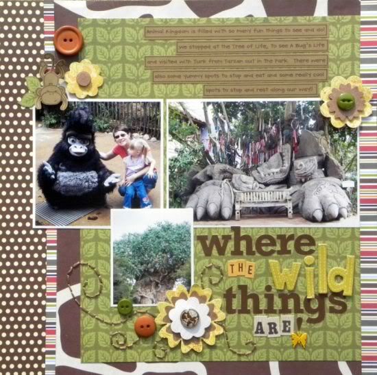
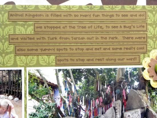
"Where the Wild Things Are!" by Ashley Horton
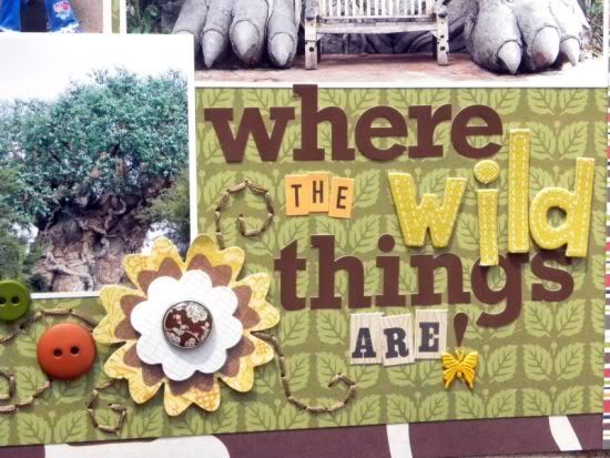
Supplies - Cardstock: The Paper Studio; Patterned Paper: Jillibean Soup, The Paper Studio, Crate Paper; Letter Stickers: Jillibean Soup and October Afternoon; Thickers: American Crafts; Font: CK Handprint; Ink: Memento; Layered Flowers: K&Company; Buttons: Blumenthal Lansing; Embroidery Floss: Janlynn; Other: Acrylic Stamp and Brads
Variation #1 - I used the left hand side of the sketch to create a one-page layout.
Variation #2 - I changed the size of the smaller 2.5x2.5 photo to 2.5x3.
Variation #3 - I added an embellishment cluster to the top left-hand corner of the layout.
Variation #4 - Since my page ended up being a one-pager, I added one of the thin striped pieces of paper to the far right-hand border of the page.
Here's a closer look at the details:
• • • • • • • • • • • • • • • • • • • • • • • • • • • • • •
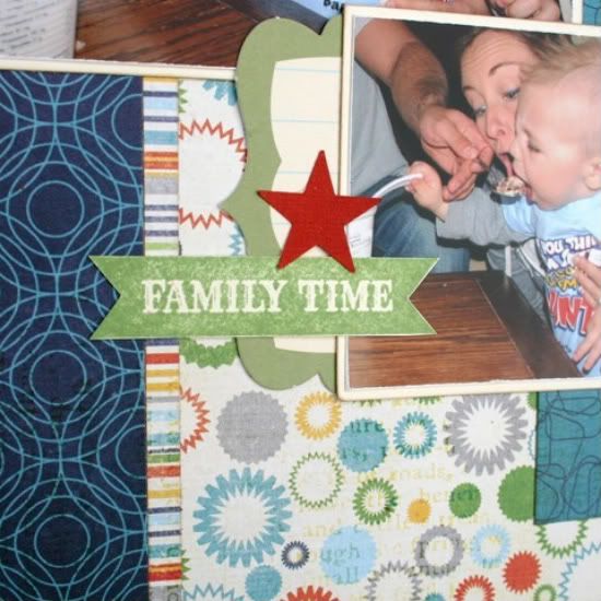
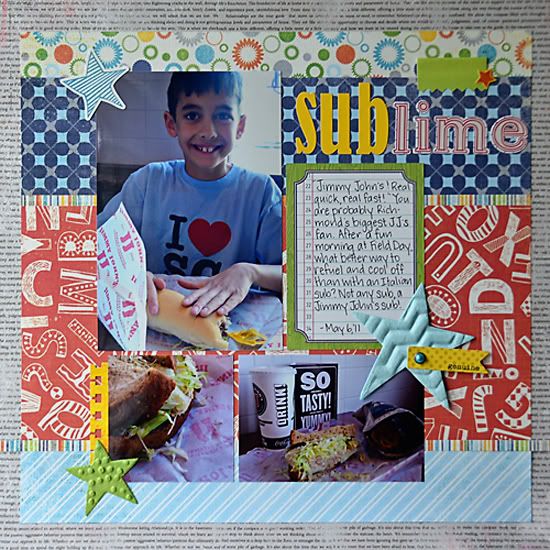
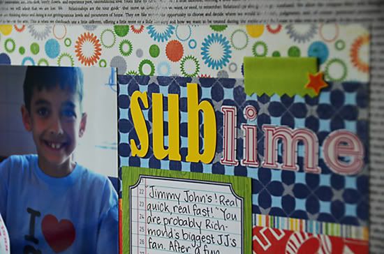
"Sub-limet" by Suzanna Lee
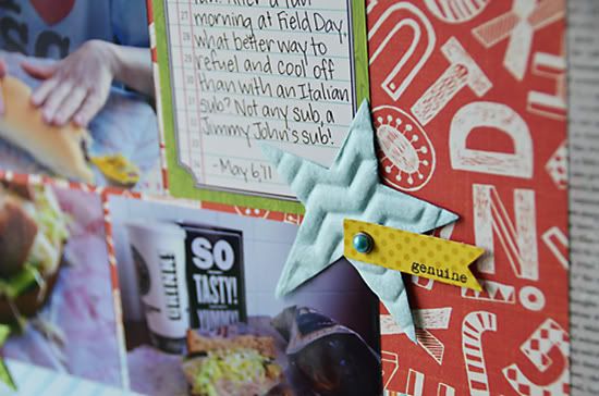
Supply List - Patterned paper: Authentique, Echo Park, Basic Grey, Jillibean Soup; Letter stickers: Jenni Bowlin, Bella Boulevard; Tabs: K&Co; Stars: Bazzill; Stickers: Echo Park
Variation 1 - I used the right hand side of the sketch and flipped it 90 degrees.
Variation 2: Instead of the three 2.5x2.5 squares, I used one square picture sized 2.5x2.5 and a longer picture of the same height.
Variation 3: The "background" piece that overlaps from the second page is omitted as there is enough movement in the different papers I used.
Variation 4: The addition of a title and embellishments not present in the sketch but necessary on a one pager.
Here's a closer look at the details:
• • • • • • • • • • • • • • • • • • • • • • • • • • • • • •
Meet the Creative Team Blog Hop!
Be sure to check back tomorrow for our "Meet the Creative Team" Blog Hop. There will be a new sketch, lots of giveaways and you'll get a chance to hop around to each creative team member's blog to see how they used the new sketch! It's going to be a great time!
•••••••••••••••••••••••


3 comments:
Great takes on the sketch Cherie and Suzanna!!
great layouts ladies!!
I love the different looks and how each of you turned it into a one page layout. The blog hop sounds like fun, looking forward to it!
Post a Comment