•••••••••••••••••••••••
You can download and print this sketch by clicking on the one-page sketches link found under the "printable sketches" tab on the right sidebar.
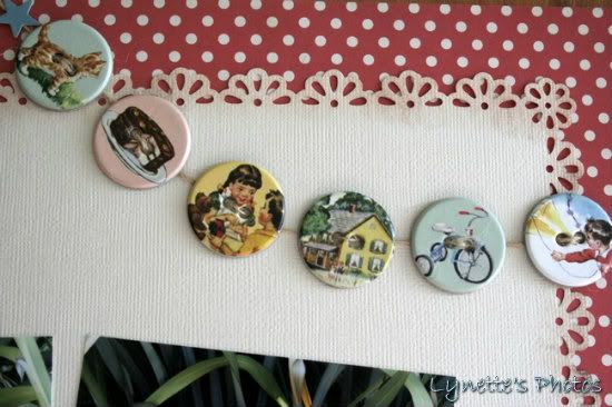
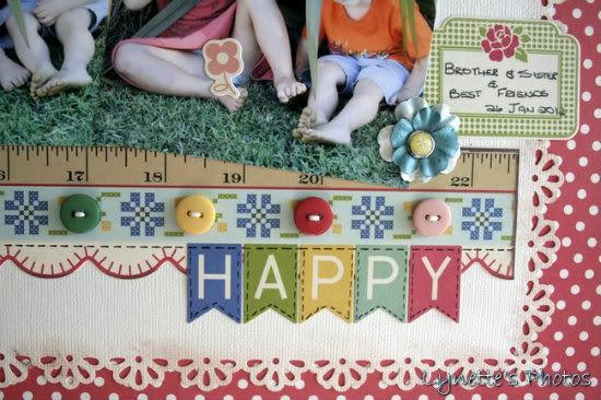
"Happy" by Lynette Jacobs
Supply list - Cardstock: Bazzill; Printed papers: Cosmo Cricket, October Afternoon; Stickers: October Afternoon: Chipboard buttons: October Afternoon; Buttons: Basic Grey; Flowers: Prima; Brads: My Minds Eye
Variation #1: I die cut the Bazzill and pasted it over the dotty paper.
Variation #2: I made the banner from chipboard buttons.
Variation #3: I substituted the butterflies for flowers.
Variation #4: I made the flags the title.
Variation #5: I used two 4x4 photos.
• • • • • • • • • • • • • • • • • • • • • • • • • • • • • •
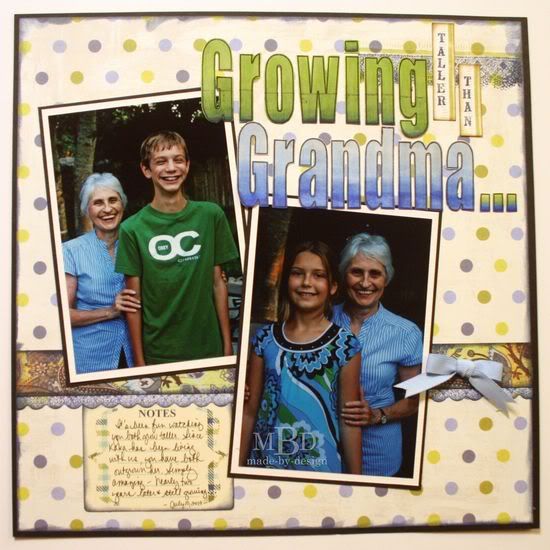
"Growing Taller Than Grandma." by Megan Bickers
Supplies Used - Cardstock: Georgia Pacific (White), Bazzill (Cream), Maple Press (Black); Patterned Paper: Basic Grey (Skate Shoppe: Indy Grab), My Mind's Eye (Wild Asparagus Blue/Green Polka Dot; Front Porch); Inks: Tsukineko (Memento: Tuxedo Black), Ranger (Distress Inkpad: Shabby Shutters, Walnut Stain, Chipped Sapphire); Stamps: Maya Road (Measure Twice Singleton), The Girls Paperie (Paper Girl), Jenni Bowlin (Lace Border), Technique Tuesday (Big Timber Alphabet), Hampton Art (Tiny Wooden Alphabet); Tools: Ranger (Foam Blending Tool); Markers: EK Success (Zig Writer: Black), Copic (B21, B24, B29, YG03, YG63, YG67, W3); Embellishments: Close To My Heart (Ribbon: Heavenly Blue), October Afternoon (Journaling Card: Detours)
Variation #1: I used larger photos by adding two 4x6" photos plus cream and black mats. This helped my photos stand out more on the page.
Variation #2: I matted my background pattern paper on a black cardstock and extended my pattern paper border to the edges along the bottom of the photos.
Variation #3: Instead of making the banner and pendant, I used a ribbon bow and stamped some lace and a ruler edge along the top of my layout.
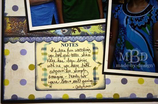
Variation #4: I added my journaling on a journaling card and moved it to the bottom left of my layout. The title was stamped and I colored the main letters with Copic markers to match.
••••••••••••••••••

.jpg)


3 comments:
Both these layouts are adorable, LOVE LOVE them!!
Great layouts, Ladies!! Lynette, I love that cute banner with the OA pins and Megan, your large title looks really awesome!!
Great pages ladies!! What a cute use for the chipboard buttons. Love it and the colorful papers!!
Post a Comment