••••••••••••••
Two-page Sketch #28
You can download and print this sketch by clicking on the two-page sketches link found under the "printable sketches" tab on the right sidebar.
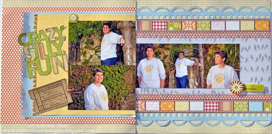
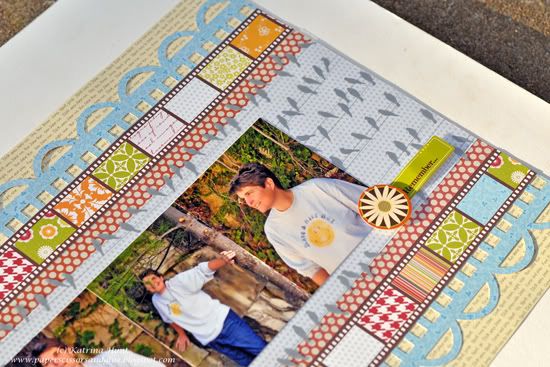
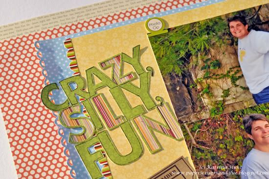
"Crazy Silly Fun" by Katrina Hunt
Supplies - Patterned Paper: Jillibean Soup (Pasta Fagoli, Chicken Noodle, Dutch Mustard, Blossom Soup, Old World Cabbage Stew); Stickers: Jillibean Soup (Old World Cabbage Stew and Chicken Noodle Soup); Transparency: Hambly Studio; Adhesives: Scotch, Martha Stewart and Scrapbook Adhesives; Ticket: Maya Road; Pen: Zig Micron; Title: Cut with Silhouette Cameo
Variation 1 - Left out a few of the pictures.
Variation 2 - Changed the stars to borders and made the border at the top and bottom of the right hand page.
Variation 3 - Added layers on both sides.
Variation 4 - Moved title up and journaling down.
• • • • • • • • • • • • • • • • • • • • • • • • • • • • • •
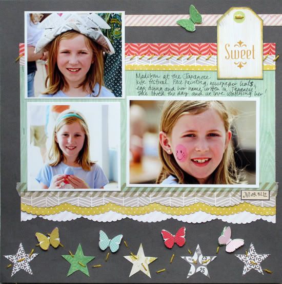
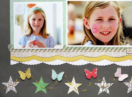
"Sweet" by Christy Arthur
Supply List -Patterned Paper: Crate Paper (Story Teller Tomorrow and Journey, Pretty Party Streamers, Confetti, Papercloth and Tag Cuts, Random Accent Cuts), My Minds Eye (Miss Caroline Dilly Dally Celebrate Token, Dolled up day Butterflies, Love Me Banners, On the Bright Side Yellow Chevron), Studio Calico (Abroad First Class, Classic Calico Dot One); Embellishments: Love my Tape (Gold Airmail), Crate Paper (Pretty Party Border Stickers), Studio Calico (Lemonade Mister Huey), Martha Stewart (Classic Butterfly and Scallop Punches)
Variation #1: I used the right side of the two page sketch to make my one page layout.
Variation #2: I moved the star border to the very bottom of the page. I then added some butterflies in with the stars and made it a curve instead of a straight border.
Variation #3: I used three photos for my layout.
Variation #4: I layered some additional paper under my patterned paper background.
• • • • • • • • • • • • • • • • • • • • • • • • • • • • • •
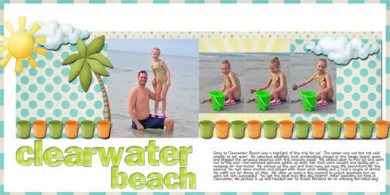
"Clearwater Beach" by Jill Sarginson
Supplies Used - Paper: Kristin Aagard's Tropical Paradise digital kit, Pond Play digital kit; Alpha: As You Wish Designs: Green Polka Dot; Font: DJB W; Cardstock: Bazzill Basics; Tools: Creative Memories circle cutting system; Other: Floss
Variations:
• I used one large photo on the left hand side vs. two 4x6 photos.
• I did not use the three smaller photos on the right hand side of the layout.
• I filled up the bottom area of the layout with journaling/title.
• • • • • • • • • • • • • • • • • • • • • • • • • • • • • •
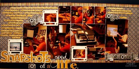
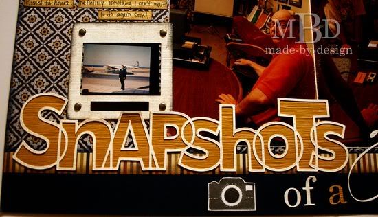
“Snapshots of a Good Life” by Megan Bickers
Supplies Used—Cardstock: DCWV (Solid Indigo), Bazzill (Cream, Yellow); Patterned Paper: Basic Grey (Granola: Jute), Bo Bunny Press (Pumpkin/Butter rum Linen), Sweetwater (Autumn Sweet); Inks: Marvy Uchida (Black), Ranger (Distress Inkpad: Pumice Stone, Walnut Stain, Chipped Sapphire), ColorBox (Fluid Chalk Ink: Charcoal); Stamps: My Mind’s Eye (Lost & Found: Union Square “Perfect”), Maya Road (Vintage Camera Singleton), Martha Stewart (World Travel), Hampton Art (DSR Camera); Tools: Ranger (Foam Blending Tool); Markers: EK Success (Zig Writer: Black); Embellishments: Making Memories (Pewter Brads); Adhesives: American Crafts (This To That: Foam Squares), Ranger (Glossy Accents); Other: Silhouette Cameo, CK Becky font (“good”), Elephant font (“life”), Georgia font (“of a”). Die Cut Shapes: Loni Stevens (Snapshots), SnapDragon Snippets LLC (Photo Slide Frame)
Variation #1: I varied the size of my photos a bit from what was pictured in the sketch. I turned my two 4x6” photos vertically on the left hand page, and used several larger 4x6” photos on the right hand page. I also printed my smaller photos as small wallets (2 x 3 ½”).
Variation #2: I increased the width of my main pattern paper to accommodate my photo sizes. I also added a stripe at the top and bottom for a border.
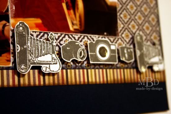
Variation #3: I added rows of stamped cameras for accent in place of the stars shown on the sketch.
The cameras were embellished with Glossy Accents. The photo slides were die cut from my Silhouette and frame several smaller photos. I added brads to the slides for dimension.
Variation #4: I added my journaling on small strips of the yellow pattern paper. The title was moved to the bottom of the layout and was created with die cut words and fonts cut from my Silhouette Cameo.
•••••••••••••••

.jpg)

2 comments:
WOW what great layouts these are today. Enjoyed them all and the way you make the sketch work for you. Fun themes for them also.
Thanks DT for always inspiring!
Great layouts as usual! I absolutely adore the way the title looks on the "Snapshot" layout! Great job to all!
Post a Comment