••••••••••••••
Two-page Sketch #28
You can download and print this sketch by clicking on the two-page sketches link found under the "printable sketches" tab on the right sidebar.
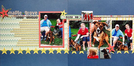
“Maple Grove Days Parade” by Jennifer Larson
Supply list – Cardstock: Bazzill; Patterned paper: Crate Paper, American Crafts, Kesi' Art, Echo Park; Stickers: Studio Calico, Jenni Bowlin, Crate Paper; Twine: Stampin' Up!; Floss: DMC; Punches: EK Success; Gems: Queen & Co.; Other: Button, twine, machine thread, pen
Variation #1- I used photos I had on hand rather than printing them specially sized, so I had to adjust the layout of the photos a bit, especially on the right side.
Variation #2- I moved the journaling so that the letter stickers would be more visible.
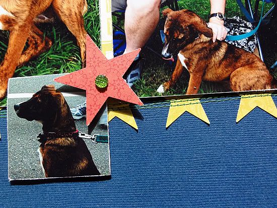
Variation #3- Rather than hand stitching around an element on the bottom, I hand stitched a star near the title to draw attention to it.
• • • • • • • • • • • • • • • • • • • • • • • • • • • • • •
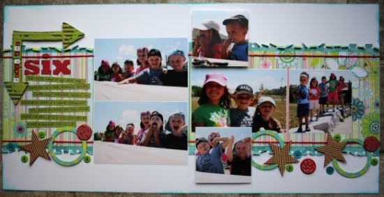
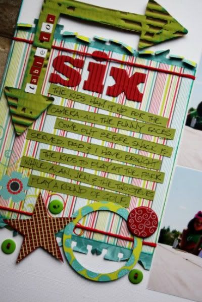
"Table For Six" by Janette Kincaid
Supplies - Cardstock: Bazzill; Patterned paper: BoBunny; Corrugated Alpha: Jillibean Soup; Letter Stickers: Making Memories, Cosmo Cricket; Corrugated arrow: Prima; Red Hemp String: Martha Stewart; Floss: DMC; Journal Pen: Zig; Ink: Color Box; Paint: Craft Smart; Punches: Marvy, Stampin’ Up; Adhesive: Glue Arts, Helmar; Unknown: buttons, brads, mesh, foamcore, sanding block
Part of me wonders if I should have used a coloured cardstock rather than the white for the background of this layout but when I tried a handful of coordinates, it didn’t feel as ‘right’ as the white. I light how light and airy the layout feels.
Variation #1 - I changed up the sizes and orientation of the photos on the right side page and used a total of four rather than the six the sketch called for.
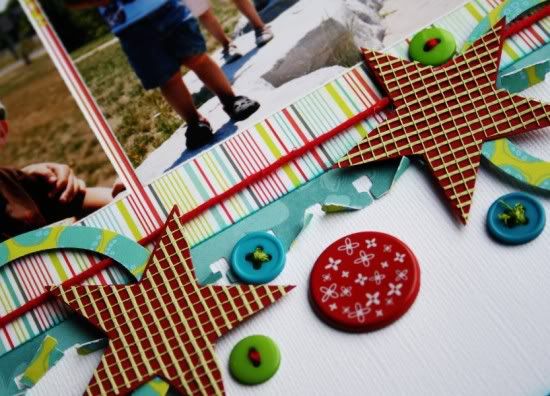
Variation #2 – I used a torn notebook edge punch on the thin horizontal strips of paper, adding a mirrored strip on the bottom.
Variation #3 – I used the same patterned paper for the background on both pages.
Variation #4 – Rather than taking the time to stitch on my layout, I used a thicker hemp string to add a splash of colour.
Variation #5 – I added more circles and less stars to the bottom of the layout, the varied size of circles adds interest and the buttons, brads and pop dotted paper adds depth.
Variation #6 – I flipped the location of the title and the journaling.
Variation #7 – I added the corrugated arrow for additional detail and interest.
• • • • • • • • • • • • • • • • • • • • • • • • • • • • • •
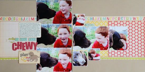
"In Your Face Chewy" by Allison Davis
Supplies - Cardstock: Bazzill; Patterned paper: October Afternoon; Stickers, die cuts, and flashcard: October Afternoon; Letter stickers: October Afternoon; Corrugated alphabet: Jillibean Soup; Heart punch: Martha Stewart
Variation #1 - The photos I really wanted to use with this sketch didn't allow much room for cropping for the photos on the right page. I didn't want to miss out on using my favorite pictures so I included an extra photo on the left page.
Variation #2 - On the right page I used another 4 x 6" photo in place of two of the 3 x 4" photos.
Variation #3 - I kept two of the 2 x 2" photos the same size but had to opt for a larger 2-1/2 x 2-1/2" photo for one of them. It just wasn't possible to crop it down any smaller.
Variation #4 - I didn't use stars along the bottom. In fact I didn't include anything along the bottom other than a scallop strip. I also included an "ABC" strip along the top.
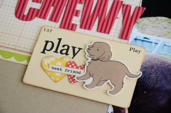
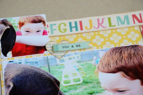
Variation #5 - I used hearts, flags/banners, a flashcard and a dog sticker in place of the star embellishments on the sketch.
Here's a closer look at some details:
•••••••••••••••••••••

.jpg)

3 comments:
Such cute and fun layouts these were. Lots of color also, enjoyed them all.
Allison, Drew looks so grown up now, great shots with Chewy.
Love all of these! Great job rockin' the sketch, Ladies!! :)
Love the layout. What ink brand and color did you use to ink all the edges? Also, could you please start including this in your supplies list?
Post a Comment