One of my favorite things about seeing layouts made from a sketch is the individuality that shines through in the way the creator interprets it. Everyone might see the same sketch but each person's creativity can go in completely different directions. Today's layouts are great examples of that. Katrina, Amy, and Shari each saw the same sketch and produced such unique elements on their layouts. While at first glance you might not see the sketch, you can see where the sketch played it's part in sparking an idea.
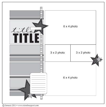
One-page Sketch #2
You can download and print this sketch by clicking on the one-page sketches link found under the "printable sketches" tab on the right sidebar.
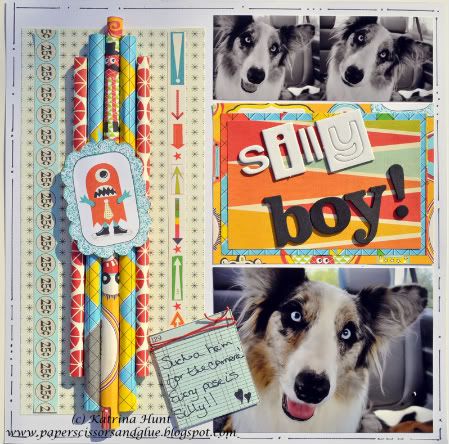
"Silly Boy" by Katrina Hunt
Supplies: Cardstock: American Crafts; Patterned paper: Sassafras Monstrosity; Stamp: {ippity} by Unity–Book It; Cording: American Girl; Pen: Sharpie Fine Point; Ink: Memento Dye Ink; Adhesive: Scotch and FabriTac
• Moved placement of pictures
• Replaced a 4x6 picture and used it as a title area
• Turned the stripes longwise and didn’t do as many
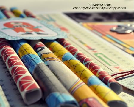
• Instead of using “strips” of paper, rolled various lengths and glued to keep shape
• Added a background pattern paper to the striped area
• Doodled around the edge of the cardstock
If anyone has any questions about anything, please let me know! I would be more than happy to hear from you.
• • • • • • • • • • • • • • • • • • • • • • • • • • • • • • • • • • • • • • • • • • • • •
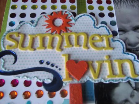
"Summer Lovin" by Amy Roller
Supplies: Cardstock: Close To My Heart and Bazzill; Transparency: Fancy Pants Designs (stripe); Swirls & dots: EK Success; Stickers: KMarcella & Creative Memories; Chipboard: unknkown; Alphabets: American Crafts; Paint: Making Memories; Glitter accent: Stickles, Ranger; Other: multi-colored craft thread
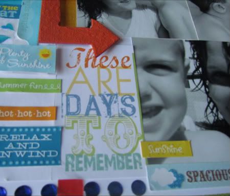
For this sketch I had the right amount of pictures but couldn't crop all of them down to size without cutting out a person so I left the 2 pictures in the center a little larger than the sketch suggested. Because of the middle picture hanging over to the left, I decided to pull the eye down and across the page using the journaling area.
Instead of handwritten journaling, I used word strips and embellishments.
As for the background, I used dot stickers to form the "strips" on the sketch. This resulted in a lot of color and movement so I went with a white background and made the overall area smaller. I then added a green cardstock behind to ground the whole layout.
The title and embellishments are made with stickers, chipboard, and stitching to make them pop off the background somewhat.
• • • • • • • • • • • • • • • • • • • • • • • • • • • • • • • • • • • • • • • • • • • • •
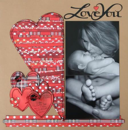
"Love You" by Shari Thurman
Supply List - Patterned paper: Basic Grey; Ink: Versamark; Adhesive: Gludots; Embroidery Thread: DMC; Tools: Cricut- Lyrical Letters, Designers Calendar; Other: machine stitching, buttons
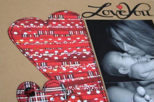
I loved the small strips of paper in the sketch and knew I had to try and make it into the shape of a heart, especially since Valentine's day is coming up.
I drew and hand cut the heart, which is roughly 5x11. I then placed it on my work mat that has grid lines which helped me keep the strips of paper somewhat straight. I used 4 different patterns of paper on the heart. I intentionally placed some on a slight angle for interest. After I had all the strips attached, I then cut around all the edges. I then ran it through the sewing machine.
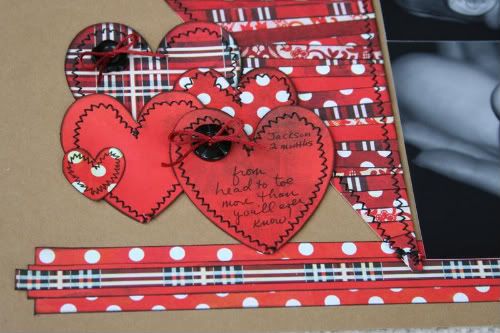
Tip: Don't put adhesive directly on the edge of the paper where you intend to stitch. It may gum up your needle and sewing machine. I'm on a first name basis with my repair guy. If you are not a fan of sewing, but you love the look of stitching, faux stitching is okay. There are stitching templates and stamps on the market that are amazing or you can just draw stitches by hand. Notice the stitching on the littlest heart.
It was too small to stitch on, so I just drew them on with a black pen.
I added hearts of various patterns to the left side of the heart to visually balance the layout. I zig-zag stitched around the hearts and finished them with buttons and floss tied in a bow.
The hearts looked like it needed a place to sit, so I added 3 overlapping strips of paper to the bottom. It seemed to ground the layout.
I didn't want my title to get lost on the layered heart, so I decided to move it above the photos.
Journaling: "Love You...from head to toe, more than you'll ever know."
••••••••••••••••••••••••••••••••


32 comments:
Amazing layouts! I wish I could stay home and scrap all day, I am so inspired!
These are all so different yet the same. So many cool ideas this week. Thank you ladies for all your hard work and inspiring work.
Love 'em all!
another day of great inspiration. Love them all, but I like kraft paper so I am pulled to the "heart" one. thank you again for the ideas ksh
Great pages! I love to see how others are inspired by the sketch!
Oh my goodness. I just picked up THREE new techniques, one from each layout. Thank you so much for sharing! I love them all as usual!
I'm so amazed by these creative backgrounds!
I can't wait to use this layout.
Great job ladies! I love all of them!
WOW! More great layouts today!
More beautiful layouts. Great sketch.
Beautiful layouts, such cool and original ideas!
Gorgeous!
Great work ladies!
It's so cool to see the different takes and how different they all look! TFS!
Love these pages! Katrina's rolled strips are sooooo cute!
another great set of layouts, love the rolled paper, the sticky dot bakground and the strippy heart.
awesome layouts! great variations on the sketch!! love the rolled paper!
Great job ladies. Very original. Thanks for sharing your ideas and creativity.
Wow these LOs are amazing. Wonderful job ladies. Love everyone's unique style to this sketch.
Oh me oh my! The DT is just ROCKIN' fabulous layouts! Beautiful work!
These are gorgeous!! Love all of the unique details! :)
awesome layouts! love the rolled paper.great effect!
Three more awesome layouts from one great sketch!! Keep them coming!
I love those rolled strips on Katrina's LO!
Gotta try that sometime!
Wow! MOre great examples of how to use this sketch. It's never endng. :)
Great ideas, so different, yet I 'see' the sketch in each. VERY good tip about the sewing maching getting gummed up with adhesive on your needle. Be sure to keep adhesive away from areas you may want to stitch. And I love the rolled strips, great idea I will have to copy.
Wow!...I am just amazed! Ladies, you've outdone yourselves!
Lulo
I absolutely LOVE that your designers are sharing their tricks with us. Thank you, thank you, thank you!
I just have to ditto what you all are saying! Great job girls! I love the cool techniques on all the layouts! :)
Are you kidding me???? These are so awwweeesssssooommmeee!!! Great job ladies!
You guys went all out with these recent layouts! Love the textures created with each of these unique background/embellishment techniques :O)
love the layouts! Here's my take: http://christine-lifeorsomethinglikeit.blogspot.com/2011/01/heirlooms.html
Post a Comment