Today's two-page layout based on the sketch is brought to you by our talented Guest Designer, Michelle McClure.
Two-page Sketch #7
You can download and print this sketch by clicking on the two-page sketches link found under the "printable sketches" tab on the right sidebar.
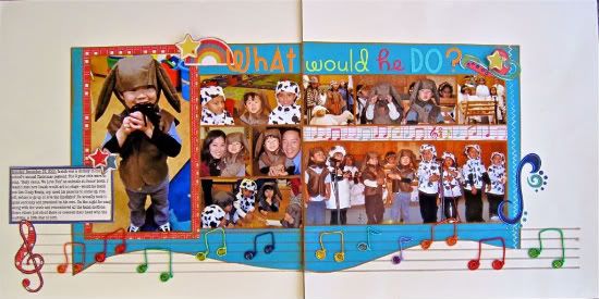
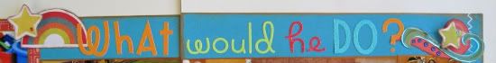
"What Would He Do?" by Michelle McClure
Supplies Used: Cardstock: Bazzill; Papers, Diecuts: My Mind's Eye; Alphabet stickers: Doodlebug; Thread: Memory Thread DMC; 3D Stickers: Jolee's All That Bling Rainbow dot gems; Ink: StazOn Metallic Copper; White pen: Gellyroll
Pre-Process
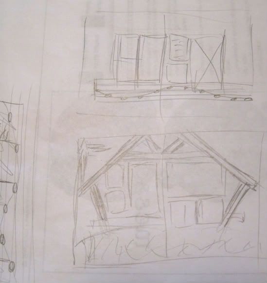
My 3 year old nephew, Isaiah, performed in his first recital at his daycare and I had all these photos of him to scrap. When I saw this sketch, I thought of doing a nativity scene since his class were the animals in the barn singing to baby Jesus. But sometimes layouts have a life of their own, and it just wasn't looking good when I was trying to assemble it prior to the gluing stage. The bottom pencil sketch was what I was planning. I abandoned that idea and reworked it to a musical theme (top pencil sketch) and it turned out cuter. The sideways drawing was me adding musical notes to the bottom of the photos. This was all in the planning stages and was done on the back of a copy of Allison's sketch.
After changing the theme of the layout from a nativity scene to a musical theme, I changed the story from performance photos only to what would my nephew do during his first performance? One side became backstage photos prior to the recital and the other side was the actual performance. Here is the journaling:

The Process
There are a lot of number and dimensions in the explanation since I had to make changes to accommodate my photos, so I hope you'll bear with me.
• Variation #1 - I flipped the two pages. I had the same problem as Allison in her "My Sweet Little Monster" layout, in that Isaiah was looking to the right in the large 5 x 7" photo. If I left it the same, he would have been looking off of the page. Now he is looking towards the center of the layout and hopefully directing the viewer to also look across the page. It also worked out so that the first page is pre-performance and the second page is during the performance photos so it is in chronological order, and matches the story of the layout.
• Variation #2 - Left page: There was a lot of empty space of the left and right of Isaiah in the 5 x 7" photo so I cropped it down to 4 x 7", so the focus is more on him, as in real life. This gave me one extra inch to play with. Instead of two 3 x 3 squares, I could put six 2 x 2 squares and have the area be exactly the same as the sketch. The photos I wanted to use were too wide to crop into squares so I opted for two 2 x 4" photos and two 2 x 2' photos, and the proportions were still the same.
• Variation #3 - Right page: I wanted to show the whole class and the photos were all horizontal, so I couldn't do the vertical 4 x 6 photo. If I flipped the sketch 90 degrees to incorporate a horizontal photo, then two pages wouldn't align in the middle because the right side would be one inch taller. Instead of 4 x 6", I printed the photo 4 x 8" so it went across the whole length of the bottom. The actual dimension across on the sketch is 7", but it was easier for me to reconfigure the page using an even number. Since my title wasn't coming off of the side, I didn't need the extra space there and used it for more photo space. I had two inches left on the height so I printed out two 2 x 2 photos and one 2 x 4 photo. Now both sides would meet in the middle at 6 inches in height.
• Variation #4 - The 4 x 8" photo showed too much wood paneling at the top and I found it distracting. If I cropped it lower in iPhoto, it also cropped the sides and cut out some kids. I physically cut off 1/2 inch from the top only and found the photo more centered. Now the right page was 1/2 inch lower than the left page. I cut a 1/2 x 8 inch strip from MME Alphabet Soup Girl paper which had musical notes on it and used that to fill in the gap. It added a spot of color in the middle of the layout since the photos had mostly dull colors and the color was only along the edges with the stickers. Now all the photos were finally the right sizes and the two pages were aligned.
• Variation #5 - I used up the journaling space with a photo, so I printed a journal block, matted it and put it were the title should be.
• Variation #6 - I lowered the placement of all the smaller photos along the 4 x 7" photo. This created a long space across the top of the photos and I placed my title there. I love the colorful and glittery letters in Doodlebug sugar coated lines. It was a nice contrast to the brown, black, white, gray photos.
• Variation #7 - This is probably the most eye catching of the variations. In place of the striped strip, I drew in a music staff. I thought the notes going up and down the staff would complement the curved line along the bottom.
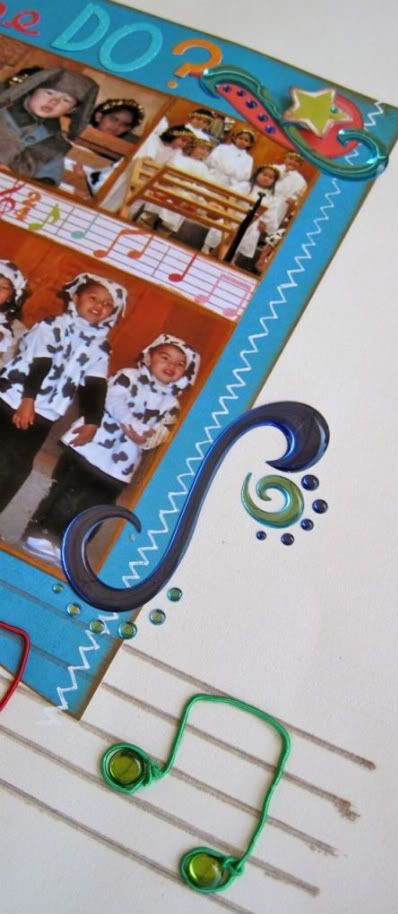
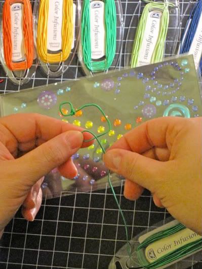
I made the notes by twisting Memory Thread together. To fill in the notes, I put in an adhesive gem dot which I had randomly purchased at Target, thinking it might become bubbles, little did I know it would be music notes. I adhered the thread to the page with Scrappy Glue.
• Variation #8 - By this time I was quite tired and didn't want to stitch so I drew in the stitched line with a white pen, sorry Allison.
• Variation #9 - Instead of snowflake embellishments, I used the dots and swirls from the same Jolee's pack of stickers I used for the notes, and some die cuts from the same line as the patterned papers.
Thanks for reading to the end!
•••••••••••••••••••••••••••••••••••••••••
24 comments:
I love the musical notes. Great layout
Love the detailed post! And super creative musical notes! Fun page!
Gorgeous layout! I love the pictures and how smart and creative the way you made the music notes! Gorgeous! Thanks for sharing!
What an awesome idea for music notes!! I love everything about this page, you did great. How cute is he up there performing and enjoying it. Thank you for showing us the detailed photo of making the music notes and all the step by step of how you did this page.
Thanks for another great week Allison.
absolutely gorgeous layout
The musical notes are so adorable! I have to get some memory thread!
Like everyone else--love the notes--great layout...thank you for all the great ideas within your directions. KSH
WOW! Love the music notes!
Wow! Impressive work with the musical notes! After all that wire twisting I'd have hand drawn the stitching as well!!
Wow! Look at those music notes! Too cool!
I really enjoyed reading how this layout came together for you. Our layouts often take different directions than originally planned!
Lulo
Was really happy to see a musical theme layout. (I have a lot of choir concert photos and am always looking for scrapping ideas for them)
I had never heard of memory thread before. The musical notes are a great idea!
Laura from the gulfcoast
I know I wrote way more than everybody else. If it is TMI, just scroll through. TFL and commenting.
I tried this layout. I only made a one page but I think it is ok. If you are interested here is a link : http://crystalscraftycreations.blogspot.com/2011/01/yum-yum.html
I love the layout, and the detailed explanation of your process! Those explanantions are one of the reasons I have always loved Allison's Sketch Week so much, Michelle! And your apology to Ali for using a white pen to draw stitches was priceless. :)
This is adorable! I especially love the musical notes along the bottom (memory thread? Never heard of it...looks fun!).
I think the manger theme is a great idea too...it's cool that this new idea worked out so wonderfully. TFS!
Love this Michelle! Those musical notes are perfection.
Very cute indeed! TFS
Super cute layout, Michelle. I also love how you did the notes. Thanks for sharing it with us.
Love how you were able to get so many pictures with this sketch. Great job!
Michelle, I love your detailed posts and think you do a fabulous job! I am a huge fan of Memory Thread and love the way you used. It's such a fun product to play with.
Amy, I loved it when I read the "sorry Allison" part too! She knows me and my love for stitching well!
Cynthia, Memory Thread is craft wire that is wrapped in thread. It comes in a ton of colors and is so easy to bend into whatever shape you want. It's great for adding little details to embellishments or like Michelle did, and make your own. You can find it at some scrapbook stores (we carry it at Scrapbook Generation) and I think you can find it in craft stores in the jewelry making section.
OMGosh, I love the bright colors you used, this is awesome!
Staci
those music notes are so cute!!!!! And the photo you included making them was a great idea!
Post a Comment