••••••••••••••••••••••••••••••••••
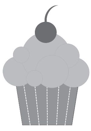
At first glance the add-on sketch might seem a little limiting because it's a cupcake, but a cupcake is not the only thing you can use this sketch for. On the two projects below I used the general shape of the cupcake as inspiration and created two embellishments that can open new doors of where this sketch can take you. Add-on Sketch #3
You can download and print this sketch by clicking on the add-on sketches link found under the "printable sketches" tab on the right sidebar.
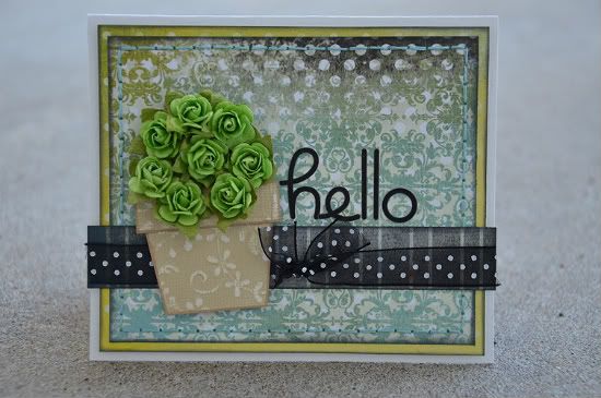
"Hello" card by Allison Davis
Supplies - Cardstock: Bazzill (white card base) and Core'dinations (flower pot); Patterned paper: Glitz Designs; Flowers: Prima; Alphabet stickers: Doodlebug; Embroidery floss: DMC; Ribbon: unknown
The cupcake sketch was easily converted into a flower pot with two simple adjustments.
1. I cut the width a 1/2" smaller. This was mainly to fit the flowers I wanted to use with the flower pot. You could use the same width as the sketch and use flowers that fit that size.
2. The finishing touch that really made it look like a flower pot is the small strip added to the top.
• • • • • • • • • • • • • • • • • • • • • • • • • • • • • • • • • • • • • • • • • • • • •
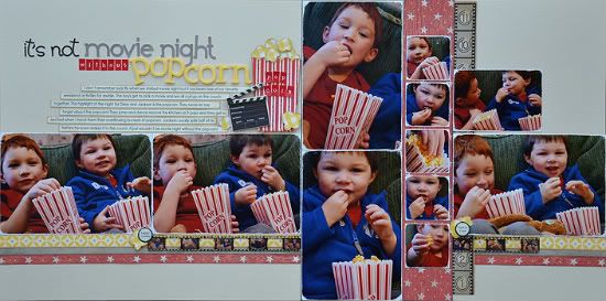
"It's Not Movie Night Without Popcorn" by Allison Davis
Supplies - Cardstock: Bazzill; Patterned paper: BasicGrey, October Afternoon, My Mind's Eye, and Fancy Pants; Alphabets: Doodlebug, KI Memories, American Crafts, and My Little Shoebox; Chipboard: BoBunny; Border punch: EK Success; Film strip ribbon: Tim Holtz; Border strip: Graphic 45; Epoxy stickers: unknown; Embroidery floss: DMC
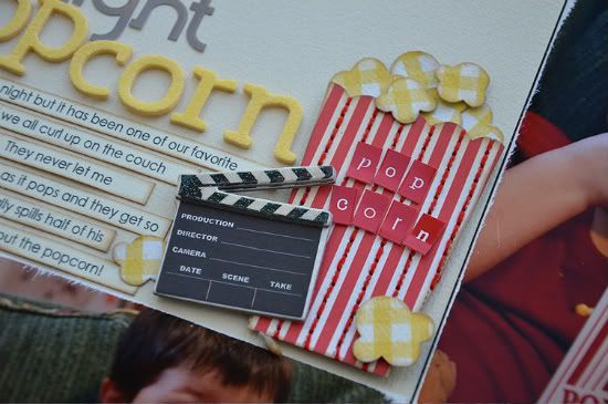
For this layout I converted the add-on sketch into a bucket of popcorn. Just like the flower pot, it took only two small adjustments.
1. I cut the "bucket" with a bigger length. I could have used the same length as the cupcake sketch but I wanted to mimic the tall, skinny buckets of popcorn my boys have in the pictures.
2. I used a scallop punch to create the same scallops on the top edge of the bucket as in the pictures.
I added some hand stitching in between the red stripes on the bucket and finished it with pieces of popcorn that I drew and cut out of yellow patterned paper.
(The next part doesn't really have anything to do with the add-on sketch but I thought I would share it too.)
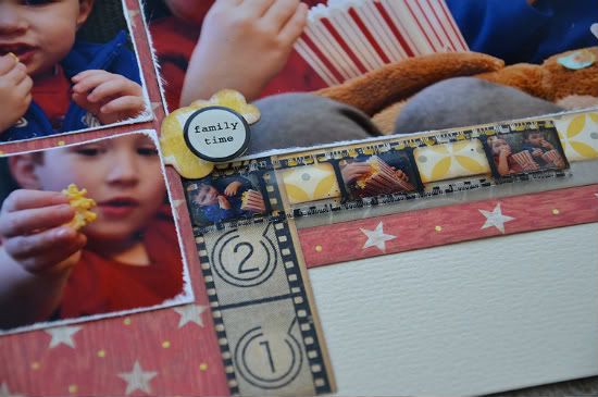
When I planned this layout I knew that I would be using the Tim Holtz film strip ribbon somewhere on my layout. I was ordering my pictures online when I realized that they have the option of getting an index print. (a 4 x 6 piece with super small images of the photos you ordered) I was hoping they would be the perfect size to fit in the windows of the film strip ribbon. I was so happy to find that they did!
They may be teeny tiny pictures but I love that I was able to customize the ribbon to fit my layout.
••••••••••••••••••••••••••••••••

16 comments:
Fantastic layout - absolutely love it.
The card is cute. The layout is amazing, love love the pictures for this one and even those mini ones. Great colors and title. Thanks for another fun week here!
Allison, I love your layout! So cute! Great to know about the index prints fitting in the film strip ribbon...I'm tucking that bit of info away for future use.
Love, love, love. You inspire me every time.
You amaze me Allison! :)
Cute card! Amazing layout!! Love how you adjusted the popcorn box size to fit your needs. Index prints ca be so much fun to use. Another wonderful job Allison!!
this is awesome! LOVE the little card and the double pager is gorgeous!
I absolutely LOVE everything about that popcorn layout! So cute!!
You guys are too stinkin' creative! Seriously...NEVER would have thought of dong the flower pot! What a pretty pretty card! NEVER would have thought about popcorn either! FABULOUS layout. Love the color scheme and design!
What a great interpretation! And I love that layout! So many photos and your boys are too cute!
Don't you just love it when a plan works out. Love the Film Strip!
LOVE the 2 pager Allison! The popcorn and bucket are too cute! I will have to find some of that filmstrip..and give that a try too.
I really love this popcorn layout. Love the popcorn bucket, the filmstrip, the distressed edges of all the pic, and even the yellow, buttered-popcorn colored letters in your title. And what a great subject to scrapbook too. :)
In your post from March 17th "Turning Four" by Suzanna Lee needs a credit to Elizabeth Kartchner as it is a complete copy of her page of her daughters 4th birthday. Want proof? its here: http://elizabethkartchner.blogspot.com/2010/06/from-party-to-page.html
Gorgeous creations! I always get so inspired by your designs :)
Joanne xo
Love the design and colors of the card, but that is a fantastic layout!
Cheryl
Post a Comment