Whenever a sketch has smaller photos, like the 2 x 2 photos on Two-page Sketch #10, you can always substitute larger photos like wallet size, 3 x 3, and sometimes even as big as 4 x 4. On Shari's first layout she used photos slightly larger than the 2 x 2 photos on the sketch and was able to do so without having to adjust anything else on the layout to accommodate the larger size.
Another way you can adjust the sketch to fit the photos you have is to switch the orientation of the photos. Two-page Sketch #10 may feature vertical photos but with a few small adjustments you can easily switch them to horizontal or even add in some extra pictures like Jennifer and Shari did on their layouts below.
Two-page Sketch #10
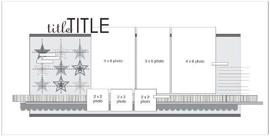
You can download and print this sketch by clicking on the two-page sketches link found under the "printable sketches" tab on the right sidebar.
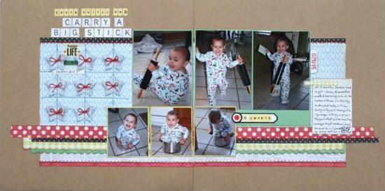
"Speak Softly and Carry a Big Stick" by Shari Thurman
Supply List - Pattern paper, Alphabet stickers, and Cardstock stickers: Echo Park; Tiny Alphabet stickers: My Little Shoebox; Paper Punches: Fiskars and Creative Memories; Ink: Colorbox Chalk Ink and Versamark; 3D Adhesive: Thermoweb; Other: twine, machine stitching
When I started on this sketch, I didn't have 2 sheets of my main pattern paper, so I just used a different pattern on the bottom of the layout, cut to the same 9 1/2 inch measurement. I cropped some distracting things from my photos, which made them smaller than the suggested sketch size. I then matted them on cardstock, so that they would still fit the sketch.
I loved the stars and stitching on this sketch. I wanted to create a shadow effect that would be interesting, but wouldn't be so busy that it would distract from the photos.
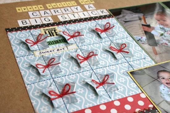
The stars are from the same pattern paper and I inked the edges in a shade slightly darker. I stitched down the middle of them and then used 3D foam adhesive to lift the sides of the stars to give a little shadow. I then trimmed them with red twine for some down home charm.
I added an extra scalloped layer to the bottom of the layout and then stitched on several of the strips.
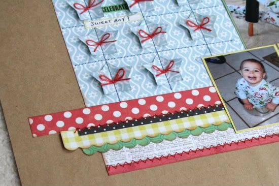
My title was extra long, so I chose to use tiny alphabet stickers for part of it. To finish, I added several sticker words and my journaling card.
Journaling reads: "At 13 months, Jackson loved to get into my drawers and cabinets. I love having him in the kitchen with me. On this day, he decided to play with my heavy rolling pin and managed to squeeze into my 6 quart pot. The fact that he was once tiny enough to fit makes me laugh, because he will probably end up being well over 6 feet tall."
• • • • • • • • • • • • • • • • • • • • • • • • • • • • • • • • • • • • • • • • • • • • •
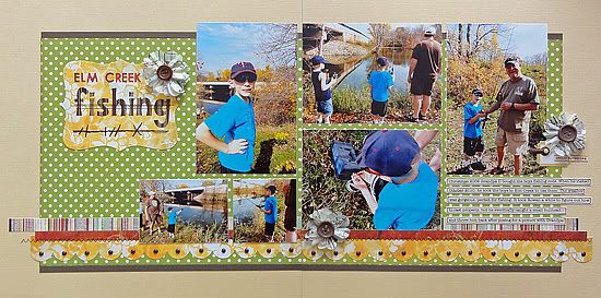
"Elm Creek Fishing" by Jennifer Larson
Supplies - Cardstock: Bazzill, Stampin' Up!; Patterned Paper: October Afternoon, Studio Calico, and BasicGrey; Die Cut: Stampin' Up!/ Sizzix; Stickers: Basic Grey, Jillibean Soup, and Studio Calico;
Flowers: Studio Calico; Template: Bazzill; Floss: DMC; Ink: Stampin' Up!; Pen: Zig; Font: American Typewriter; Other: Buttons, machine thread, brads, and photo turn
1. I had these photos from a recent fishing trip in a variety of sizes when I saw the sketch, so I decided to use them and trim them, rather than printing out photos in the sizes on the sketch. I played around with placement until it worked.
2. The stars didn't work with my theme, so I deleted them.
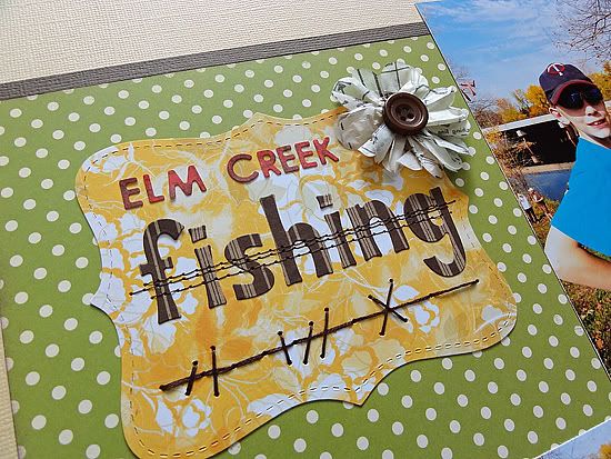
I did add stitching to the title, thinking it was sort of like fishing line, which did fit my theme!
3. I added some flowers in a broad visual triangle to lead the eye across the page; these flowers are rustic looking-enough to work on a boy's page.
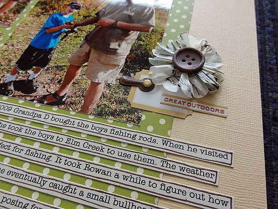
4. Before I printed the photos, I added a PSE action from Pioneer Woman called Boost, which heightens the color and slightly darkens photos. It worked well for the colors in fall on this bright day.
5. The biggest cluster of accents is by the focal point photo, where my son is showing off the teeny bullhead they caught!
• • • • • • • • • • • • • • • • • • • • • • • • • • • • • • • • • • • • • • • • • • • • •
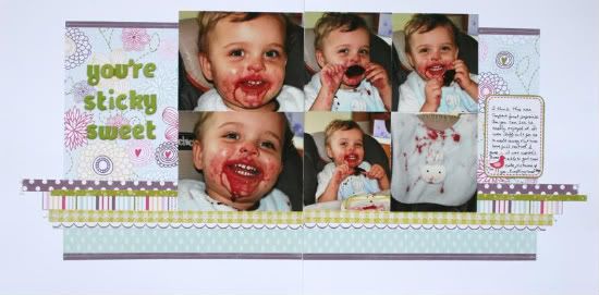
"You're Sticky Sweet" by Shari Thurman
Supply List - Pattern paper and Cardstock stickers: Echo Park; Alphabet stickers: American Crafts; Other: Machine Stitching
On this layout I added a few extra layers of pattern paper and stitch across several of them.
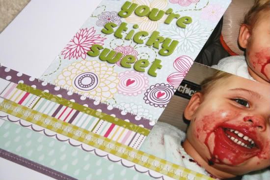
I moved my title down on the floral pattern paper, drawing the eye to the photos of my son with his popsicle. The photos that I wanted to use were printed in the landscape perspective rather than portrait, so I cropped them to fit on the page. I also eliminated the smaller supporting photos as the sketch suggests.
Journaling reads: "I think this was Cooper's first popsicle As you can see he really enjoyed it. It was difficult for me to walk away and let him have full control. I guess it was worth it. I was able to get some cute pictures and yes...everything came clean."
••••••••••••••••••••••••••••••••••••
7 comments:
I love them all. Still get amazed how one sketch can turn out so many different ways. Good job ladies.
I like them all. Super cute pics and nice show of how to alter a sketch to fit photos!
What great layouts! Those pictures in the first one by Shari are too darn cute! Oh my, just adorable! LOVE the colors in the layout by Jennifer!
These are great!!
Great layouts Shari and Jennifer!
Shari I love the stars on the first layout. Such a cool way to have a lot of something on the layout without it being distracting.
Jennifer, I love the photo arrangement you came up with and the little detail stitching on the title piece.
:)
Great job ladies!
Awesome layouts!!
Post a Comment