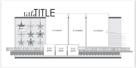
I hardly ever let the name of a sketch determine what I create. You can go from a card sketch to a two-page layout, a one-page sketch to a home decor project, or, as we've done today, from a two-page sketch to a one-page layout. Both Christy and I used the left side of the two-page sketch to create one-page layouts and, while using the same source for inspiration, produced completely different results.
Two-page Sketch #10
You can download and print this sketch by clicking on the two-page sketches link found under the "printable sketches" tab on the right sidebar.
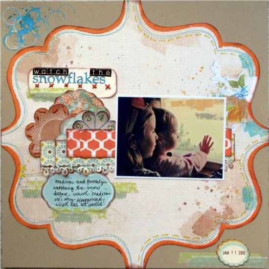
"Watch the Snowflakes" by Christy Arthur
Products - Cardstock: Bazzill (kraft); Patterned paper: Sassafras, Studio Calico, October Afternoon; Alphabet stickers: Jenni Bowlin; Label stickers: October Afternoon; Flowers: Studio Calico, Sassafras; Mists: Tattered Angels, Studio Calico; Flashcard: Elle's Studio; Punch: Martha Stewart; Mix tape: Dear Lizzy, American Crafts; Floss: Bazzill, In Stitch; Pen: American Crafts
I used the left side of the two page sketch.
Instead of a vertical 4x6 photo, I used a horizontal one and eliminated the 2x2 photos below.
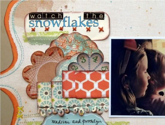
I used a cluster of flowers instead of the star grid.
I used strips of mix tape for the lower strips of paper.
I used a larger die cut behind the elements instead of the smaller cardstock square that is in the sketch.
I added some mist circles at the top left and a date with some strips of mix tape in the bottom right; which are not in the sketch.
I added a few stitching details to the title, to mimic the stitching that is printed on the die cut paper.
I added the date to the lower right corner and some additional strips of mix tape.
• • • • • • • • • • • • • • • • • • • • • • • • • • • • • • • • • • • • • • • • • • • • •
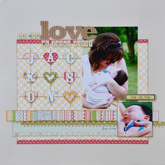
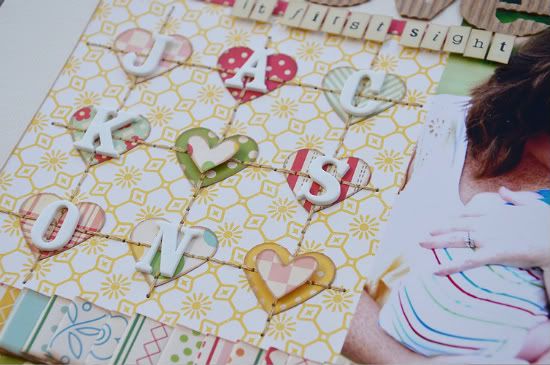
"It Was Love at First Sight" by Allison Davis
Supplies - Cardstock: Bazzill; Patterned paper: October Afternoon; Alphabets: My Little Shoebox (it was, at first sight), Jillibean Soup (love), and American Crafts (Jackson); Heart punch: Martha Stewart; Border punch: EK Success; Metal accent: unknown; Embroidery floss: DMC
Variation #1 - For my one-page layout I used the left page of the sketch. I tried to somewhat get the same overall design of the sketch on half the size. I did this by centering the background pieces and then cutting and arranging the strips as they are on the whole sketch.
Variation #2 - For the grid I used hearts in place of the stars. After I added the hand stitching over the hearts I added Jackson's name on top of them.
Since his name didn't have enough letters for each heart, I cut smaller hearts and adhered them on top of the two without a letter.
Variation #3 - I decided not to include journaling on the front of this layout. This is one of those pages that I wanted to pour my heart into the journaling and I just didn't have the space I needed so it is written on the back.
• • • • • • • • • • • • • • • • • • • • • • • • • • • • • • • • • • • • • • • • • • • • •
My Creative Classroom giveaway winner
I'm looking forward to getting to know both...
jengd said...
I've recently started trying to enter at least one sketch challenge a week just to keep me in motion. I'd love to take your class and get some additional pointers! Thanks for the chance!
and
Chanel's Owner said...
Didn't realize you gave online classes! I love your sketches and would love to see how to use them without taking them so literal! Cant wait for the class! :)
in my online class, Sketch Support!
Both of you will need to send me an email at allison@scrapbookgeneration.com and we'll get you all set up and enrolled in the class.
•••••••••••••••••••••••••••••••

4 comments:
This first layout is amazing how she came up with a different look. It looks so wonderful and sweet.
Allison your's is so cute and love that little Jackson with all that gorgeous hair. I love the hearts and his name on them.
Congrats to the winners!! I will try to take the class this time too Allison.
such sweet layouts. I have done the journaling on the other side too!
Fabulous work!
I'm working on a two pager for this as well! FUN!
TFS! :)
Great layouts!
Post a Comment