•••••••••••••••
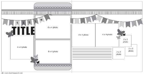
Two-page Sketch #13
You can download and print this sketch by clicking on the two-page sketches link found under the "printable sketches" tab on the right sidebar.
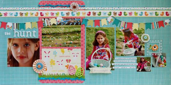
Supplies - Cardstock: Coredinations, Bazzill; Patterned Paper: We R Memory Keepers, BoBunny, October Afternoon, American Crafts; Paper Flowers and Tags: American Crafts; Letter Stickers: Basic Grey, American Crafts; Felt Embellishments: World Market; Punch: Fiskars; Frame and Bravissimo: Making Memories; Wire Ribbon: Whimsy Trims; Tape: Kamoi Kakoshi
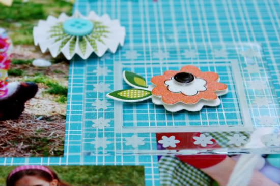
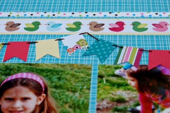
I changed up some of the picture sizes to suit what I had. I used a 4x6 instead the first 4x4. I used the acrylic frame instead of a 2x2 and I omitted a 4x6 and used patterned paper instead. My embellishment clusters are still in triplicate, just placed slightly differently. It was too busy to have something next to the title so I moved that one up to the top left.
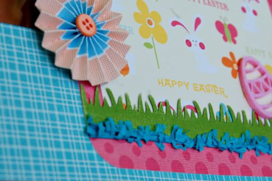
Here is a closer look at some of the details:
• • • • • • • • • • • • • • • • • • • • • • • • • • • • • •
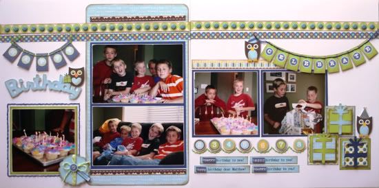
"Happy Birthday" by Carolyn Wolff
Supply List - Cardstock: American Crafts ; Patterned Paper: Jillibean Soup; Floss: We R Memory Keepers; Brads: American Crafts; Ink: Ranger Distress Ink (Vintage Photo); Scalloped Circle Punch: EK Success; Bakers Twine: My Mind’s Eye; Foam Adhesive: 3L; Stickles: Ranger; Cricut: Create A Critter & amp; Celebrations cartridges
This is one of my favourite two-page sketches! I love, love, love the banners and as soon as I saw them, I thought of making birthday banners!
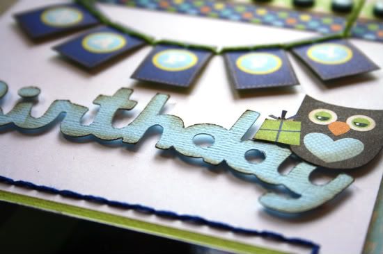
Variation #1 – The placement of my banners is different than shown on the sketch. I used the banner on page 1 as part of my title. My banner says ‘Happy’ and then I used my Cricut to cut out the phrase ‘Birthday’.
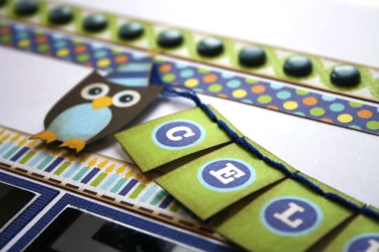
I placed the second banner on page 2 and it says ‘Celebrate’. I eliminated the third banner all together.
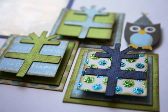
Variation #2 – I replaced the butterfly images with the owls that were part of the pattern papers. I hand cut them out and used foam adhesive to pop them up. I used one to embellish my title, one by the banner and the other by the presents.
Variation #3 – I decided to replace the 2x2 photos and make an embellishment instead. I created some presents by layering different size squares. I started with 2x2 squares for the base and then decreased the size by ¼ inch each time. The top layer is popped up with foam adhesive. Allison has done something similar to this on layouts and I just loved the idea and wanted to give it a try. I used my Cricut and cut out the cross with the burst for the present topper.
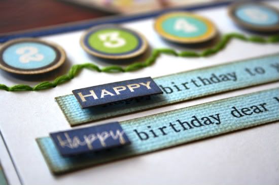
Variation #4 – For my journaling, I typed out the verse for the Happy Birthday song and then cut it into strips. I cut out the word ‘happy’ several times from one of the pattern papers and used foam adhesive to pop it up over the typed word.
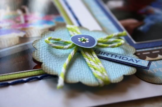
Variation #5 - I added a stitched scalloped border above the journaling and added punched out circles from the pattern paper.
••••••••••••••••••••

13 comments:
Hi! For me this sketch is a little intimidating, but so far the inspiration as been amazing!! I love the colors, different banners and all the wonderful details!!
Sabrina
What fun layouts they are today. I'm loving the banners and want to make more on my pages.
These are great layouts. I can't wait to use this sketch.
Gorgeous LO's ladies! Love them both!
I really like this sketch! Banners seemed intimidating for a 2-page layout but with the help of this sketch, I think I can finally create one. Just signed up for your Super Sketch Club too. :)
Enbelievable detail work here - I'm in awe. Beautiful!
Wowza...you two really ROCKED that sketch! FABULOUS work...so many details to take in!
The attention to detail is amazing. I'm totally blown away. Thanks for all the inspiration and for continually producing AMAZING LOs!
Oh my these are so cute! I love both if them. Great job Ladies!
Awesome LO's to both of you! I love the boy/owl theme and your detail Carolyn! Suzanna-love your grass and banner, Your pics stand out so well..great color choices!
Carolyn, I like how you simplified the banners. You've inspired me to use this on a birthday LO of my own.
Suzanna, I love how you used that acrylic frame as an embellishment without a picture underneath. I always struggle to find the right picture to put under those, and now I feel like I've been set free. Such a little thing, and yet I've never thought to do that.
What great layouts! Thanks for the inspiration, ladies.
I like the substitution of the typed words with the word strips or what I call wordfetti! Great job!
Fabulous layouts! I especially love Carolyn's and her banners and gifts :)
Joanne xo
Post a Comment