Today we've got the picks from creative team member Amy Roller and Jill Sarginson. Both of these were obvious stand outs in the gallery and are such wonderful interpretations of the sketches they used as inspiration.
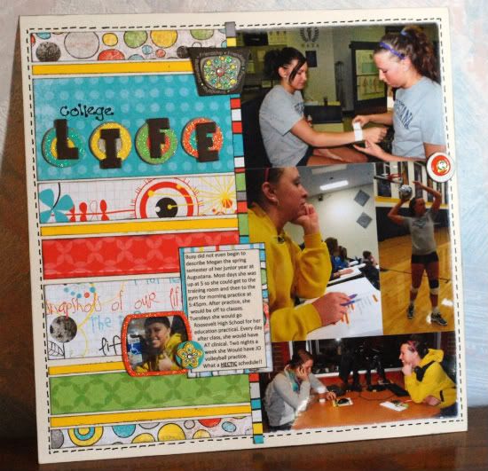
"College Life" by Mary Bezdicek
based on One-page Sketch #2
Picked by creative team member Amy Roller
1. I really like this layouts bright colors because the papers follow the bubbling excitement of youth and the fun that college brings.
2. I also love how many pictures she fit into the page! The small picture next to the journaling area is a great way to sneak another one in and draw your attention to the journaling.
3. The other thing that grabbed my attention is the way she has layered and popped up the title. It grounds it against the bright background adding more detail without being to overwhelming while still keeping with the same cheery color scheme. Overall it's just a fun layout! Thanks for sharing it with us!
• • • • • • • • • • • • • • • • • • • • • • • • • • • • • •
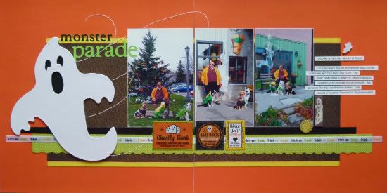
"Monster Parade" by Michele Edwards
based on Two-page Sketch #10
Picked by creative team member Jill Sarginson
Browsing the Flickr gallery to pick out a favourite layout proved to be a challenging feat - there were so many amazing creations that caught my eye. In the end, this layout was my favourite. I picked it because:
1. The stitching - the lines that create movement for the ghost are just absolutely fantastic!
2. The ghost - it looks so simple to make and yet it completely makes the page! It's the perfect embellishment!!
3. The theme was Halloween and a 2 pager! Halloween is my favourite thing to scrap so I found it extremely inspirational!
and lastly this layout has Halloween colours but doesn't appear to be using an actual Halloween line. I love when I can see people take ordinary papers and have them fit into a theme - in this case, to perfection!
•••••••••••••••••••••••


6 comments:
I think these are good picks too and the Halloween stands out for me because of the ghost. Love the colors on the college life one.
Both great layouts!! I especially love the BoBunny products on the first one!
This is such a fun week!
Mary, I love that collection and it's sucha great match for your pictures! I love the way you put your picture in the layered chipboard piece. Such a cute touch!!
Michele, LOVE the way you did the stitching!!!What a fabulous look! The little ghost stickers are so cute along the bottom, too.
Thanks for sharing!
You are changing the way people scrap. How awesome is that!
Great picks. Keep 'em coming!
Love the colors in the LO's today.... The ghost is cute. Nice picks!
Thank you Jill for selecting my layout "monster parade"... it means a lot to me. Allison's sketches, and the layouts from the creative team have really inspired me. And thanks everyone for their comments.
Michele
Post a Comment