••••••••••••••••••••••••••••
Two-page Sketch #18
You can download and print this sketch by clicking on the two-page sketches link found under the "printable sketches" tab on the right sidebar.
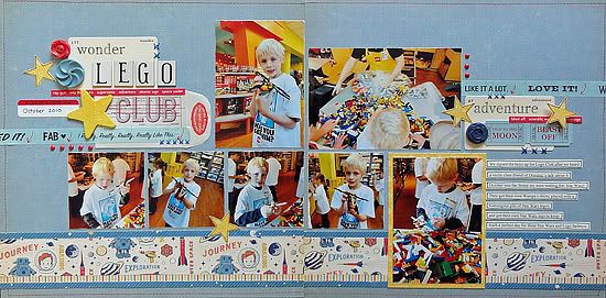
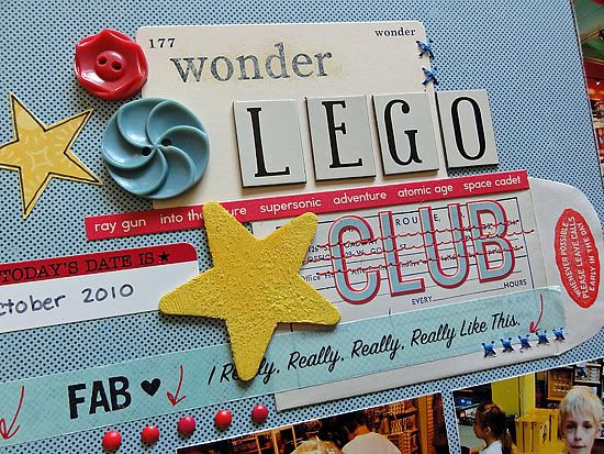
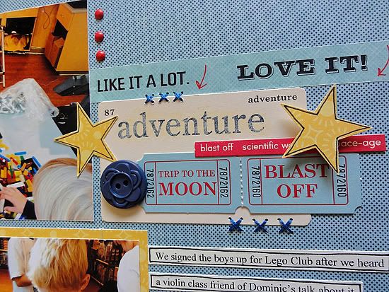
Supplies - Cardstock: Stampin' Up!; Patterned Paper: October Afternoon, Pink Paislee; Chipboard letters: The Girls' Paperie; Letter stickers, die cuts buttons, chipboard star: October Afternoon; Paint: Jenni Bowlin, Claudine Hellmuth; Glitter: Pink Paislee; Tape: K & Company; Label sticker: Jenni Bowlin; Pens: American Crafts, Zig; Punch: Fiskars; Floss: DMC; Other: Machine stitching, envelope.
1. The sketch made me think of these photos from the Star Wars Lego Club meeting. I didn't have the right size photos for the whole sketch, so I made the left side fit the sketch for the most part and I adjusted the right side to fit the photos I had.
2. My theme was outer space, so I subbed in outer space accents for the sun, waves, and fish.
3 Just because I like to, I used journaling strips instead of a journaling block.
• • • • • • • • • • • • • • • • • • • • • • • • • • • • • •
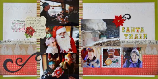
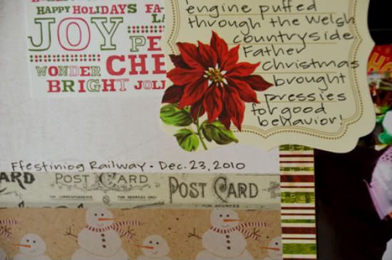
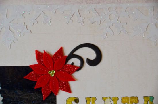
Supplies - Cardstock: Coredinations; Glittered Cardstock: Reminisce; Patterened Paper: My Minds Eye, Jillibean Soup, Basic Grey, Echo Park; Chipboard: BoBunny; Felt Embellishment: Papyrus; Tag: Paper Source; Journal Spot: Anna Griffin; Die Cuts: Sizzix; Punch: Martha Stewart; Tape: Ranger
Variations:
The biggest variation from the sketch is that I flipped the whole thing horizontally with the vertical strip of pictures on the left hand page and the title on the right hand side.
It was a bit cold and snowy where we were so waves and fish just weren't going to work with this layout!! I kept the decorative layers in the sketch but made them a bit wider. I originally had visions of a train running along the red Basic Grey paper that looks like the train tracks. However, I don't have the Cricut cartridge that would have been perfect for that purpose and so just skipped it altogether.
My swirl and the journal spot are flip flopped from the sketch as well. The pictures are a bit dark and needed the contrast of the white background to pop them a bit.
There is also some random face that is hiding under the journal spot! I used a complimentary chipboard swirl by the poinsettia on the right, in place of the sun, to create some movement from left to right between the two swirls.
I also have a few extra layers than the sketch has. I have a tone on tone border of snowflakes up top and then the whole spread is matted in green for a little added pop.
• • • • • • • • • • • • • • • • • • • • • • • • • • • • • •
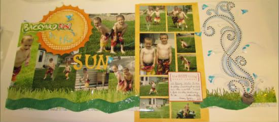
Supplies - Patterned paper: Bo Bunny, Two Busy Moms; Cardstock: Close to my Heart, Stampin Up!;
Stickers: Karen Foster designs, Creative Memories; water droplets: Hobby Lobby; Liquid glass: Close To My Heart; Cuttlebug, Emboss folder: Provo Craft; Markers: Zig, Stampin Up!; Blending pen: Stampin Up!; Journling Spot: My Little Yellow Bicycle
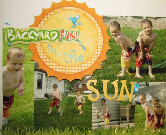
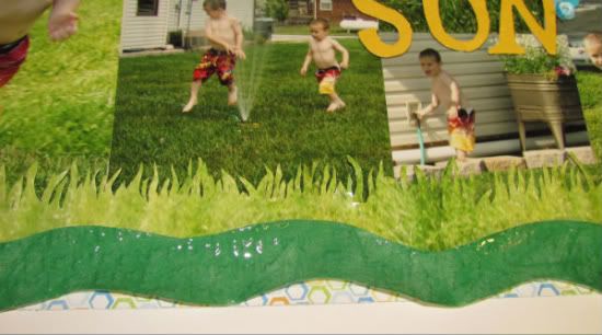
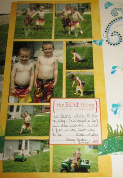
The main variations for my layout are that I changed the picture sizes and have a total of 13 photos on this page! I also changed the "waves" along the bottom and turned it into grass and a water hose instead. I left off the fish elements along the bottom because I didn't have anything that really fit my changed theme. Instead, I added more detail and texture to the hose.
I started the layout by arranging my pictures on the left side and it just worked out that I could fill the bottom area of the page that only has three small photos in the sketch.
I cut the large sun out of my pattern paper and used it to ground my title. I added in small water sprinkles with 3 -D "droplets" and crystal effects to create a "wet" look.
Next I decided to use leftover grass from my cropped photos and cut it to look more like actual grass blades and then placed it along the bottom. This is where the waves in the sketch are.
I then put down my pattern strip that is in place of the stripe in the sketch. I would have preferred the stripe but I didn't have one so I improvised with something close that pulled in all my colors.
For the right side, I had a ton of small photos so I made a collage with them in the place of the three large photos and decided to leave some background paper showing to help break up the photos because there was so much green throughout them.
Next I hand cut a hose and ran the pieces through an embossing folder with my cuttlebug for the texture of a real hose. Then I covered it with liquid glass which makes it shiny and more 3-D. For the end of the hose I hand drew and cut out a shape like the metal end of a hose and then added a silver gel pen over the whole piece.
Next, I added a large swirl rhinestone and more liquid glass coming off in "splashes". I added more water "droplets" throughout as well as water stickers. Last I traced the flow of water with 3 different colored markers and blended them out with a blender pen to give it a more lifelike see-through look of water.
•••••••••••••••••••••••



3 comments:
These are all amazing and fun again. I'm so impressed with how the DT makes these sketches their own.
Funny to see another Christmas one snuck in again with a summer layout.
more great LO's! Really love this sketch.
Wow Love the LO's and sketch. I am still trying to get caught up on last weeks and the rest of this weeks form being away from the computer but wow!, you ladies are awesome!
Post a Comment