••••••••••••••
Add-on Sketch #9
You can download and print this sketch by clicking on the add-on sketches link found under the "printable sketches" tab on the right sidebar.
"Click Click" by Jennifer Larson
Supplies - Cardstock: Bazzill, Stampin' Up!; Patterned paper: Pebbles, American Crafts, My Mind's Eye, Studio Calico, Crate Paper; Stickers: Sassafras, American Crafts, 7gypsies; Buttons: Stampin' Up!; Punches: EK Success; Twine: The Twinery; Ink: Jenni Bowlin; Pen: Zig; Die Cuts: American Crafts; Other: machine stitching
1. I followed the directions pretty clearly on the size of the camera. I tried making it bigger, but I am so bad at proportions. Lesson learned: follow Allison's measurements for fewer headaches!
2. I didn't do any stitching on the camera, and I didn't follow the directions exactly for patterned paper placement.
3. I adhered the lens with pop dots to make it look like a real lens coming off the camera.
• • • • • • • • • • • • • • • • • • • • • • • • • • • • • •
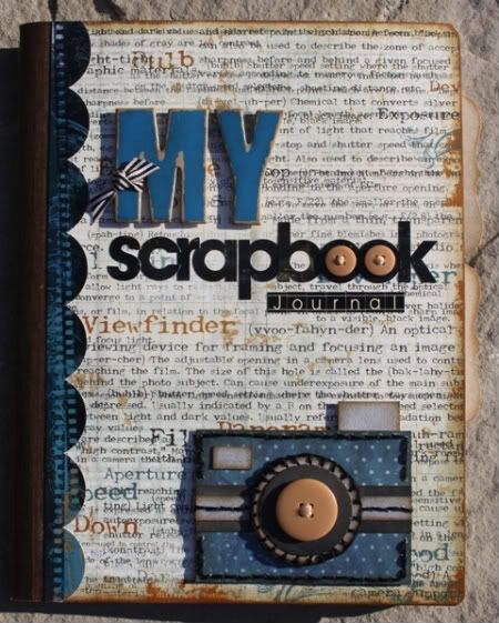
"My Scrapbook Journal" by Carolyn Wolff
Supply List - Patterned Paper and Stickers: Bo Bunny (Mama-razzi); Cardstock: Bazzill; Journal: Staples (office supplies); Alpha Stickers: Bo Bunny, Jenni Bowlin, October Afternoon; Ink: Ranger Distress Ink, Vintage Photo; Floss: DMC; Chipboard Letters: Pink Paislee; Tab Die: My Favourite Things; Ribbon/Buttons: unknown
This was a fun sketch to work with. I love creating my own embellishments and a camera is something I can see myself using over and over again. I made myself a ‘scrapbook journal’. I intend to keep a record of my stamps and dies for quick reference. I am hoping if I know what I have, I might use them more often.
Here are my tips for this project:
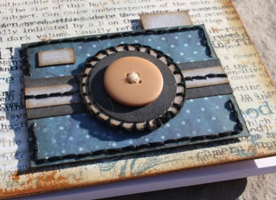
Variation #1 – To make the camera I changed the camera measurements slightly to make it a bit bigger. I started with 3 ½ x 2 ½. My strips are ¾ x 3 ½ and 3/8 x 3 ½ inches. I used a 1 ¼ and 1 ½ inch circle punch for the lens.
Variation #2 – I added some straight stitching around the camera and to the strip down the center. I attempted a blanket stitch for the circle, which didn’t turn out too bad. I also added a button to the center of the lens.
Other details:
• I bought my journal at Staples (a local office supply store). It is lined inside and has lots of pages.
• I covered the front of the journal with my pattern paper and accented with a matching border sticker.
• I used a mixture of alphabets to create my wording. I added the 2 buttons to the o’s and ribbon to the letter ‘m’ to bring in the ‘scrapbooking’ feel to my journal.
• I added 2 tabs to the pages on the inside of the journal to divide the stamp section from the dies section.
• • • • • • • • • • • • • • • • • • • • • • • • • • • • • •
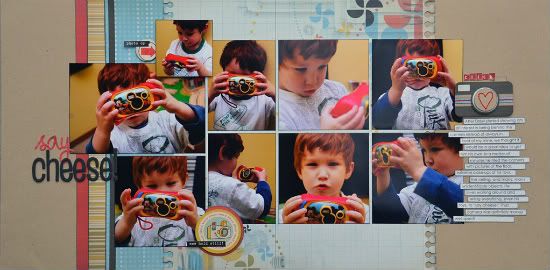
"Say Cheese!" by Allison Davis
Supplies - Cardstock: Bazzill; Patterned paper: We R Memory Keepers; Alphabets: Basic Grey (say) and American Crafts (cheese!); Stickers: Cosmo Cricket and 7Gypsies); Chipboard circle: Scenic Route
The camera add-on sketch was perfect for a collection of photos I have with Drew and his camera. The pictures are actually from a little photo shoot we had for an article we did together for Creating Keepsakes magazine. My only wish for this page is that I had printed some of his photos before the camera was broken. Most of them were extreme, washed out close ups of unidentifiable objects but it would have been so much fun to include them on the layout about his love for taking pictures.
For the camera on my layout I stayed very, very close to the sketch with only a few minor variations.
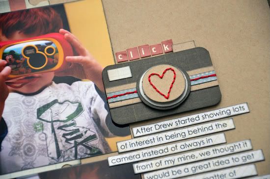
Variation #1 - I added another circle layer to the lens for no reason other than I wanted to get another color in there.
Variation #2 - I hand stitched a heart to the center of the top circle to support the story of the layout about Drew's love for taking pictures.
•••••••••••••••••••••


5 comments:
I love all 3 of these, so many great ideas for this camera. Awesome job ladies.
I love the stitching you used Carolyn around the circle and the button adds a fun dimension. The inking around the "flash" and view finder really pop the edges!
those are all great!! i will have to try to implement all those ideas in my own layouts. thanks for sharing!
I really love this add on!
Jennifer, this is such a cute layout!!
Carolyn, LOVE the journal (will be stealing that tab idea)..I made one with all my punches, ink refills etc in it for the very same reason JUST DON'T FORGET TO TAKE IT WITH YOU..or it won't do you any good! LOL I know from experience! I made my front too embellished and was getting tore up from traveling and I took it less and less..I should go make another, less "bumpy" one!
Allison, such a simple LO but so cute! Love the heart...I'm a sucker for hearts on anything! And I know how you feel about the boys camera..ours broke too and there were some real comical pics on there that I would have loved to have kept!
Post a Comment