•••••••••••••
Two-page Sketch #19
You can download and print this sketch by clicking on the two-page sketches link found under the "printable sketches" tab on the right sidebar.
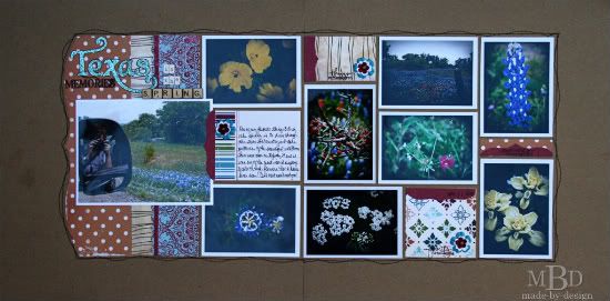
"Texas Memories in the Spring" by Megan Bickers
Supplies - Patterned Paper: My Minds Eye (Bliss, Friends, Brocade/Red), October Afternoon (Prize Pig, Grandstand), Pink Paislee (Enchanting, Adorable); Cardstock: DMD (Kraft); Stamps: Technique Tuesday (Family Circle), 7 Gypsies (Nottinghill, word-memories), Office Supply (Date Stamp); Inkpads: Clearsnap Colorbox Fluid Chalk Ink (Dark Brown); Stickers: Making Memories Shimmer Alpha (Spring Fling), EK Success (Bookworks Mini ABC's); EK Success (Scrabble Letter Stickers); Pens: Zig Writer (Brown); Other: Fiskars Border Punch (Scalloped Sentiment); Brads: Making Memories (Antique Copper); Flowers: Prima; Distress Stain: Ranger (Antique Linen); Other: Sewing Machine and brown thread
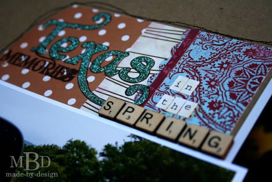
Variation #1 - For my title, I used several different sticker fonts and a stamp to create the main words. I outlined the blue glitter alphabet with a brown marker to help it stand out more and colored the words "in" and "the" with the distress stain to match the cream colors in my layout.
Variation #2 - I used one 4x6 photo and eight wallet size photos (2.5 x 3.5"). So my main photo was smaller and oriented horizontally, and my other photos were rectangular instead of squares and some were horizontal and some were vertical. When I printed my photos, I used a white border around them and I like how it gives the photos some definition and helps them stand off the page. I love how the layout had a grid-like look to it when I had all the photos adhered to the background.
Variation #3 - Because my photo sizes varied from the sketch, my pattern paper sized varied also. I used smaller pieces in between the photos and used some scraps to create the mat under my largest photo and the title. The decorative edges on the small red pieces and the main orange polka dot piece were all cut by hand. My entire layout had a larger border around all the edges since the photos I used were smaller. To ground all the pieces of paper and photos in the center of the layout, I used machine stitching in wavy lines as a border. I was inspired by the stitching lines that were drawn between the photos in the original sketch.
Variation #4 - Instead of using the smaller journaling strips on the open squares, I used stamped words in the pattern paper sections and added a flower to each area.
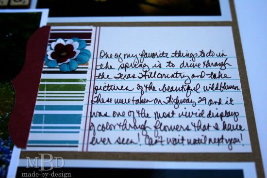
My main journaling was written in the same place as the sketch but I used a lined pattern paper and bordered it a piece of the striped pattern paper to tie it in with the other layout papers.
• • • • • • • • • • • • • • • • • • • • • • • • • • • • • •
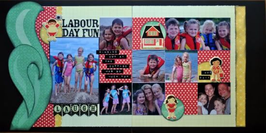
"Labour Day Fun" by Jill Sarginson Supplies Used - Cardstock: Bazzill Basics; Patterned Paper: Pink Paislee (Hometown Collection); Tools: Creative Memories circle cutting tool; Ink: Vibrance: Letters: American Crafts; Journaling: Dymo Gun; Embellishments: Pink Paislee (Hometown Collection)
Instead of using 4x4 photos, I resized mine to 3x3 (the larger one was resized to 4.5x6), thus giving me room for an extra layer. I also placed random embellishments on the page, anchoring them with a circle cut out of coordinating cardstock.
• • • • • • • • • • • • • • • • • • • • • • • • • • • • • •
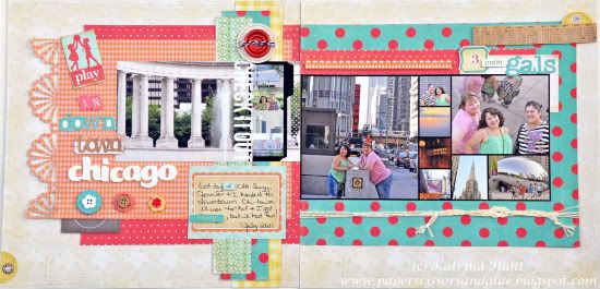
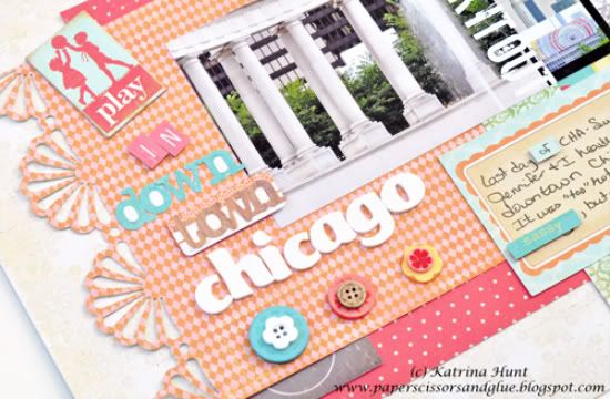
"Play in Downtown Chicago" by Katrina Hunt
Supplies - Patterned Paper: Crate Paper (Emma’s Shoppe); Stickers: Crate Paper (Emma’s Shoppe); Buttons: Crate Paper (Emma’s Shoppe); Chipboard Piece: Crate Paper (Emma’s Shoppe); Foam Letters: American Crafts; Twine: The Twinery Baker’s Twine; Adhesive: Scotch ATG, Fabri-Tac and Scrapbook Adhesives by 3L; Punch: Martha Stewart; Photo Collage: Kerri Bradford
I loved the sketch, but I wanted more room to play with paper and embellishments. I accomplished this by putting my pictures in collages and making them smaller. I actually got thirteen pictures on the sketch instead of nine, plus making play room!
• Variation 1 - Changed the pictures.
• Variation 2 - Moved title to side and bottom.
• Variation 3 - Moved journaling area down.
Here's a closer look at some of the details:
•••••••••••••••••••••




4 comments:
These are awesome again today ladies. love love seeing this sketch variety this week. all the pp being used on each one is great.
Wonderful LOs all week long with this sketch. I especially love the colors that Katrina Hunt chose for her Chicago LO. Just beautiful.
Megan I love the way you "shrunk" the sketch and used different size photos. Another great day on Sketch Support. NIce job ladies!
love all the different variations again today!
Post a Comment