•••••••••••••
Two-page Sketch #19
You can download and print this sketch by clicking on the two-page sketches link found under the "printable sketches" tab on the right sidebar.
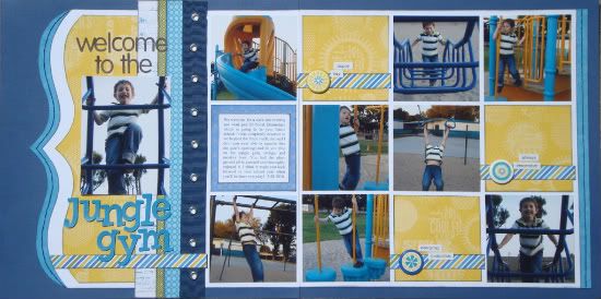
“Welcome to the Jungle Gym” by Andrea Friebus
Supplies used - cardstock: American Crafts; patterned paper: Little Yellow Bicycle, Basic Grey; fabric trim: Bo Bunny Press; ink: Clearsnap; embroidery floss: DMC; letter stickers: Basic Grey, American Crafts; stickers: Echo Park; brads: Queen & Co.; other: word stickers
I really liked this sketch and didn’t want to vary from it too much but in order to make it work for me I
had to change the square size from 4”x4” to 3.5”x3.5”. By reducing the size of the squares just this little bit, I was able to leave margins between the squares as well as use the dark blue cardstock base as a frame. Since I had the margins separating the squares, I chose not to stitch between them and instead I added a little stitching to the two turquoise blue borders.
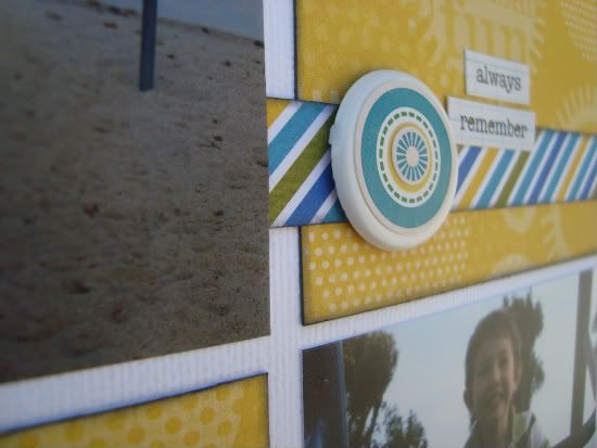
My photo under the title is smaller than 5”x7” so I continued the title underneath it and added some striped paper that I also included throughout the layout. I was glad to finally use these large brads that have been in my stash for a while but felt they were kind of plain so I layered stickers on top of them.
•••••••••••••••••••


7 comments:
I love love this layout. The colors and the paper are so fun. The pictures are great and inspires me to do a l/o like this one.
The school near us has a jungle gym like this and I have tons of pictures of the kids playing on it. Every time I think about scrapping the pictures it overwhelms me and I quit. Seeing yours cut down though looks good so maybe I should try that with mine.
Thanks for the inspiration!!!
I love the LO! The colors like Dawn said are so fun. What a great week it has been!
I love the colorful papers and the movement in the pictures!! It makes for a happy layout.
Thank you so much for the nice comments!! You all have made my day!
I have enjoyed this week's LOs from this great sketch. Used it myself for pictures from our Golden Wedding Anniversary reception. I'm sure that I will probably use it again when I am doing a LO with a large number of pictures. Also loved the ones using only the right side page. I plan to do that, too.
Such a terrific layout Andrea!! Love this color combo and love the cute way you added embellishing to the paper squares! Great work!
I loved this sketch so much I did TWO double page spreads with it. Here is the first one: http://crystalscraftycreations.blogspot.com/2011/09/ckcb-challenge-three-stamp.html
Post a Comment