••••••••••••••••
One-page Sketch #17
You can download and print this sketch by clicking on the one-page sketches link found under the "printable sketches" tab on the right sidebar.
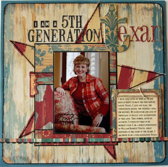
"5th Generation Texan" by Penny Grimsley
Supplies - Cardstock: Bazzill; Patterned paper: Cosmo Cricket (Halfway Cafe); Alphabets: October Afternoon, Cosmo Cricket, Silhouette Die Cutting Machine; Embellishments: Cosmo Cricket, Tim Holtz; Punch and Corner Rounder: Fiskars; Ink: Tim Holtz (Old Paper); Embroidery Thread: DMC; Twine: Stampin' Up; Fonts: Mailart Rubber stamp, Pharmacy; Date Stamp: Office Depot; Digital Stamp: Ali Edwards
Variation #1 - I changed the orientation of the photo and background pieces.
Variation #2 - I trimmed down the main patterned paper and added a cardstock mat and stitching to set off the patterned paper.
Variation #3 - I added a scallop punch border below the striped strip and moved these down in placement to accommodate the change of my photo's orientation.
Variation #4 - I used a journaling card from the paper collection vs. journaling strips, setting it off with twine and pop dots.
Variation #5 - I eliminated the row of starts beneath the photo.
Variation #6 - I added a black cardstock mat to my photo and to my background pieces for emphasis.
Variation #7 - I added an office tab and paper clip to capture the photo date.
• • • • • • • • • • • • • • • • • • • • • • • • • • • • • •
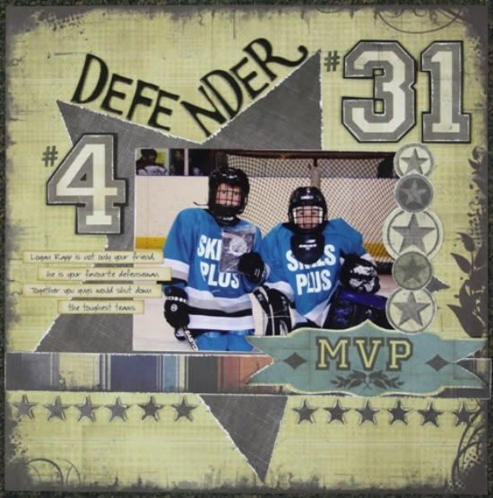
“Defender” by Carolyn Wolff
Supply List - Patterned Paper: We R Memory Keepers; Alphabet: American Crafts; Ink: Ranger Distress Ink; Stars: Large-Cricut, Small-Dienamics; Stamp: My Favourite Things
Variation #1 – I made the star smaller than my background rather than having it go off the page as shown in the sketch.
Variation #2 – I did not create a backdrop for my photo like it was shown on the sketch. I wanted my photo to be right on top of the star. I didn’t even mat my photo, which is very unusual for me.
Variation #3 – I flipped the journaling and the row of stars to make room for my numbers.
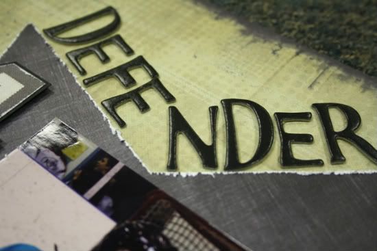
Variation #4 – I changed up my title and had it follow along the edge of the star.
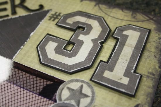
Variation #5 – I added the jersey numbers of my son and his defenseman.
• • • • • • • • • • • • • • • • • • • • • • • • • • • • • •
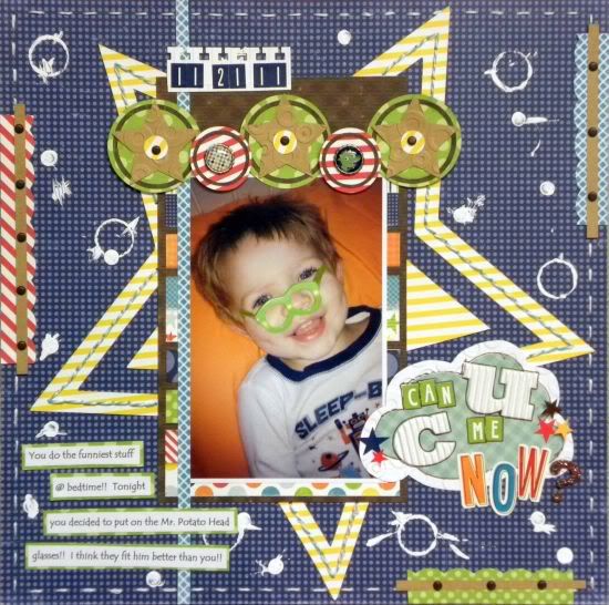
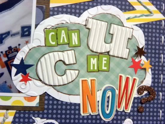
"Can You See Me Now" by Ashley Horton
Supply List - Cardstock: Tim Holtz; Patterned Paper and Stickers: Echo Park; Acrylic Paint: Apple Barrel; Brads: The Paper Studio; Baker's Twine: The Twinery; Embroidery Floss: Janlynn; Corrugated Alphas: Jillbean Soup; Punch: EK Succes; Edgers: Provo Craft; Embossing: Sizzix Big Shot and Provo Craft; Font: Tempus Sans ITC; Thicker: American Crafts; Pen: Zig; Adhesives: 3L, Recollections, and Zig
Variation #1: My photo was portrait, instead of landscape so I rotated the sketch to accommodate the picture.
Variation #2: I cut an outline of the large star shape instead of a solid, but added a smaller solid star to the center.
Variation #3: I added a stitched border and three scalloped borders around the edge of the page.
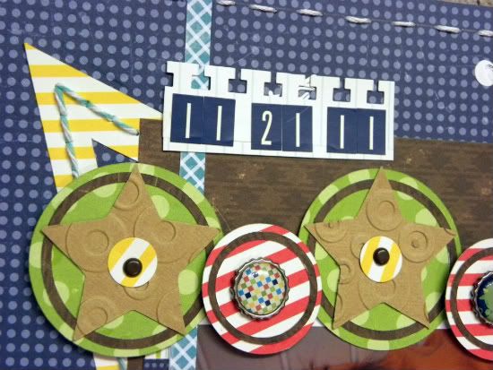
Variation #4: Sometimes, I can be layered challenged, so instead of layering small stars above and across the photo, I chose to add several circle accents with embosed stars.
Variation #5: Since I rotated the sketch, I moved my title down a little further on the page and moved the journaling strips over to the bottom left-hand side of the page.
Variation #6: I added some messy circles and spots of messy paint for a fun, whimsical look.
•••••••••••••••••••••


6 comments:
I had so much fun with this sketch!!! Penny and Carolyn, I love both of your pages! Penny, the white-washed effect on your page is so cool! And Carolyn, I love the big collegiate #'s on your page!!
WOW WOW WOW to all 3 of you!!!!!!!!! These are amazing, love love love what all of you did with your layouts. You ladies rocked this sketch!!
Penny so good to see that your layout has a photo of you in it, that is awesome.
Keep Calm and Sketch On !!!!
Allison this week might actually beat the last 3 weeks of awesome sketches, it's coming pretty dang close. So excited to have another year of inspiration by you and the dream team!! Thanks!!
Ashley, I can't take credit for whitewashing it. Halfway Cafe was one of the first two lines that Cosmo Cricket introduced. Loving red, white and blue like I do, I snagged it and have hoarded it all these years.
When I thought about this sketch and what I wanted to do with it - this story - my mind went RIGHT TO this line of paper and it was a lot of fun to use some "preciously hoarded stash".
The photo of me - that took 45 minutes to get. Ha. I'm sure it was quite comical to see me adjust the tripod, hit the button and run each time. :-) Thankfully, I was home alone. My 3 guys laugh at me enough already. :-)
I loved this sketch and I always really enjoy seeing everyone's work off it. You really can't beat a good sketch. Allison sets us up pretty good. :-)
Thanks and great work, all!
Love everyone's pages- just shows how versatile this sketch is!
These layouts are all great! I really love this sketch!!!!
Penny, LOVE your layout! Colors are perfect!
Carolyn, I guessed right on what your LO would be about! LOL Another great one as well.
Ashely, I love the fun feel of this LO and the colors are great.
Post a Comment