••••••••••••••••
Two-page Sketch #27

You can download and print this sketch by clicking on the two-page sketches link found under the "printable sketches" tab on the right sidebar.
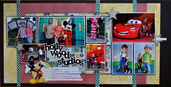
"Hollywood Studios" by Jill Sarginson
Supplies Used - Patterned Paper: My Mind's Eye; Cardstock: Bazzill Basics; Alpha: Jillibean Soup; Embellishments: Disney; Ink: Vibrance; Tools: Creative Memories star punch, circle maker; Font: DJB Tweenybopper
Variations
• The sketch has three vertical 2.5 x 2.5 photos on the right hand side - I opted to go with two photos here.
• The sketch has a 5 x 3.5 photo on the right hand side. I opted to use two photos that were about 3" wide each.
• I put my journaling at the bottom of my page vs. the top.
• • • • • • • • • • • • • • • • • • • • • • • • • • • • • •
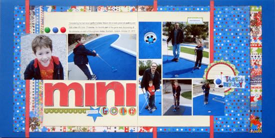
“Mini Golf” by Andrea Friebus
Supply list - Cardstock: American Crafts; patterned paper: Bo Bunny, Little Yellow Bicycle; stickers: Jolee’s Boutique, Creative Imaginations; journaling spot: Jillibean Soup; ink: Clearsnap; other: chipboard letters
Variation #1 - I eliminated the small photo on the left page so I could use large title letters. (I thought it was funny to use such large letters to spell the word “mini”).
Variation #2 - Rather than three small square photos on the right page, I used two photos that had the same dimensions. I also changed the orientation of the 6x4 photo and turned the 5 x 3.5 photo into two smaller photos.
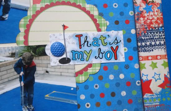
Variation #3 - I added some embellishments next to the journaling in the upper left.
• • • • • • • • • • • • • • • • • • • • • • • • • • • • • •
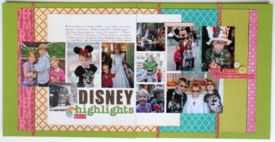
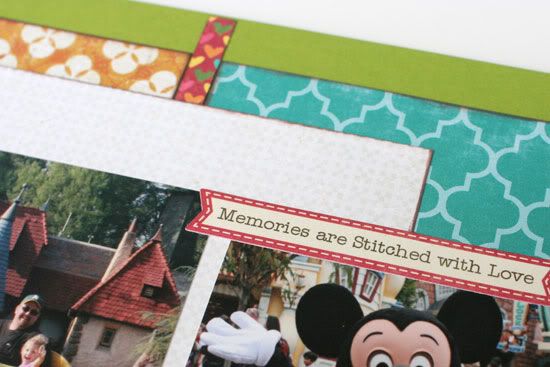
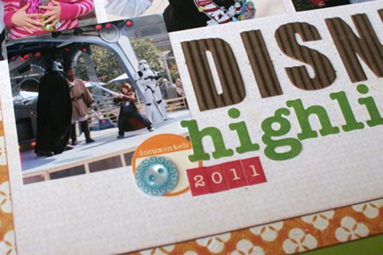
"Disney Highlights 2011" by Christine Chain
Supplies – patterned paper: American Crafts, Crate Paper, Echo Park, Jillibean Soup
Variation #1 – I used a cute mini-heart print from Jillibean Soup rather than striped paper. I didn’t have a good stripe to match all the patterned paper I was using, and I liked how this paper coordinated and had a small enough print to work.
Variation #2 – Instead of using labels and a swirl on the far right, I used little letter stickers and a couple of buttons. I was able to write the sentiment I wanted to in the same space without changing the overall design.
3 comments:
WOW!! Look at these fun pages and themes, love them all.
Andrea how funny to see your putt page done in blue, so different from my typical green ones. I like the blue!
Great job ladies!
Disney layouts make me happy!! All of these are really amazing and I love the fun, bright colors that each one of you used!! :)
Oh how fun are these pages, fabulous!
Post a Comment