Showing posts with label Robbie Herring. Show all posts

Thursday, November 24, 2011

One-page Week, Part 4

••••••••••••••
Happy Thanksgiving to all of our Sketch Support readers!

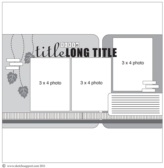
One-page Sketch #15


You can download and print this sketch by clicking on the one-page sketches link found under the "printable sketches" tab on the right sidebar.


"Fun on the Fall Trail" by Katrina Hunt
Supplies - Patterned Paper: Little Yellow Bicycle (Hello Fall Collection); Die Cut Embellishments: Little Yellow Bicycle (Hello Fall Collection); Adhesives: Scotch ATG, Fabri Tac and Scrapbook Adhesives; Letters: Little Yellow Bicycle, Doodlebug Designs; Acrylic and Fabric Embellishments: Little Yellow Bicycle

Variation 1 - Stacked my pictures on top of one another

Variation 2 - Moved my title to take the spot of the third picture

Variation 3 - Replace the trailing leaves with my acrylic embellishment over the top of my picture collage.

Variation 4 - Did not leave a space in the middle of the page between the background layers, I have a “thing” about that! So, I moved everything to the left and did layers, since I love layers!

  • • • • • • • • • • • • • • • • • • • • • • • • • • • • • •


"Winter Beauty" by Robbie Herring
Supplies - Patterned Paper, Chipboard, Stickers, Ribbon, Journaling Card, Buttons and Jewels: Bo Bunny Snowfall Collection; Glitter Alphabet: Creative Imaginations

Variation 1: I only used one picture. It is 4x6" instead of 3x4".

Variation 2: I added the borders to the very bottom of the center design, instead of placing them across the center pieces. I also added two extra borders to the top.

Variation 3: Instead of curving the inside of the two pieces in the center for interest, I chose to use eyelets and lace ribbon for some detailing.


I then bent back the top to show a bit more of the brown border.

Variation 4: The sketch has falling leaves. I used a chipboard piece from Bo Bunny that gave some of the same downward movement on the page and added snowflake layers with stickers and more chipboard.

••••••••••••••••••••••

Friday, November 18, 2011

Add-on Week, Part 5

•••••••••••••••••••
Add-on Sketch #11
You can download and print this sketch by clicking on the add-on sketches link found under the "printable sketches" tab on the right sidebar.


"The View" by Robbie Herring
Supplies - Cardstock, Patterned Paper, Corrugated pieces, Chipboard Alphabet, Red Felt Flowers, Felt Leaves: Jillibean Soup; Chipboard Button: Jenni Bowlin; Green Felt Flowers: Fiesta Flowers; Alphabet stickers: Prima Marketing Inc.; Twine: Doodlebug and Martha Stewart; Ribbon: Bazzill; Brad: unknown

Variation #1 - Instead of making the leaves entirely of strips of paper, I chose to leave space between the strips to allow the kraft paper to show more. I like the way this coordinated with the corrugated pieces and the printed kraft paper.


  • • • • • • • • • • • • • • • • • • • • • • • • • • • • • •


"Thankful" banner by Christy Arthur
Products - Patterned Paper: American Crafts (Amy Tangerine Here and There), Studio Calico (Autumn Press Bundle and Scarf), Crate Paper (Random Textile, Farmhouse Cross-stitch, Peppermint Ski Lodge), Pebbles (Happy Go Lucky Carefree)

Variation #1: I took the exact proportion of the add on leaf and used it as a base for our "thankful thoughts" this month. I added additional types of leaves that are hand cut and hand stitched onto a ribbon. I used a tiny clothes pins to "pin" the sketch leaf onto the banner.


Variation #2: Since we would be writing on the leaves, I kept them simple and did not add the chevron detailing that is in the sketch.


  • • • • • • • • • • • • • • • • • • • • • • • • • • • • • •


"Fall" by Shari Thurman
Supplies - Patterned paper and die cuts: Authentique; Adhesive: ATG by Scotch; 3D foam adhesive: Thermoweb; Ink: Colorbox Chalk Ink (Dark Brown); buttons: unknown; hemp: unknown; Sketch: Sketches for Scrapbooking, Volume 7


Variation #1: I omitted the stem.

Variation #2: I omitted the stitching down the center of the leaf.


Variation #3: I drew my own pattern for one of the leaves.

Variation #4: I added die cuts and buttons to embellish and to create layering.

••••••••••••••••

Wednesday, October 26, 2011

One-page Week, Part 3

•••••••••••
One-page Sketch #14


You can download and print this sketch by clicking on the one-page sketches link found under the "printable sketches" tab on the right sidebar.


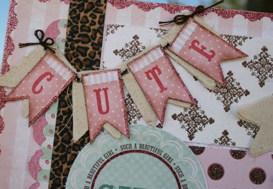
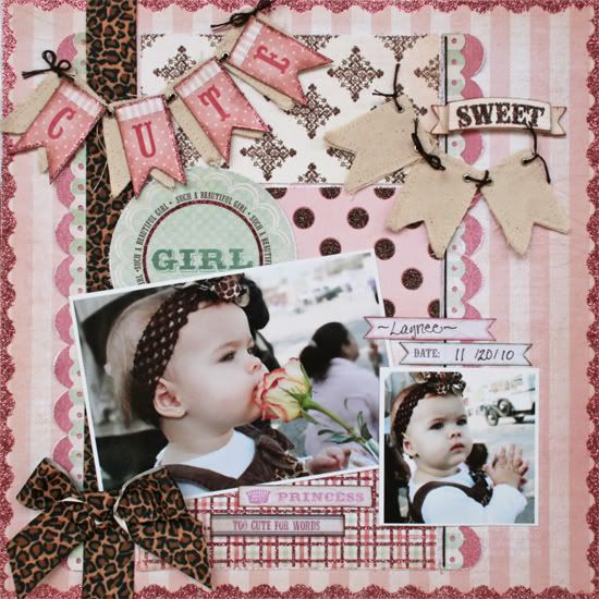
“Cute Girl” by Robbie Herring
Supplies - Patterned paper: My Mind's Eye; Layered Stickers and Stickers: My Mind's Eye; Title Card: My Mind's Eye; Canvas Banner: Maya Road; Ribbon: May Arts; Border Punches: EK Success and Fiskars; Embroidery Floss: DMC

Variation #1 – I changed the size of the bottom two pictures to 4x6” and 3x3”.

Variation #2 - I omitted the top three pictures.

Variation #3 – The background rectangles were changed to 3x6”. I left a space between the bottom two rectangles and placed one of the journal stickers there.

Variation #4 – I added borders to the right side and used a circular title card in place of a rectangular one.

Variation #5 – I used two separate banner groupings instead of using one. I also changed the placement as shown.


Variation #6 – I moved the stitching to the right side and substituted a large ribbon with a bow on the left.

• • • • • • • • • • • • • • • • • • • • • • • • • • • • • •


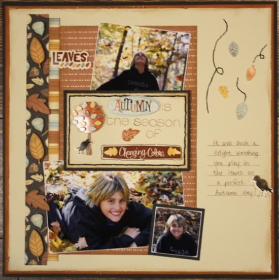
"Autumn" by Carolyn Wolff
Supply List - Cardstock: American Crafts; Patterned Paper and Stickers: American Crafts (Nightfall); Distress Tool: Making Memories; Stamps: My Favourite Things and Papertrey Ink; Ink: Ranger Distress Ink; Sanding Files: Basic Grey; Floss: We R Memory Keepers.

Variation #1 – I used three photos instead of the five that are shown on the sketch. I matted the small photos and sanded the edges of the larger ones.

Variation #2 – I placed the title block in front of the photos and not tucked behind like it was shown on the sketch.


Variation #3 – I used a stamp to create my journal area instead of the strips of paper.

Variation #4 – I eliminated the banner and added the falling leaves on the right side of the layout.


• • • • • • • • • • • • • • • • • • • • • • • • • • • • • •


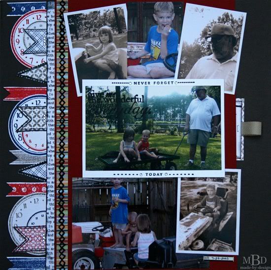
"Wonderful, Ordinary, Everyday" by Megan Bickers
Supplies Used - Cardstock: Bazzill (Red), The Paper Studio (Grey), Close To My Heart (White); Patterned Paper: Little Yellow Bicycle (Love Letters), Fancy Pants (Fabulous); Inks: Tsukineko (Black StazOn), Ranger Distress (Pumice Stone, Barn Door, Chipped Sapphire), Marvy Uchida (Black Marvy Matchables); Stamps: Technique Tuesday (Ordinary Days), Hampton Art (Memories Mix & Match, This Day Sentiments Mix & Match), Maya Road (Clocks), Martha Stewart (Patterns Background), Close To My Heart (Ritzy Ribbons), Glitz Designs (Love Games); Stickers: 7 Gypsies (Date Mini Label); Embellishments: The Paper Studio (Clear Gemstones), Martha Stewart (Twill Tape-Putty), Making Memories (Scrapbook Stitches-Black Thread); Tools: Tim Holtz (Tiny Attacher), WeR Memory Keepers (Sew Easy-Orange Head), Ranger (Foam Blending Tool), Exacto Knife; Pens: Close To My Heart (Outdoor Denim Marker), EK Success (Zig Black Writer).

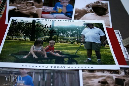
Variation #1: Instead of using small square photos as shown on the sketch, I used 2.5 x 3.5 wallet photos. I also varied their placement on the page and lined them up more so they were all visible. Because my photos are larger, I have less white space on the right side of my layout.

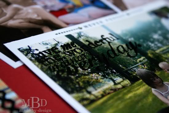
Variation #2: For my title, I stamped the words with StazOn ink in the corner of my largest 4x6 photo. I used the photo in place of the title block because it was the main focal point of my layout.


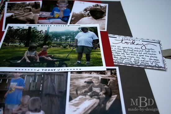
I also stamped the words "never forget" and "today" above and below the photo and accented them with gemstones. I completely omitted the candles and stars as shown in the sketch.

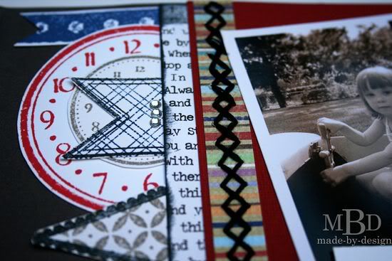
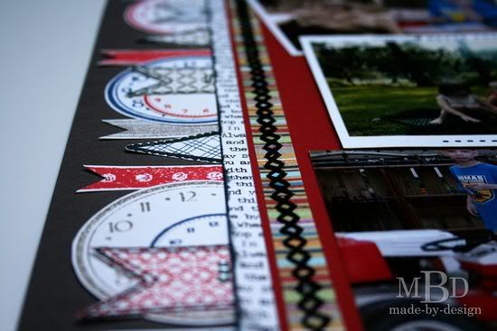
Variation #3: Because my photos were larger than the sketch photos, the banner would not fit across the top of my page. So I created a custom banner with a variety of clocks, ribbon images and banners that were all created with white cardstock, stamps and inks. I added clear gemstones to three of the banners to add some detail.


Variation #4: Instead of adding my journaling in strips under my title, I created a custom stamped journaling tag and added a stamped word border along the top.


To hide this journaling section on my page, I used an exacto knife and created a slit in the layout and made a pocket. I added some ribbon to the journaling piece so it was easy to pull out to read.
•••••••••••••••••••••

Wednesday, September 28, 2011

One-page Week, Part 3

••••••••••••

One-page Sketch #13


You can download and print this sketch by clicking on the one-page sketches link found under the "printable sketches" tab on the right sidebar.


"All the Best Moments..." by Allison Davis
Supplies - Cardstock: Bazzill; Patterned paper: My Mind's Eye; Label stickers: My Mind's Eye; Chipboard: My Mind's Eye; Brads: My Mind's Eye; Buttons: My Mind's Eye

For this layout I did kind of a half flip on the sketch and added a few extra layers.

Variation #1 - I flipped the strips that run behind the pictures from horizontal on the sketch to vertical on my layout. I like the strips as they are on the sketch but with the other variations I did to the sketch I ended up liking them a little better going up and down instead of across.

Variation #2 - I added two background pieces to my layout. I really wanted to get more paper on the layout and this was an easy way to do it!

Variation #3 - I cropped all three of my pictures to 3 x 3 instead of just having two and then a larger photo. I love these photos but there was a lot of empty space in them and I liked the cropped version better.

Variation #4 - I decided to remove the journaling block and instead wrote my journaling directly on the page. Since the paper that was showing had lines it worked out perfectly!

Variation #5 - I moved my title to the right of the top photo.

  • • • • • • • • • • • • • • • • • • • • • • • • • • • • • •


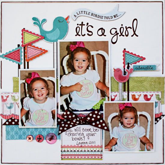
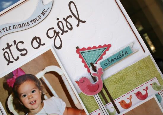
"It's a Girl" by Robbie Herring
Suppliy List - Bazzill: Polka Dot White Cardstock; My Mind's Eye Fine and Dandy Collection: Stickers, Patterned Paper, Chipboard, Buttons and Journal Card; Doodle Bug Designs: Alphabet Stickers; Bo Bunny: Double Dot Ribbons.

Variation 1: I changed the size and orientation of the photos. The center photo is 3 1/2 x 5. The left photo is 2 1/2 x 4 and the right photo is 3 1/2 x 3 1/2.

Variation 2: I switched the journal card and the right photo's position.

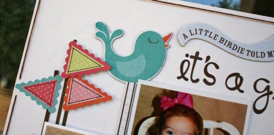
Variation 3: Instead of the clouds in the upper right, I used a large bird and a banner embellishment that moves across the center of the page and becomes part of the title.


Variation 4: I Added more flags and poles to the right side of the page to balance my large title work.


Variation 5: Instead of the butterfly on the right lower side, I used buttons and a bow to add more weight to offset the heavy embellishing at the top of my page.

Hints: Because I used chipboard as part of the layering across the center of the page, I added foam dots to the back of the smaller photos. To help prevent bending of these photos over time in your book, cut a piece of transparency and tape to the back before adding your foam dots. The same thing can be done with stickers that are attached with foam dots.

To save time on stitching, just do a long stitch along each edge and use tape to secure it on the back of the page. I use all 6 strands of floss when I use this technique.

  • • • • • • • • • • • • • • • • • • • • • • • • • • • • • •


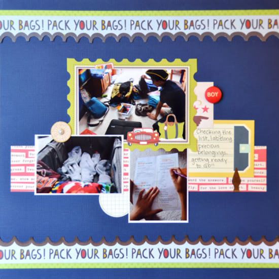
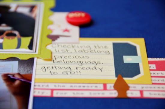
"Pack Your Bags" by Suzanna Lee
Supplies - Cardstock: Bazzill; Patterned Paper: Prima, Cosmo Cricket, BoBunny; Brads: My Mind's Eye, Crate Paper; Journal Spots: Prima, Jillibean Soup; Book Dart: Lee Valley

The most obvious is my inclusion of top and bottom borders. I doing so, I omitted the embellishment cluster at the top right corner. I still have the "main" strip moving across the page behind the pictures but chose to eliminate the smaller ones. I flipped the journal spot for some symmetry across the page.


I also used a journal spot to frame my main picture while fussy cutting some elements. I omitted the flags as I felt the page was busy enough and didn't really need anything else.

  • • • • • • • • • • • • • • • • • • • • • • • • • • • • • •


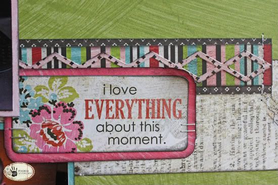
"I Love Everything About This Moment" by Tammy Tutterow
Supplies - paper: BasicGrey (Out of Print: Reprint, Giclee, Storyteller, Headline, Daily News, Mish Mash, Classifieds, Lithograph); stickers: BasicGrey (Out of Print Stickers); flowers: Bazzill Basics (Wild Rose: Precious Pink and 1" and 1.5" Twisted Flowers); ink: Tim Holtz Distress Ink (Black Soot); mist: Ranger Ink Perfect Pearls Mist (Biscotti, brushed on the flowers which doesn't really show in the photos); stamps: Hero Arts (Printer's Type Uppercase Alphabet, numbers); tools: Bazzill Basics (In-Stitchz Junior Mat), Tim Holtz (Idea-ology Tiny Attacher), Fiskars (Twist n Flip Corner Punch, Round n Round); adhesive: Therm O Web Adhesive Foam Squares, Sticky Strip Runner; Craft Zots

For my page, I really loved the sketch design so I wanted to stay pretty true to the original. The main change I made was to turn the top photo vertically, which worked better for the photos I wanted to use. I also omitted some of the embellishments and the titles. I found that after I had my photos and papers in place along with a couple of small tags that it just felt complete.

Here's a closer look at the details:


••••••••••••••••••••
Wednesday, September 7, 2011

Card Week, Part 3

••••••••••••••••••

Card Sketch #11


"Thinking of You" card by Robbie Herring
Supplies Used - Patterned Paper and Chipboard: Pebbles Inc.; White Cardstock: Bazzill; Ribbon: Michaels Basic; Rub-on: American Crafts.

Variation 1: I used a wider strip of paper for the center piece and added scalloped punched borders to the edges.

Variation 2: I used a ribbon strip and bow instead of using the stripe.


Variation 3: I changed the squares to circles. I used a scalloped circle punch and a regular circle punch for the circles. The white circles are adhered with pop dots to add dimension.

Variation 4: I added two hearts instead of one to the 3rd circle. Instead of stitching around the circles (or squares), I added stitching to the large center piece.

Variation 5: I used a chipboard tag to add the sentiment.

  • • • • • • • • • • • • • • • • • • • • • • • • • • • • • •


"Birthday Fishes to You" digital card by Jill Sarginson
Supplies Used - Digital Kits: Kristin Aagard Fix Me Up Doc, Kristin Aagard Pond Play; Font: CK Ali Edwards

I kept the main elements the same here but decided to create a fun little scene surrounding those elements.

  • • • • • • • • • • • • • • • • • • • • • • • • • • • • • •


"First Day" card by Christy Arthur
Products - Bazzill: Kraft Cardstock; October Afternoon: Schoolhouse Shape Stickers, Workbook, Flashcards, Report Card Shape Stickers; Studio Calico: Elementary Library; Crate Paper: Emma's Shoppe Dresses

I used the sketch to make a "first day of school" card for my daughter.

Instead of the hearts that were used in the sketch, I chose various school related stickers and placed them on punched circles. I framed the outside circles with another punched circle "frame" to give it a little color.


I added a few sticker borders and the "first day" text to complete the card.
••••••••••••••••••

Tuesday, August 23, 2011

One-page Week, Part 2

•••••••••••••••••••••••
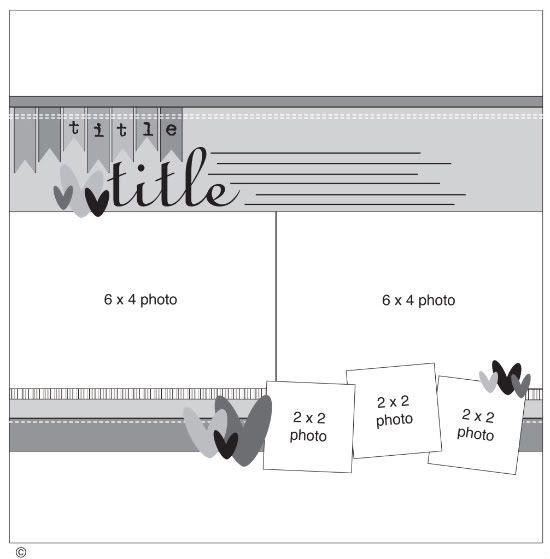
One-page Sketch #12


You can download and print this sketch by clicking on the one-page sketches link found under the "printable sketches" tab on the right sidebar.


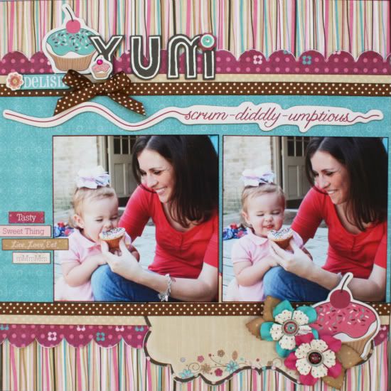
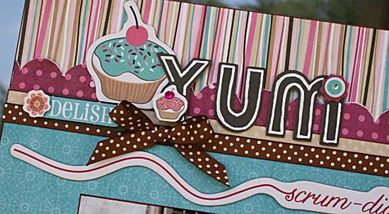
"Yum" by Robbie Herring
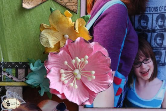
Supplies Used - Bo Bunny Sweet Tooth Collection: paper, noteworthy, brads, chipboard, stickers; Bo Bunny Double Dot: ribbon and paper; Prima: flowers.

Variation 1: I changed the picture size on the large photos. I chose to use two 5x5 pictures. To balance the page without the pictures going all the way across the center, I added some little journal stickers to the left side.

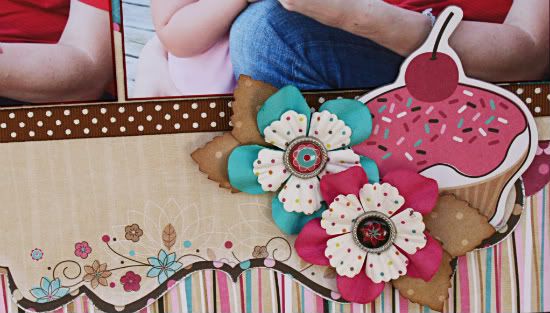
Variation 2: Instead of adding the three pictures along the bottom of the page, I chose to use three large embellisments.


I also added a journaling sheet to the bottom section. I layered it in with the borders.

Variation 3: I still used a 12x7 piece of paper for the background paper. I just added a piece of chipboard above them to fill in the space and add an extra border.

Variation 4: I moved my title and embellishments along the top of the page instead of leaving it as placed.


Because the chipboard piece that I used for another border had wording, I thought that my page looked better and my title was more prominent by moving it up to the top of the page. I used more embellishments that coordinated with the bottom of the page instead of using the banner pieces shown in the sketch.

  • • • • • • • • • • • • • • • • • • • • • • • • • • • • • •

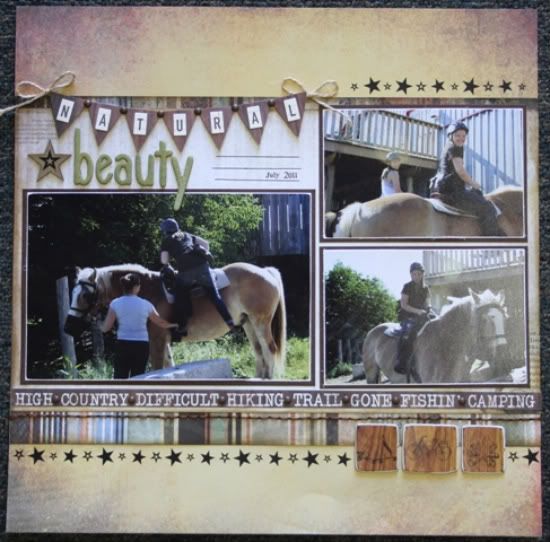
"Natural Beauty" by Carolyn Wolff
Supply List - Patterned Paper: Kaisercraft (Hunt and Gather); Cardstock: Bazzill; Stickers: October Afternoon (letters), Kaisercraft (banner); Embellishments: Kaisercraft (chipboard icons), Maya Road (chipboard letters); Ink: Ranger Distress Ink, Vintage Photo; Twine: unknown; Floss: DMC; Rub-ons: Rusty Pickle; Glimmer Mist: Tattered Angels

Variation #1 – I used three main photos instead of two like the sketch shows. I replaced the three smaller photos with some chipboard embellishments that matched the collection of papers I used.


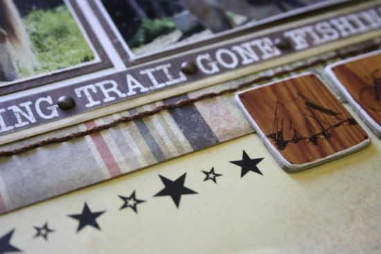
Variation #2 – I added a row of start rub-ons to the top and bottom of my layout. 

Variation #3 – For my title I created a banner using a sticker and some alpha stickers.


I also used some chipboard letters and misted them with Tattered Angels Glimmer Mist.

  • • • • • • • • • • • • • • • • • • • • • • • • • • • • • •


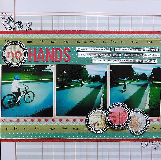
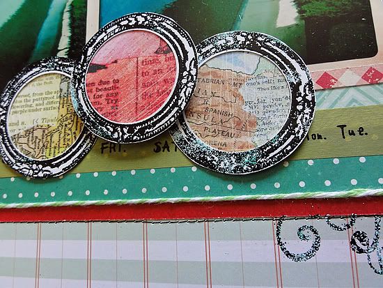
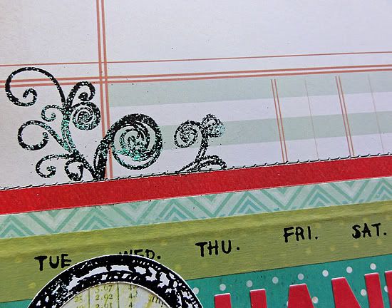
"No Hands" by Jennifer Larson

Supplies - Cardstock: BoBunny; Patterned Paper: Studio Calico, Basic Grey, Crate Paper, Simple Stories; Letter Stickers: October Afternoon, Sassafras; Circle Punch: EK Success; Stamps: Studio Calico, Hero Arts, Daisy Bucket; Embossing Powder: American Crafts; Tape: Cute Tape; Twine: My Mind's Eye; Pen: Zig; Font: American Typewriter; Other: Machine thread

1. I kept the basic design, but I wanted to use some photos I took using the Instagram app; the photos were 4x4, so I used three instead of two 4x6.

2. I didn't have supporting photos, so I replaced the small photos with three punched circles in stamped, embossed frames.


3. I eliminated the hearts because they didn't fit thematically.

4. Just for fun, I used a few different colors of embossing powder.


First I sprinkled lightly a couple shades of blue, then tapped the extra off. Next, I added more black, and again tapped off the excess, this time saving it for future use. When I embossed, the mix added a nice, watery look similar to the photos.

  • • • • • • • • • • • • • • • • • • • • • • • • • • • • • •


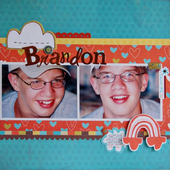
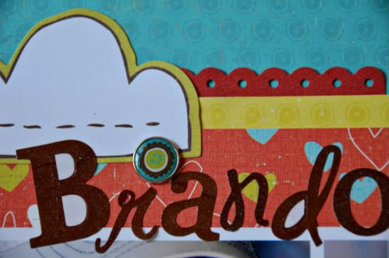
"Brandon" by Suzanna Lee
Supplies - Patterned Paper, Stickers, Brad: Crate Paper; Alpha Stickers: GCD; Label Sticker: Luxe Designs; Pen: Sakura; Misc: Pop Dots

I pretty much stuck to the sketch for this one! Shock, horror, I know!  My biggest deviation from the sketch is the absence of the banner and the 2x2 pics.


I also shrunk the pictures a tad so that they don't run the whole width of the page. Instead of the 2x2 pictures I used larger embellishments which enabled me to have somewhere else for my journaling.


  • • • • • • • • • • • • • • • • • • • • • • • • • • • • • •

 Counterfeit Kit Challenge


There is another fun sketch challenge at Counterfeit Kit Challenge today! The time it's flipping the sketch. This is such a great way to get multiple uses out of one sketch! Just think, if you take one sketch and rotate or flip it each way, that four uses out of one sketch! 


Be sure to head over there check out the ways they flipped the sketches!
••••••••••••••