•••••••••••••••••••••••
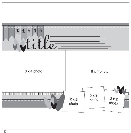
One-page Sketch #12
You can download and print this sketch by clicking on the one-page sketches link found under the "printable sketches" tab on the right sidebar.
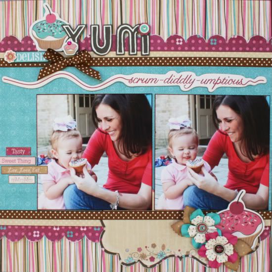
"Yum" by Robbie Herring
Supplies Used - Bo Bunny Sweet Tooth Collection: paper, noteworthy, brads, chipboard, stickers; Bo Bunny Double Dot: ribbon and paper; Prima: flowers.
Variation 1: I changed the picture size on the large photos. I chose to use two 5x5 pictures. To balance the page without the pictures going all the way across the center, I added some little journal stickers to the left side.
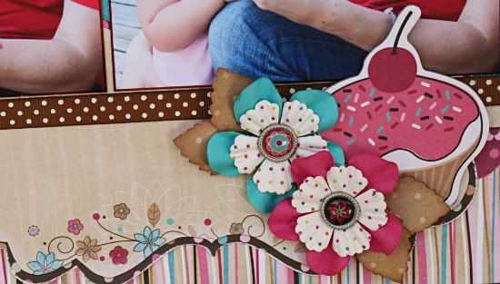
Variation 2: Instead of adding the three pictures along the bottom of the page, I chose to use three large embellisments.
I also added a journaling sheet to the bottom section. I layered it in with the borders.
Variation 3: I still used a 12x7 piece of paper for the background paper. I just added a piece of chipboard above them to fill in the space and add an extra border.
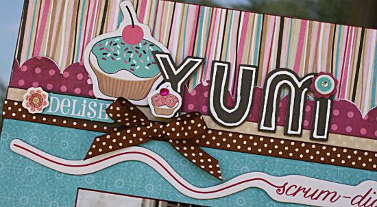
Variation 4: I moved my title and embellishments along the top of the page instead of leaving it as placed.
Because the chipboard piece that I used for another border had wording, I thought that my page looked better and my title was more prominent by moving it up to the top of the page. I used more embellishments that coordinated with the bottom of the page instead of using the banner pieces shown in the sketch.
• • • • • • • • • • • • • • • • • • • • • • • • • • • • • •
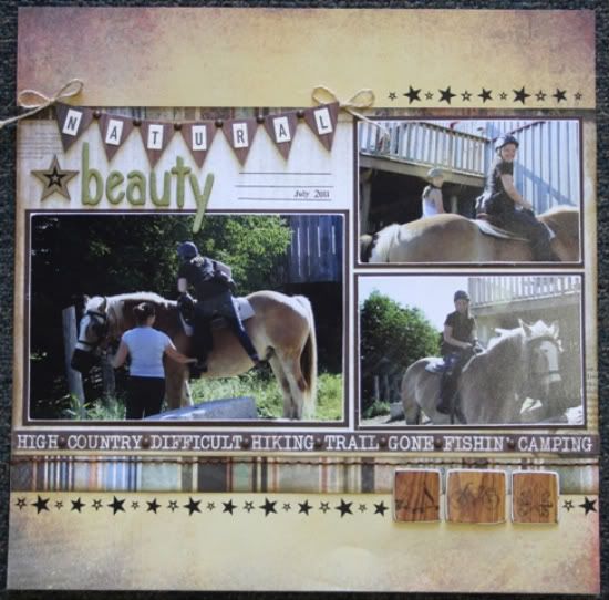
"Natural Beauty" by Carolyn Wolff
Supply List - Patterned Paper: Kaisercraft (Hunt and Gather); Cardstock: Bazzill; Stickers: October Afternoon (letters), Kaisercraft (banner); Embellishments: Kaisercraft (chipboard icons), Maya Road (chipboard letters); Ink: Ranger Distress Ink, Vintage Photo; Twine: unknown; Floss: DMC; Rub-ons: Rusty Pickle; Glimmer Mist: Tattered Angels
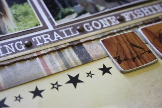
Variation #1 – I used three main photos instead of two like the sketch shows. I replaced the three smaller photos with some chipboard embellishments that matched the collection of papers I used.
Variation #2 – I added a row of start rub-ons to the top and bottom of my layout.
Variation #3 – For my title I created a banner using a sticker and some alpha stickers.
I also used some chipboard letters and misted them with Tattered Angels Glimmer Mist.
• • • • • • • • • • • • • • • • • • • • • • • • • • • • • •
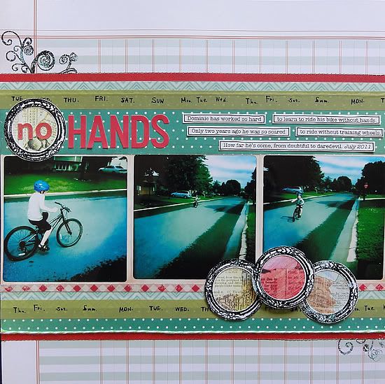
"No Hands" by Jennifer Larson
Supplies - Cardstock: BoBunny; Patterned Paper: Studio Calico, Basic Grey, Crate Paper, Simple Stories; Letter Stickers: October Afternoon, Sassafras; Circle Punch: EK Success; Stamps: Studio Calico, Hero Arts, Daisy Bucket; Embossing Powder: American Crafts; Tape: Cute Tape; Twine: My Mind's Eye; Pen: Zig; Font: American Typewriter; Other: Machine thread
1. I kept the basic design, but I wanted to use some photos I took using the Instagram app; the photos were 4x4, so I used three instead of two 4x6.
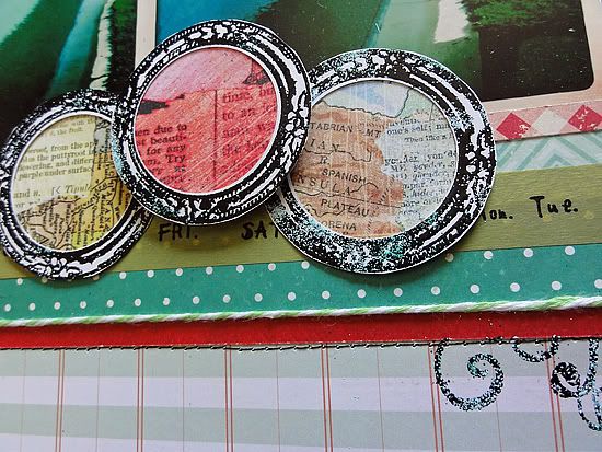
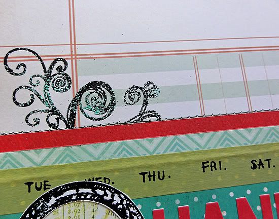
2. I didn't have supporting photos, so I replaced the small photos with three punched circles in stamped, embossed frames.
3. I eliminated the hearts because they didn't fit thematically.
4. Just for fun, I used a few different colors of embossing powder.
First I sprinkled lightly a couple shades of blue, then tapped the extra off. Next, I added more black, and again tapped off the excess, this time saving it for future use. When I embossed, the mix added a nice, watery look similar to the photos.
• • • • • • • • • • • • • • • • • • • • • • • • • • • • • •
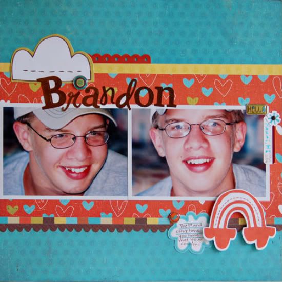
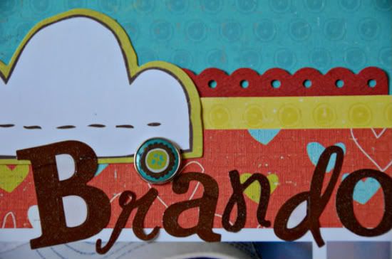
"Brandon" by Suzanna Lee
Supplies - Patterned Paper, Stickers, Brad: Crate Paper; Alpha Stickers: GCD; Label Sticker: Luxe Designs; Pen: Sakura; Misc: Pop Dots
I pretty much stuck to the sketch for this one! Shock, horror, I know! My biggest deviation from the sketch is the absence of the banner and the 2x2 pics.
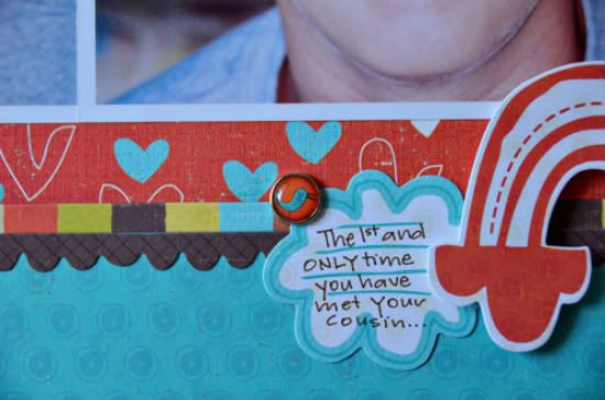
I also shrunk the pictures a tad so that they don't run the whole width of the page. Instead of the 2x2 pictures I used larger embellishments which enabled me to have somewhere else for my journaling.
• • • • • • • • • • • • • • • • • • • • • • • • • • • • • •
Counterfeit Kit Challenge
There is another fun sketch challenge at Counterfeit Kit Challenge today! The time it's flipping the sketch. This is such a great way to get multiple uses out of one sketch! Just think, if you take one sketch and rotate or flip it each way, that four uses out of one sketch!
Be sure to head over there check out the ways they flipped the sketches!
••••••••••••••


3 comments:
awwww that first layout is so cute. The layouts are awesome today and the themes were cute. Thanks for always inspiring me and sharing with us.
Very nice ladies!
What a fantastic sketch! Love the layouts shared today!
Post a Comment