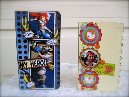
It's Guest Designer, Michelle McClure's turn to take over and show you how she put together her cute "his and hers" cards.
Card Sketch #2
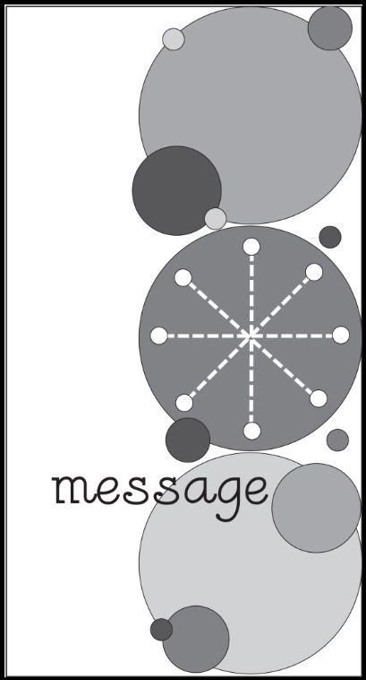
You can download and print this sketch by clicking on the card sketches link found under the "printable sketches" tab on the right sidebar.
I thought this sketch looked really cute and lent itself to a card for a little boy or girl. Since I don't have kids, I just made one of my husband and myself, but you can imagine the effect. I guess you can make it for the young at heart too.
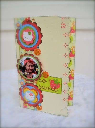
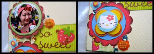
So Sweet girl card by Michelle McClure
Cardstock: Bazzill; Patterned Paper and So Sweet Sticker: Doodlebug Bon Appetit; Hello Kitty Stickers: Sanrio; Solid Papers: unmarked scraps from my scrap pile; Circle and Scallop Punches: EK Success; Border and Corner Punches: Martha Stewart; Ink: ColorBox fluid chalk inkpad; Jewels: Kaisercraft; Photo doctoring: iPhone KittyCamera App
Pre-process
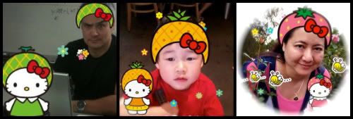
I was looking at the circles in the sketch and went into Big Lots looking for inspiration and something that had a distinctive shape. I found a pack of Hello Kitty stickers that used circles and scalloped circles so I used that as my starting point. I came home and saw that the colors matched the Doodlebug Bon Appetit papers that I had just ordered so I put those two lines together. Also, a student recently took a photo of my husband in his physics classroom (see below) and I asked how that was done. It is made with an iPhone app called KittyCamera where you put fruit caps on people's heads. The fruit motif further complemented the paper line so everything was falling into place. He ordered and installed it on my phone and I made a picture of my nephew but I didn't think my sister would want a Hello Kitty card of him so instead I had to use my own photo in the card.
The Process
•Variation #1- I used a frilly border and edger punch along the opening edge to match the scalloped circles and feminine style of the card. The decorative edge was blending into the same colored background so I chalked it in a dark green and glued two strips on the card behind it. The patterned paper I used had various fruits and flowers on it. Since I was wearing the strawberry cap, I cut the strip from a specific section of the paper that would show the strawberries along the edge. Now the border showed better but the little eyelet flowers were still getting lost on the creamy background. I cut another strip in a dark pink that matched the strawberries. Now the punched flowers looked pink when the card is closed.
•Variation #2 - The circles looked too busy next to the decorative edge so I moved them over to the left side along the straight border and it didn't compete with the frilly edge anymore.
•Variation #3 - The circle stickers were only 1.5" so I backed them on 2" scalloped circles to increase the size. There was still too much space in between the three large circles so I decreased the height of the card from 7.5" to 6.5" and the scale matched the sketch better since the original circles were 2.5".
•Variation #4 - The three circles still looked like they were floating in space so I cut the same patterned paper in a one inch strip and placed it behind the circles. Now they seem more anchored. I decorated around the larger circles with smaller stickers from the same pack and adhesive jewels. Here are some close up pictures:
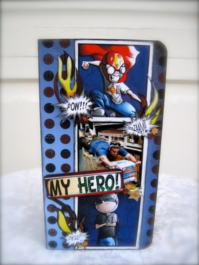
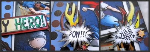
My Hero boy card by Michelle McClure
Patterned and Colored Papers, Graphics, Words: Rusty Pickle Shazaam line papers; Ink: ColorBox fluid chalk inkpad; Glitter: Gelly Roll Stardust clear pen and Ranger Diamond Stickles; Star Brad: from an unknown birthday brad set; Mini Star Punch: unmarked
Pre-Process
I had bought a Rusty Pickle Shazaam kit at an Expo for $3.00 with the intention of scrapping my husband and three year old nephew, but never got around to it. When I saw the sketch I immediately pictured the three large circles as three panels in a comic book and thought of the papers I had previously purchased. I had also taken a picture of my husband during a routine trip to Home Depot on my iPhone, this was not purposely posed for this layout, unfortunately. I just thought all the elements would combine well with a comic book theme and make a good contrast to the other more feminine card
The Process
•Variation #1 - The card is the same size, I just rounded the corners. The circles became squares to simulate a comic panel, but I kept it the same size (2.5") so it is the same scale and fills the height of the card. I matted the squares with plain white cardstock and inked everything in black to further enhance the comic look. Two squares are cut from designs on the patterned paper and one is a photo. The chalk ink did adhere well to the glossy photo.
•Variation #2 - I changed the smaller accent circles into my interpretation of super hero elements - onomatopoeia, flames and stars. I drew out some flame shapes with pencil on the back side of the yellow and red patterned paper and cut it out. I punched out mini stars and colored them with the Gelly Roll stardust pen. It is a good alternative if you want instantly dry glitter and don't want to mess with smearing and drying time. It also give you a much thinner line for smaller areas like outlining the flames.
•Variation #3 - For the words, I tried typing them out but it looked very plain. The patterned papers had the words I wanted and in the style I wanted but they were too big. It was made for use on a whole page and not a smaller card. The photo is of my card on the 12 x 12 papers. See how big the Shazaam! is on the paper compared to what I ended up using.
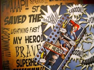
I decided not to reinvent the wheel and just color copied the pattern papers on white cardstock and reduced the size on my all in one printer at home. It was quick and solved my scale issue. I reduced the "My Hero!" for my title, and reduced the onomatopoeia even further for the accents.
•Variation #4 - I matted the title in red to bring that color in more and raised it with foam dots to make it stand out. Some of the stars and sayings are also raised for further visual interest.
I hope you enjoyed these fun little cards!
•••••••••••••••••••
14 comments:
Fun, cute and creative!
Wow didn't expect something new here on a Saturday!! Is this really everyday of the month?? I love these cards, so cute and fun!
Michelle, your cards made me laugh! (That's high praise indeed). They're great.
Michele
super cute cards, love the personal pics you added to the card.
All I can say is WOW....great cards and I love the personalization!!
very cute!!
Great cards Michelle!
Oh my gosh these are awesome! Thank you for sharing your whole process in creating these and so happy to have you joining us Michelle!
Thanks for your nice comments, I was totally nervous to post anything in cyberspace, especially after seeing how succinct everyone else was and how silly my cards were.
Michelle, your cards turned out awesome!!! I just now put two and two together that you made the diaper cake and shared with me. Girl, you have amazing talent. Keep up the good work.
Very cool cards Michelle! So glad to have you join in on all the fun we have been having here.
Shazaam!!! The world needs more silly!! These cards are FUNtastic!!!
Lulo
Both are awesome...almost like mini pages!
I see the word "love" used way too much on scrapbooking blogs but...I love your cards.
Post a Comment