•••••••••••••••••••••••••••••••••••••
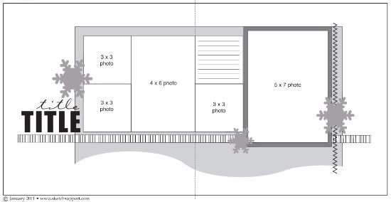
We've got another three layouts to share with you today, including a one-page layout based on one side of the sketch. That's one of the great things about two-page sketches, a lot of times, you can get two sketches for one by using the left or right side as individual sketches.
Two-page Sketch #7
You can download and print this sketch by clicking on the two-page sketches link found under the "printable sketches" tab on the right sidebar.
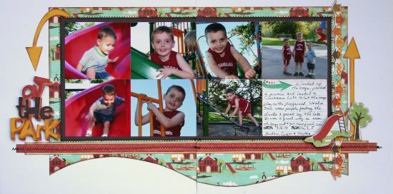
"At the Park" by Shari Thurman
Supply List - Patterned paper, chipboard shapes, borders, rub-ons: Crate Paper; Ink: Colorbox Chalk Ink (chestnut roan); Adhesive: Thermo-web 3D; Embroidery floss: DMC; Tools: Sew Easy, We R Memory Keepers, and Cricut; Other: cardstock, machine and hand stitching
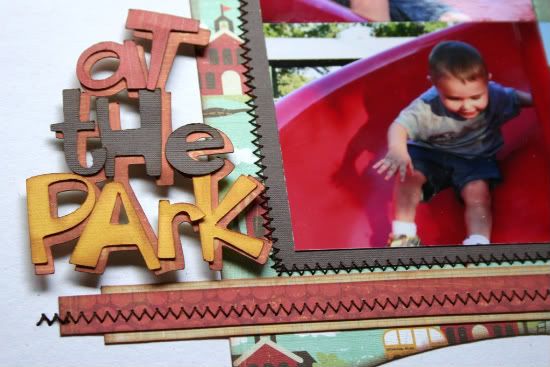
The wavy line on this sketch just screams "movement!", which was great for pictures of my boys at the park. I picked out seven photos I wanted to use and then adjusted the sketch to accomodate them. I added a brown stitched mat behind the photos to anchor the photos and give some relief from the busy background paper.
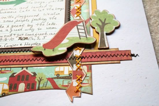
I moved the journal block to the lower right, so that it didn't break my photo grouping. For the embellishments I added some chipboard stickers and arrows to play up the movement and used machine and hand stitching to finish.
Here are the adjusted measurements:
• Background: 9 1/4 x 11" on both sides, with the wavy line cut along the bottom.
• Red strips are 11 x 1/2", cream strips are 10 1/2 x 3/4"
• Photos and journal block: 3 1/2 x 4
• The background is 1/2 inch from the top of the page.
• Brown mat is 1 inch from the top of the page.
• • • • • • • • • • • • • • • • • • • • • • • • • • • • • • • • • • • • • • • • • • • • •
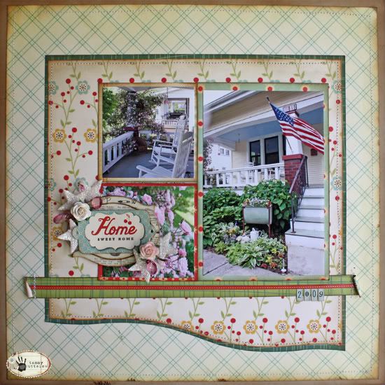
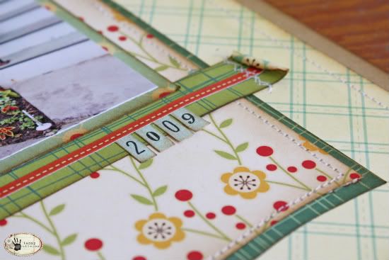
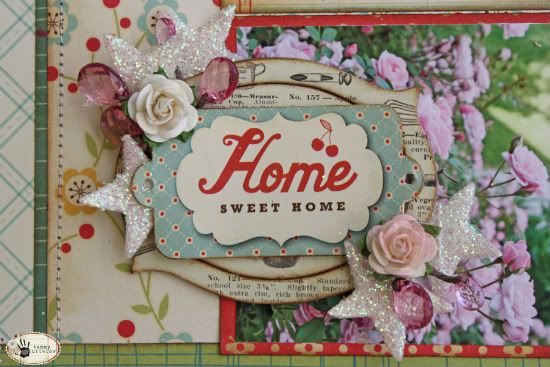
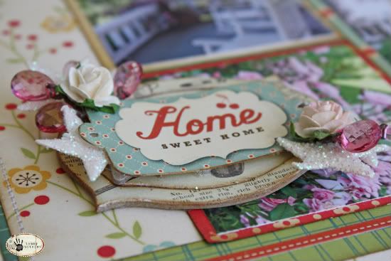
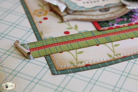
"Home Sweet Home" by Tammy Tutterow
• • • • • • • • • • • • • • • • • • • • • • • • • • • • • • • • • • • • • • • • • • • • •
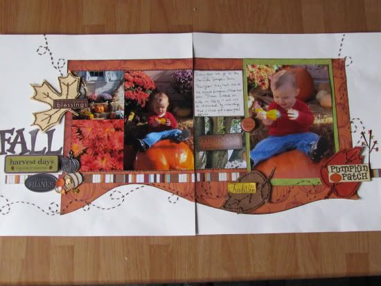
"Fall" by Amy Roller
Supply list - Cardstock: Stampin Up! (background) and Bazzill (title); Patterned paper: Dollar Tree and Imaginisce, Sticker Embellishments: Karen Foster, K Marcella, and Jolees; Metal charms: unknown; Other: Brown craft thread; Adhesive squares: 3M
For this sketch I only changed a few things. I used a larger pattern for the background instead of a smaller one just for the fact that I liked how the big pumpkins fit the large pumpkin Mason is sitting on.
I stitched a solid line around the group of smaller photos because I thought it helped break up the orange a little and helped them stand out.
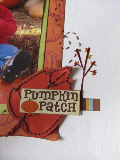
I also carried the stitched line from the right side of the sketch around my page in several spots to form the "swirling" path of the leaves which I used in place of the snowflake embellishments in the sketch.
I added stitching details to these as well. Really just because I liked the added contrast and depth it added.
I also chose to group several embellishments together instead of just 1 or 2 in the designated areas. And the little round embellishment by the 5 x 7 picture is not on the sketch but was a "mistake fixer upper"! I had a to cover a blemish on the photo and it was the perfect size.
••••••••••••••••••••••••••••••••••••••••••••••••
••••••••••••••••••••••••••••••••••••••••••••••••



38 comments:
That's why I love sketches: you can make them fit your photos or wishes.
Great job, ladies!
Tammy's page makes me want to sit in the rocker with a big glass of ice tea.
I sure enjoy your new site, Allison.
Linda from KS
I love getting up in the early morning and coming here to see all these great layouts. Great job to everyone, love all the changes and all the details. The last layout is so neat with the swirling leaves and the stitching everywhere. Thank you ladies!
Wow ladies, these are beautiful!!! I know I'm part of the "team" but I also get so excited to log in everyday to see these amazing creations.
While I like all the layouts, I have to say that Tammy Tutterow's blows me away...it's so beautiful!
The thing I love about your sketches is how versatile they are. Great pages!
Love your sketches and all the "takes" by the guest designers. This is a wonderful resource. Thank you!
Love the variations on the sketch today by the guest designers. I adore all the embellishments on the layouts!
Another batch of great layouts. Way to go girls.
Shari - I just love the park theme and how you changed up the photos.
Tammy - Beautiful! Love all the details, especially the machine stitching.
Amy - Awesome. All the little details make this page really jump out.
Great LOs! TFS!
Every single one of the layouts is just yummy.
These are all gorgeous!! Great job! Love the layered title on Shari's layout.
Impressed by how each of the guest designers used the embellishments to enhance their layouts.
what font is used in the Park" title? TIA
Michelle
Fabulous layouts gals!!
Beautiful work, ladies! Tammy, would love to see your supply list...that is one gorgeous layout!
Lulo
Outstanding! The detail going into these layouts is incredible! I can see why you chose these women to be on the creative team! WOW!!!
L-
Sorry about that. The patterned paper is all Cosmo Cricket Early Bird. The flowers, crystals, and stars are all Prima. I tossed the packaging on the Prima stuff quite a while back (oops)so I don't have the exact names on those. Sorry.
Wow...fantastic layouts!
Wonderful layouts! Love the detail and stitching on these layouts.
I love the different takes of this sketch. I especially love the stitching details added on to the LOs. It really makes me want to add it to my LOs. Beautiful job ladies.
LOVE these layouts. Just discovered this website and can't wait to use some of these fabulous sketches!
Love them all. Thanks for giving us even more sketches and examples. So inspiring.
Momtotucknlexi, I used 'cuttin' up' cricut cartridge. If you go to my blog and email me, I can send you the cut file by email.
Great layouts! Love all the details.
Super inspiration this week - thank you to all the designers!
I love all the stitching and details. Tammy's LO wants me to do a page about our home.
Love all the little details added to each of these layouts. They look great!
the DT takes keep getting better and better!
Thanks so much for the sketch. Love how the letters are done for At The Park. TFS
Stitching on the embellishments totally changes them. These layouts are great. Great job ladies.
gorgeous lo's, love all the details & beautiful embellies!
Staci
All the layouts were great- but the Fall one is extra cute:-)
Tammy's porch looks so inviting! Ah....
Fantastic LO's, I love all the stitching, I just got a sewing machine and I need to learn how to stitch on paper!
Looking great ladies!!!
Wow, beautiful pages! !!
Thanks for the inspiration,
Karina
The stitching creates a lovely, flowing path for fall leaves. Wonderful! TFS!
Post a Comment