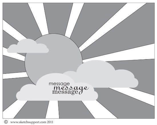
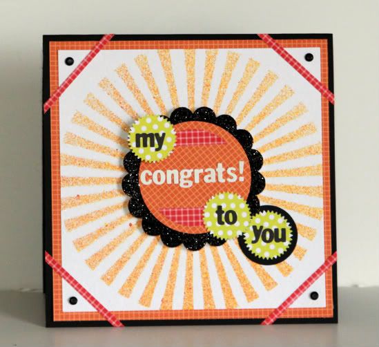
It's our May guest designer, Angela Ploegman's turn to share what she created with the sunshine card sketch. I love it and I'm sure you will too! It's always fun to see how differently everyone interprets the sketch.
Card Sketch #6
You can download and print this sketch by clicking on the card sketches link found under the "printable sketches" tab on the right sidebar.
"My Congrats to You" card by Angela Ploegman
Supply List - Cardstock: Bazzill; Patterned Paper: Pebbles; Template: Crafter's Workshop; Mists: Tattered Angels; Glitter paper: Reminisce; Punches: EK Success (scalloped circle and pointed circle)' Paper Studio (large circle), Fiskars (medium circle); Alphabet letters: Basic Grey; minibrads: Karen Foster
This card sketch brought a big smile to my face. I had picked up a Crafter's Workshop Sunburst template some time ago and had been looking for an excuse to use it! This sketch fit the bill, to a 'T'!
I ended up centering the design and misted the sunburst onto white card stock. Since I put the design in the center, the card took on a more graphic than whimsical look, so I enhanced the graphic feel by mounting the design first on orange patterned paper and then on a black 6x6 inch card base. I added custom photo corners, using strips of coordinating red paper and black mini brads. The center tag is a scalloped circle punch layered with circle punches and popped with pop dots...I replaced the trio of clouds with 3 pointed circles and used them as a base to complete the card sentiment.
••••••••••••••••••••••••••••••••••


5 comments:
Thanks for the card sketch and the NSD layout sketch! I can't wait to use them.
Very Cheery!! I like you colors. Nice card.....
This is beautiful!! I LOVE the bright, happy colors!!
You have a beautiful site!
www.birdietobe.blogspot.com
I really like this! I love that is so graphic, colors are popping against one another. Great job!
Post a Comment