••••••••••••••••
One-page Sketch #17
You can download and print this sketch by clicking on the one-page sketches link found under the "printable sketches" tab on the right sidebar.
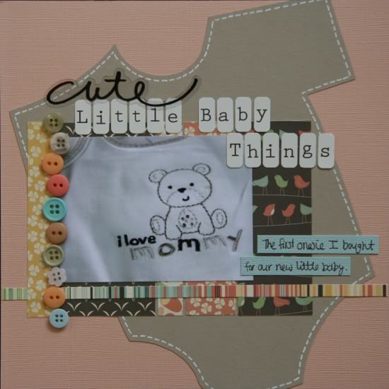
"Cute Little Baby Things" by Noey Hunt
Products used - Patterned papers: Cosmo Cricket; Stickers: Deja Views (cute); Letters: Prima; Tools: Silhouette (onesie)
Variation 1: I shrunk the sketch. The album this layout goes in is only 8x8 inches, so I took all the sizes and shrunk them to 2/3 the original size. The photo is only 3x4 inches.
Variation 2: The stars did not fit my theme so I swapped out the large one for a baby onesie and the little ones for buttons.
Variation 3: Some minor adjustments. My title was extra long so I continued it next to the photo. Since there isn't much room on an 8x8 layout, I kept the journaling short and sweet.
• • • • • • • • • • • • • • • • • • • • • • • • • • • • • •
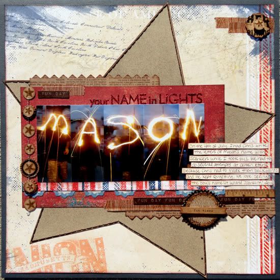
“Your Name in Lights” by Andrea Friebus
Supply list - Cardstock: American Crafts, Bazzill Basics; Patterned paper: Basic Grey, Bo Bunny; die cut borders, garland, chipboard, stickers: My Mind’s Eye; Ink: Clearsnap; spray mist: Tattered Angels; decorative tape: American Crafts; embroidery floss: DMC; letter stickers: Making Memories; star stamp: Li’l Davis
Variation #1 - I decided to flip flop the photo and the background paper the photo is on. Instead of five papers for the background photo mat I used one and instead of one photo, I used five that I merged together and printed as one. My photos turned out to be larger than the 6x4 in the sketch so I made the mat behind them larger, too.
Variation #2 - I matted my entire layout on a sheet of cardstock. I really wanted to use the red, white, and blue striped paper underneath the photos but it was on the back of the main piece of patterned paper. So I trimmed a small piece off which made the paper smaller than 12x12 so I mounted it on cardstock.
Variation #3 - I added some borders, die cuts, and stickers behind and on top of the star, and in the upper right corner for texture and interest.
Variation #4 - My title is smaller and less noticeable than the sketch so it wouldn’t compete with my son’s name in the photos.
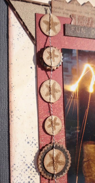
Variation #5 - Instead of using stars and stitching them down for the border, I used the back side of the My Mind’s Eye garland and stamped stars on the circles. They were already stitched together!
••••••••••••••••••••••


5 comments:
Andrea, what a cute idea, love this!!
Noey, I love love how you did the name with a sparkler how awesome is that!! Great layout for this!!
Noey, that layout of the onesie is ADORABLE! Love the colors too.
Andrea, my son will love this one, his name is also Mason. Good job ladies..love this sketch and can't wait to use it myself!
Noey, that little 8x8 layout is adorable!! I love that you used the onesie in place of the star!!
Andrea, that is an awesome picture series and I love the way you stamped the little stars on the circles!
Love the Onesie background! Very clever and cute:)
LOVE the onesie idea and the picture of name in lights!
Post a Comment